| The first step for color management is to set up the color system. Fortunately, Adobe provides predefined color settings that are suitable for many users. To turn on color management: 1. | Choose Edit > Color Settings. This opens the Color Settings dialog box  . .
The Color Settings dialog box contains the controls for managing how colors are displayed and printed. 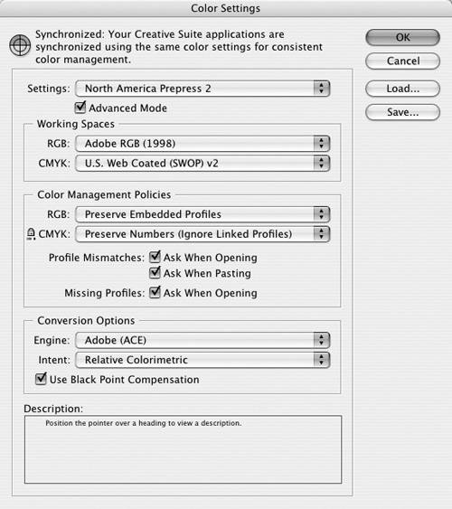 | 2. | Check Enable Color Management. This opens the color settings controls.
| 3. | Choose one of the predefined settings from the Settings menu  : :
The Settings menu lets you choose one of the predefined color management settings. 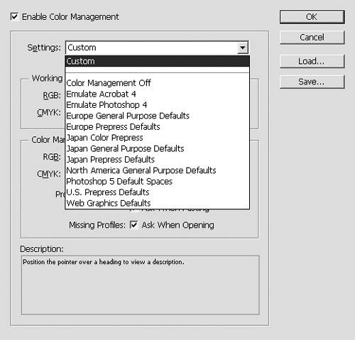 Custom uses the settings you choose in the Color Settings dialog box (see the exercises that follow). Color Management Off uses minimal color management. Use this for video or on-screen presentations. ColorSync Workflow (Mac) manages color using the ColorSync 3.0 CMSl. Emulate Photoshop 4 simulates the color workflow used by Adobe Photoshop 4.0 and earlier. Europe Prepress Defaults manages for typical European press conditions. Japan Prepress Defaults manages for typical Japanese press conditions. Photoshop 5 Default Spaces manages using the default working spaces for Photoshop 5.0 and later. U.S. Prepress Defaults manages for typical U.S. press conditions. Web Graphics Defaults manages for display on the World Wide Web.
| 4. | Check Advanced Mode only if you want to set the added color controls (see page 419).
| 5. | Click OK to apply the color settings. In many cases, this is all you need to do to set color management in InDesign.
|
Talk to Your Print Shop Most designers I know are embarrassed to admit they don't understand color management. It's nothing to be ashamed of. What you need to do is talk to your print shop. Ask them what settings they recommend for color management. And remember, color management also needs to be set in image-creation applications such as Adobe Illustrator and Adobe Photoshop that you use to create images placed in InDesign. |
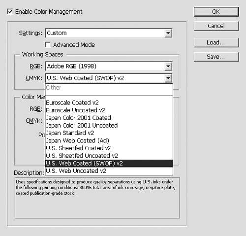
The working space applies the default color profiles for RGB and CMYK colors (see Chapter 5, "Working in Color"). To set the RGB working space: - Use the RGB menu to choose one of the following RGB display settings
 : :
The Working Space RGB menu lets you choose the display options for RGB colors. 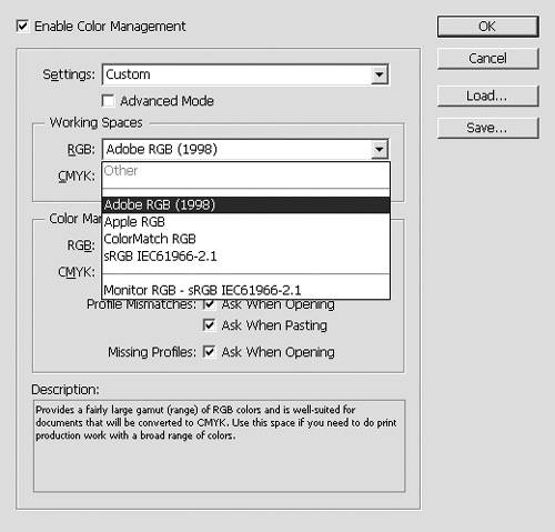 Adobe RGB (1998) has a large color gamut. Use it if you do print work with a broad range of colors. Apple RGB reflects the characteristics of the Apple Standard 13-inch monitor. Use for files displayed on Mac OS monitors or for working with older desktop publishing files. ColorMatch RGB matches the color space of Radius Press View monitors. sRGB IEC61966-2.1 reflects the characteristics of the average PC monitor. It is recommended for Web work, but is too limited for prepress. Monitor RGB sets the working space to the color profile of your monitor. Use this if your other applications do not support color management. ColorSync RGB (Mac) matches the RGB space specified in the control panel for Apple ColorSync 3.0 or later.
Tip When the Advanced Mode is chosen, the RGB Working Space menu displays additional options.
To set the CMYK working space: You can also set what happens when placed images contain different color profiles than the current working spaces. To set the Color Management Policies: 1. | Choose a setting in the RGB and CMYK Color Management Policy menus  and and  as follows: as follows:
Off turns off color management for imported images or documents. Preserve Embedded Profiles maintains the profile in the imported image or document. Convert to Working Space converts placed images and documents to the working spaces you set for the InDesign document.
The RGB Color Management Policy menu let you choose what to do with different RGB color profiles. 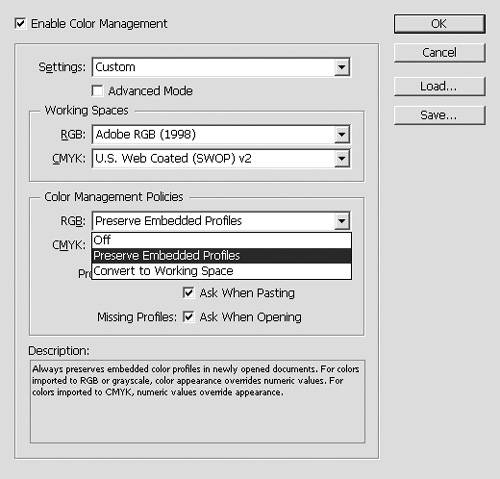
The CMYK Color Management Policy menu lets you choose what to do with different CMYK color profiles. 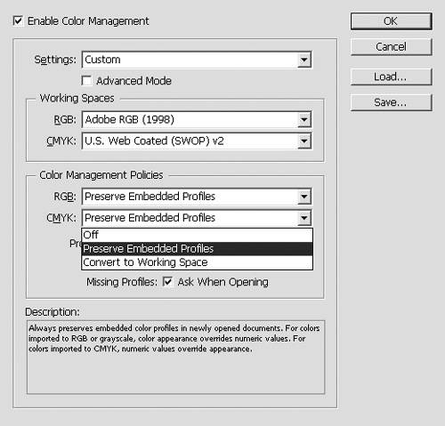 | 2. | Check Ask When Opening (under Profile Mismatches) to give a choice when opening documents with different profiles  . .
The Profile Mismatches and Missing Profiles options control what happens when different profiles are in the same document. 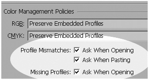 | 3. | Check Ask When Pasting (under Profile Mismatches) to give a choice when pasting information from documents with different profiles.
| 4. | Check Ask When Opening (under Missing Profiles) to give a choice when pasting information from documents that have no color profiles.
|
Black and White Points? A white point is the most extreme highlight in an image. This is the part of the image that should be totally white without any ink. A black point is the most extreme black part of an image. |
The Conversion Options, in the Advanced Mode, control how objects and color data are converted  . .
The Conversion Options are displayed in the Color Settings when the Advanced Mode is checked. 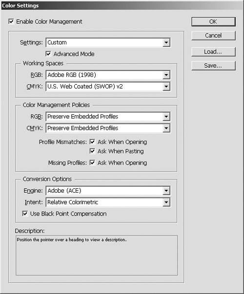 To set the conversion options: 1. | Choose one of the settings in the Engine menu  and and  : :
The Engine menu (Win) lets you choose the Adobe Color Engine or the Microsoft Image Color Management for color management. 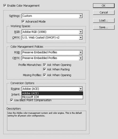
The Engine menu (Mac) lets you choose the Adobe Color Engine or the Apple ColorSync or Apple Color Management Module for color management. 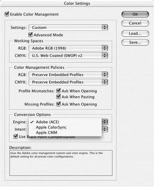 Adobe (ACE) uses the Adobe color management system and color engine. This is the default setting for most preset color configurations. Apple ColorSync (Mac) or Apple CMM (Mac) uses the color management system provided for Mac OS computers. Unless you have an optional color module installed, there is no difference between the two settings. Microsoft ICM (Win) uses the color management system provided for Windows computers. Tip Choose Adobe (ACE) if you are working with other Adobe products.
| 2. | Choose one of the settings in the Intent menu  : :
The Intent menu lets you choose how the final color display should look. 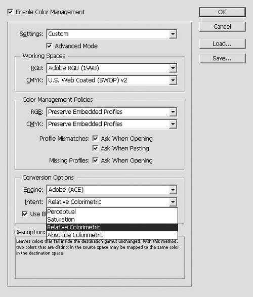 Perceptual preserves the relationships between colors in a way that is perceived as natural by the human eye. Saturation is suitable for business graphics, where the exact relationship between colors is not as important as having vivid colors. Relative Colorimetric is more accurate than absolute colorimetric if the image's profile contains correct white point information. This is the default rendering intent used by all predefined color management configurations. Absolute Colorimetric maintains color accuracy at the expense of preserving relationships between colors.
| 3. | Check Use Black Point Compensation to adjust for differences in black points.
Tip Adobe strongly recommends you keep the Use Black Point Compensation option selected. |
|