| In the mid-'90s, when the web was still young and the stock market sensible, people looked at web sites with fresh eyes. They didn't have many preconceived notions about what a web site should do. There were plenty of opinions, sure; but hard and fast notions about how a web site should behave hadn't yet developed. Five years later it's a different world. The web has been integrated into tens of millions of lives, and users have come to expect certain things. 4 kinds of web conventions: Navigation systems. People habitually look to the top or left of a web page to find navigation, and several specific systems like tabs and "breadcrumbs" have also become conventions in their own right. See navigation systems, p. 114. Icons and other visual elements. Like stop signs on the street or playback controls on a stereo, certain symbols like the shopping cart are now recognized by most web users. See visual conventions on (and off) the web, p. 87. Placement on the page. People have developed expectations about where certain elements should appear on the page. The logo should be in the upper-left corner, for example, and the shopping cart icon in the upper-right corner. See how people see web sites, p. 86. Color. There aren't many color conventions, but a few have emerged: Blue, for example, often means a link. But people bring their own cultural expectations to the web green might mean "go" or "money" or "Erin go Bragh," depending on who's looking. See color on the web, p. 146.
These expectations have changed the way designers design. In the early days, we made everything up as we went along. But we no longer have a blank slate. Depending on your outlook, you can bemoan your loss of freedom or rejoice that someone else has done the hard work for you. "We were completely flying blind when we started," said Jeffrey Veen, who joined the staff of HotWired in 1994. "Because no one had ever done web design before. We copied some conventions from magazines and books, and some conventions from computer operating systems. But now there are conventions for the web." "If you're an e-commerce site, you can put your different products in tabs across the top, and it'll work," he explained. "People know what that means. Especially if you put the shopping cart in the upper right-hand corner and the logo in the upper left-hand corner. You can call that boring, but it will work! You have a foundation to start from, and you can innovate on top of that." Granted, this is a mixed blessing. The emerging conventions are by no means perfect, and it can be hard to break the mold, even if you design a genuinely superior system. "Going against conventions is an uphill battle," said designer Doug Bowman. "For better or worse, users have gotten used to certain conventions and placements on the page." These conventions have been largely set by the sites used most often portals like MSN, stores like Amazon, news sites like CNN.com. And it's hard for smaller sites to deviate too widely from the norm. "As the large web businesses gain dominance, they define the expectation for web sites in a much deeper way," said Hilary Billings, chairman and CEO of specialty gift store RedEnvelope. Customers expect, for example, an Amazon-like check-out process. "Even though our check-out is much better for our business, customers get confused because it doesn't follow Amazon's," Billings said. "So we have to model some portions of our web site the very functional portions of our web site against the big sites out there, because they've set the customers' expectations." lesson from the trenches: why you should follow design conventions  "Don't break the rules just to show off how different you are." Michael Twidale Over time, conventions emerge in all industries to make our lives easier, our products better, and our communications faster. There are conventions for everything from traffic signs on highways to playback controls on a stereo. And conventions are now emerging on the web, dictating where certain elements should appear, what they should look like, and how they should work. (Think of the shopping cart icon in the upper-right corner, which leads users to the check-out process.) Some designers resist these basic conventions out of a desire to be original. And while innovation is always needed, this push-back is a bit misguided. What would happen, for example, if every city had a different traffic system: If street signs used different shapes and colors; if red and green no longer meant stop and go? Drivers would have to learn these systems on-the-fly and far more accidents would happen. On the web, of course, the stakes are lower. No one dies from poor web design. But companies and products suffer when visitors can't use their sites. Conventions, you see, are a way of helping users make their way on the web. What they've learned on other sites should help them navigate yours. "As more and more customers are buying more on the web, they want it to be a faster and faster experience," says Hilary Billings, chairman and CMO of the specialty gift store RedEnvelope. "Customers want to go autopilot," she explained. "They don't want to have to stop and think; they just want to click through really quickly. And it's a lot easier for them if the functional parts of all the major sites are virtually identical. It makes the shopping experience much easier." And this applies, of course, to all web sites not just online stores. "If I'm on a site, I hope there's going to be some sort of corporate logo somewhere near the top, near the left-hand corner, and when I click on it, it will take me back to the top-level page of the site," said Michael Twidale, a professor of library and information science at the University of Illinois, Urbana-Champaign. "So if I get lost, I'll always be able to find my way back." "That's an emerging convention," he said. "And it's really irritating when it's not there." "Now, I'm not saying we all have to follow all the world's conventions," he explained. "But you shouldn't change a convention just to be different. That would be like General Motors saying, 'Well, Ford has the brake and accelerator this way round, so we'll have it the other way round just to be different.'" "If you want to break the conventions because you've thought of this fabulous new usability innovation, that's OK," he said. "But it better be 10 times better than what we've got. Only break the rules when you're going to do something useful with it. Don't break the rules just to show off how different you are." Jeffrey Veen, author of The Art & Science of Web Design, also takes a measured approach to following and breaking interface conventions. He embraces conventions, but also encourages designers to keep pushing the limits. "I completely 100% believe in following conventions," Veen said. "And you have to completely internalize, understand, and know why conventions work before you can start to break them. And then you should! Because we're not done yet!" "But you can't bury your head in the sand, and say, 'I'm gonna do it different! I'm gonna be innovative!' without first understanding all the rules. You can't be James Joyce without first knowing grammar." |
how people see web sites When users arrive at your site, you have only a few seconds to orient them. You must explain where they are, what they can do, and how to do it. You must do all this in just a few moments. "If it ain't 100% usable in 15 seconds, you've failed," John Shiple wrote on Webmonkey. And his estimate is probably a little high; web users are an impatient bunch. To design an effective interface, you must first understand how users will see your site when they arrive. 1. how users take in a web page It's seen over and over again in usability labs: People habitually scan web pages the way designers have traditionally arranged them: with site identity top-left, the main content center-right, and additional navigation down the left side. Users typically glance at the top of the page to orient themselves, then look toward the center. If they don't find what they're looking for, they shift their eyes (and mouse) to the left, where they expect to see navigation. 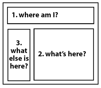 How the user takes in a web page. People tend to scan web pages the way they've "traditionally" been designed, with the logo on the top, featured content in the center, and navigation on the left. Source: Inspired by a diagram in Jeffrey Veen's The Art & Science of Web Design. 2. where users expect things to be Whether or not they realize it, web users have developed expectations about where certain elements will be placed on the web page. This is also seen in usability labs: Testers habitually look toward the place on the page where they expect something to appear (often hovering the cursor over it). They expect to find the shopping cart icon near the upper-right corner, for example, and information about the organization "About us," "Contact us" at the bottom of the page. 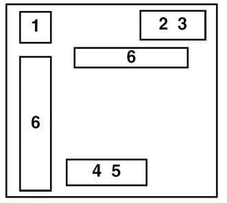 Where users look for common elements. Usability studies show that people have expectations for where particular page elements should appear. Logo, leading back to front door Shopping cart, leading to check-out Help About us Contact us Site navigation bars
Source: Optimal Web Design (www.optimalweb.org) and other sources. |
lesson from the trenches: visual conventions on (and off) the web Visual conventions arise out of need. In so many aspects of our lives, we need quick, easy ways to communicate important concepts like "poison," for example, or "bathroom" or "Stop!" in ways that can be almost universally understood, even by those who don't read or speak the language being used. Of course, not all conventions are a matter of life and death. Visual symbols and other conventions arise in many industries simply to make our lives easier or, in the case of comics, funnier. Here are a few examples from some familiar worlds including, of course, the web. on the web 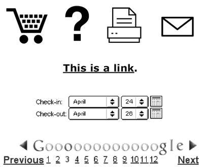
on the road 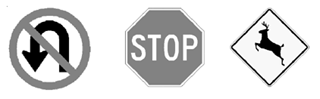
in public places 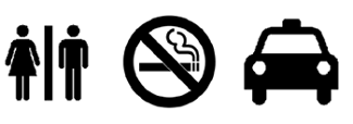
on consumer electronics 
in comics 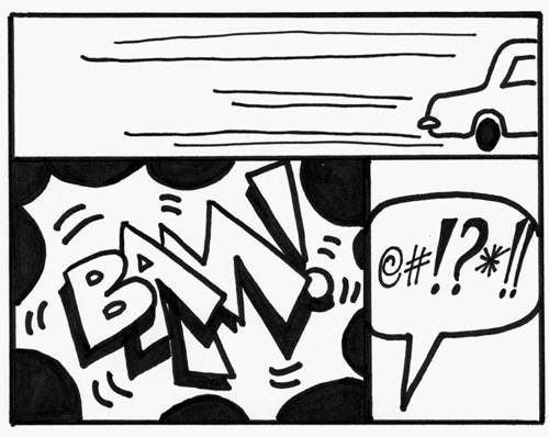
The value of conventions is that they don't need to be explained. Most people know that a right-facing arrow means Play on a stereo or VCR. And the lines behind a cartoon car mean it's moving. These conventions are relatively new (25 and 75 years old respectively), but widely understood. Web conventions, too, are taking hold. Most users now understand that a shopping cart icon leads to the check-out process. Also: A question mark leads to Help, a printer icon will print the page, and an envelope will send email. Users also recognize that underlined words are links. They know how to use pull-down menus and how to navigate through pages of search results. |
|