Section 2.1. Pivot Table Basics
2.1. Pivot Table BasicsPivot tables require data to be arranged in columns with headings. We start by selecting the range of cells or the columns that we want in the pivot table. The pivot table wizard will attempt to find the range for you, if you select a single cell containing data.
Next we click on the Data For this example we simply click the Finish button. This accepts all of the defaults, and this is often all you will need. Several options are available at this point, including linking our pivot table to external data or making a PivotChart. For now, just click Finish, which brings us to the display in Figure 2-3. A newly created pivot table has a few parts. Item 1 is a list of data items in the table. We can drag and drop these items onto the pivot table. Item 2 is the Pivot Table toolbar. On your system it may show up in a different location. Item 3 is the area where we drag-and-drop row fields. Our selection in this area establishes the order of the rows in the finished table. Item 4 is the data area. Items dragged to this area are summarized by both row and column. Item 5 is the area for column fields. Selections here determine the horizontal arrangement of the table. The page field area in item 6 is a filtering option, allowing you to add a fourth dimension to the table. Figure 2-2. The PivotTable Wizard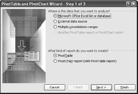 Figure 2-3. The parts of a pivot table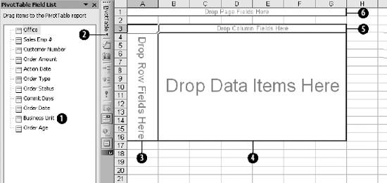 2.1.1. Populating the TableWe start by looking at the average age of orders by location. First, drag the Office data item into the row field area. The results are shown in Figure 2-4. Office is a categorical item. The row, column, and page areas can only use categorical data. The pivot table is only active when some part of the table is selected. If you select a cell outside the table the field list disappears and the table features are disabled. You can reactivate the pivot table by clicking on any part of it. Figure 2-4. Populating the row field area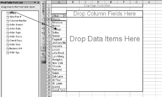 Scalar items go in the data area, and the next step is to drag the Order Age data item to that area. You can use a categorical item in the data area, but this will make most of the calculations unusable. Excel will try to determine what kind of data you have selected, and it will set a default calculation. In this example the default is Count. We change the Count to the Average as demonstrated in Figure 2-5. Unfortunately, there is no way for the user to change the default, so you will have to do this every time you move an item to the data area, unless you actually want the default. 2.1.2. Sorting and FilteringSuppose we want see the locations sorted by average order age. With the interior of the table selected, I click on the Pivot Table button on the toolbar and select Sort and Top 10 as shown in Figure 2-6. This brings up the sort dialog in Figure 2-7. Here I select a descending sort on Average of Order Age. In this dialog I could also limit the display to the top few items after the sort. The top ten is the default, but I can select any number of items to show using the options on the right side of the dialog. In Figure 2-6 the last city is named (blank). This could be useful if we had some blank city names in the data. But we don't. To remove the blank entry, I click on the arrow in cell A4 of Figure 2-6. This displays the dialog in Figure 2-8. Figure 2-5. Changing from Count to Average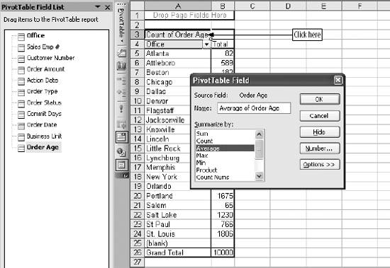 This allows me to control which offices will appear on the table. Here, I have unchecked (blank) to exclude it. When OK is clicked, the display looks like Figure 2-9. There is a big difference in performance. Boston handles orders in about 8.6 days on average while St. Paul takes over 42 days. Some of the difference might be understandable if there is a difference in the kinds or value of orders between the offices. 2.1.3. Multiple Data ItemsNext we check to see if the average order amount is related to average order age. First, I drag Order Amount from the field list into the data area. This adds Count of Order Amount as a second data item. To change to the average, I right-click on one of the cells containing data for Count of Order Amount. In Figure 2-10 I right-clicked on cell B7, bringing up a menu dialog. Selecting the Field Settings option allows us to select how the data is summarized using the dialog in Figure 2-5. By default, Excel puts the new data item under rather than beside the first one. If you want them side by side, just drag the data item in cell B3 to cell C3 as shown in Figure 2-11. Figure 2-6. The pivot table menu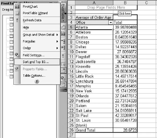 Figure 2-7. Sorting the table This puts the averages next to each other, making it easy to use Excel functions on the data. I check for linkage between the averages by using the CORREL function as shown in Figure 2-12. Figure 2-8. Filtering the row fields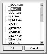 Figure 2-9. The sorted offices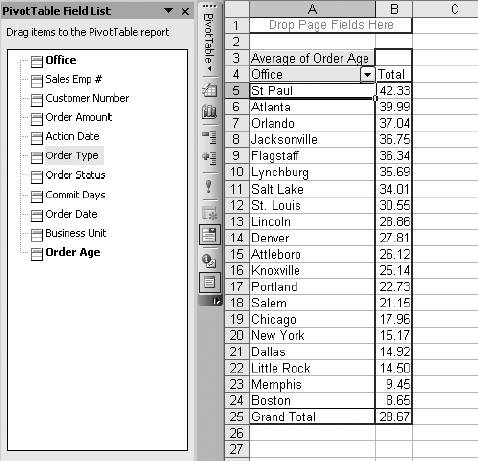 A correlation of -0.3 doesn't explain much. There is a tendency for small orders to be worked in less time. But it cannot account for the differences in performance overall, and we reject the idea that the average size of orders an office processes causes the difference in aging. Figure 2-10. Adding a second item to the data area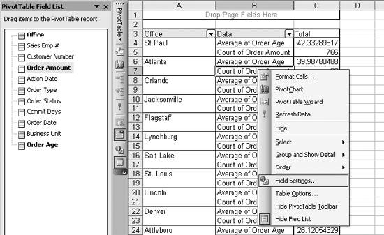 Figure 2-11. Rearranging the table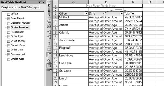 2.1.4. Working with Rows and ColumnsTo check the mix of order types in the offices, start by right-clicking on the average order amount and selecting Hide from the menu of table options. This removes the item from the table. Then drag the Order Type item into the column area as shown in Figure 2-13. Figure 2-12. Checking for a link between the averages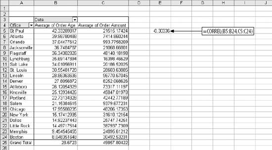 Figure 2-13. Putting data into the column area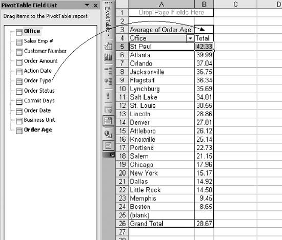 This gives a breakdown by both city and order type. The display is too large to fit in the window on my computer so I used the format menu to show only to two decimal places and auto fit the column widths. Adjusting column widths in pivot tables is almost a waste of time because the pivot table feature resets widths when you make changes to the table. This results in the worksheet displayed in Figure 2-14. Figure 2-14. A table with both city and order type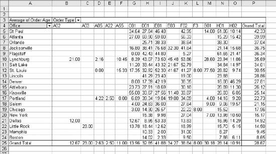 This demonstrates the real power of the pivot table tool. In seconds I could change this table to look at sales employee numbers, or switch from average order age to average order amount. We can see in row 25 that there is a difference in age by order type. We can also see the performance differences between the fastest and slowest offices are across the board. 2.1.5. Adding a PivotChartTo highlight the difference between the best and worst performers, I remove all but the two fastest and two slowest offices using the filtering technique shown in Figure 2-8. This results in Figure 2-15 and lets me create a chart to compare the best and worst side by side. This creates a pivot chart linked to the pivot table. The pivot chart has the field list and pivot menu. It also has all the functionality of the pivot table, as shown in Figure 2-16. I have the same drag and drop capability on the chart as on the table. If I want to switch from Office to Business Unit, I can drag Office off the chart (it is at the bottom) and replace it with Business Unit. If I make that change on the chart, it is also made on the table, since they are linked. Figure 2-15. Adding a PivotChart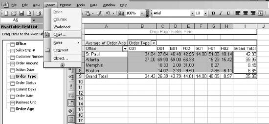 Figure 2-16. The pivot chart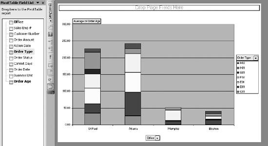 Here we see clearly that Memphis and Boston (the best performers) are better than the slower cites for all the order types. The pivot chart has all the power of a normal Excel chart and I can change the chart type by right-clicking in the plot area and selecting a different chart type. I changed to a 100% stacked column chart to look at the order type mix. Then I clicked on the Average of Order Age button just above the plot area on the left and changed from average to count. The result is shown in Figure 2-17. This chart lets us see how the mix of work differs. When we changed from Average to Count, the pivot table changed automatically. The sort option is enabled on the table so now it is sorting on Count not Average. This changes the order of the cities on the chart. Figure 2-17. Comparing the order type mix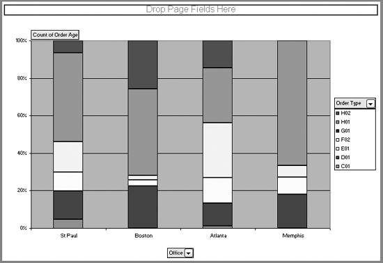 2.1.6. Multiple Layers and PagesPivot tables and charts can have multiple layers. Suppose I want to see which customers take the longest for each city. I go to the table and start by taking the filter off City so they all show up on the table. Then I drag Order Type back to the field list and drag Customer Number to the row area as shown in Figure 2-18. It is important to drag Customer Number to the right side of cell A4. If it is dropped on the left side of A4, Excel tries to arrange cities by customer, which makes no sense. I then use the pivot table menu and select Sort and Top 10. I fill out the sort options as shown in Figure 2-19. I indicate a descending sort on Average of Order Age, with only the top 5 items showing. The results are shown in the table in Figure 2-20. Next I want to be able to see this information by order type. I drag Order Type to the page area at the top of the display, as in Figure 2-21. This creates an interactive display allowing the user to select any Order Type (or all) and see the results in the table immediately. You could drag Customer Number back to the field area and replace it with Sales Emp # or Commit Days to create different views of the data. Figure 2-18. Change to a customer-based approach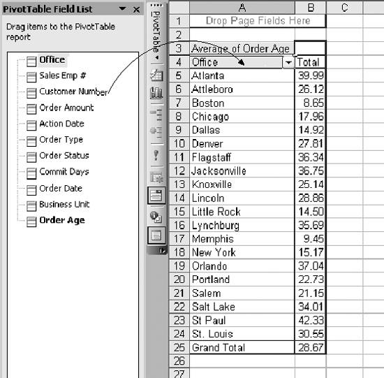 Figure 2-19. Sort and Top 10 options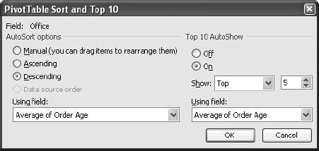 2.1.7. Drilling DownPivot tables have a built-in drill down feature. Suppose we need to see the details for one of the rows in the report from Figure 2-21. The third row for the St. Paul office is customer 160645, and their average order age is 118 days. To see the detail, I double click on the number 118 as shown in Figure 2-22. Figure 2-20. The top five customers by city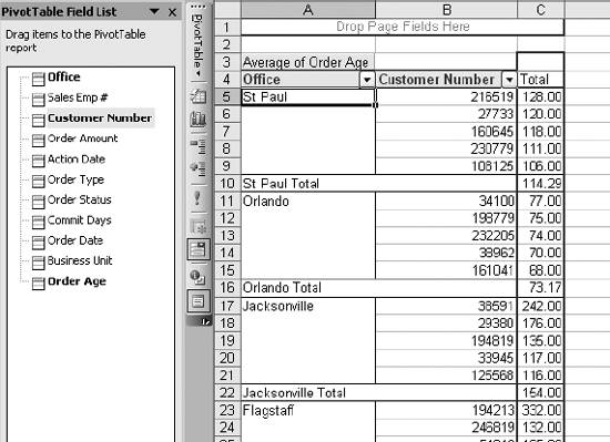 This adds a new sheet to my workbook containing the orders for this customer. The result is in Figure 2-23. Each time you drill down, you will get a new sheet. So, it is important to delete the new sheet when you finish using it. Features like these make pivot tables ideal for analysis, but they are also a great way to present information in cases where users need flexibility and don't mind interacting with the application. |
 Pivot Table PivotChart Report menu option. This starts the pivot table wizard and brings up the dialog in Figure 2-2.
EAN: 2147483647
Pages: 101