Adding a Control to the Toolbox
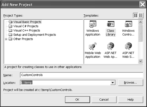
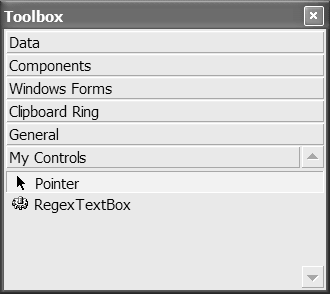
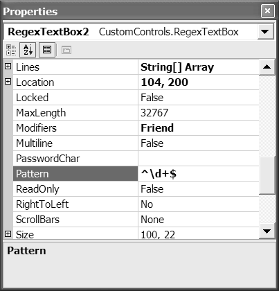
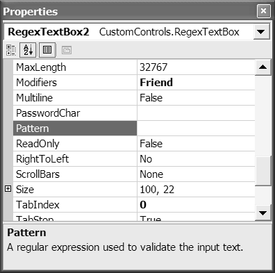
| If you define your control in a separate class library project, you can use the ToolsCustomize Toolbox menu item to add the controls in that class library to the Toolbox. (You can also create a merge module project that will automate the process for you and ease sharing your control among other developers. We'll look at the manual process for now.) Continuing with our RegexTextBox control, we have tested the control and found it to work to our satisfaction. We can add a class library project (select FileAdd ProjectNew Project) from the Add New Project dialog. Let's name the class library project CustomControls as shown in Figure 9.2. To complete the process of building the class library, we delete the basic class1.vb file added by the template; drag and drop the RegexTextBox.vb source file from the Windows Forms demo program to the CustomControls.vbproj file (using the Solution Explorer); and build the class library project. When following along with this example, you may need to make some adjustments to the class library project and control source code. For example, I needed to add the System.Windows.Forms.dll assembly to the CustomControls.vbproj references list and the complete namespace System.Windows.Forms to the Inherits statement in the RegexTextBox source code file (see Listing 9.3). Figure 9.2. Adding a class library project from the Add New Project dialog. To add the RegexTextBox control to the Toolbox, add a tab named My Controls by selecting Add Tab from the Toolbox's context menu. With the My Controls tab selected, select Customize Toolbox from the context menu, pick the .NET Framework Components tab of the Customize Toolbox menu, and click the Browse button. Browse to the CustomControls.dll assembly and click Open . You will see the name RegexTextBox appear in the name column of the Customize Toolbox dialog. Click OK to complete the operation. The new custom control is shown in the Toolbox in Figure 9.3. Figure 9.3. The RegexTextBox control shown on the My Controls tab of the Toolbox. You can now drag and drop the control from the Toolbox onto a form as you would any other control. The Form Designer will add a reference to the CustomControls.dll assembly and add the control to the form. You can test the control again to make sure it is working correctly with no undesirable side effects. For example, you can add a regular expression to the Pattern property (shown in Figure 9.4) and make sure the pattern validation works as planned. Figure 9.4. The RegexTextBox Pattern property shown in the Properties window. Associating a Bitmap with Your ControlBorland's VCL source code and the high quality of that framework helped to enhance a cottage industry of component makers . Perhaps one of the best-known component creators is Ray Knopka. Ray implemented Raize Tools and perhaps helped set an expected standard for components in the industry. In addition to the components solving the purported problem, Ray created clever design tools, and the components integrated in such a way as to appear to belong to the VCL. Visual Studio .NET offers tremendous support for third parties to build integrated, professional, custom components and controls. An expected level of support is the ability to use a custom bitmap with your control. I describe here this first taste of custom control fit and finish.
It makes sense to think of a component's bitmap as extra information or metadata. For this reason you use attributes specifically , the ToolboxBitmapAttribute to associate a bitmap with a custom component. If you apply the ToolboxBitmapAttribute to the component class, initializing the attribute with the path to a bitmap, that bitmap will be displayed in conjunction with the control in the Toolbox. A nice feature of .NET (if you are artistically inclined) is that you can actually draw the bitmap in the IDE and make it part of your project. Follow the numbered steps on the next page to create a bitmap and associate it with your custom control.
When you are finished you should see the custom control with the associated bitmap next to it. If you see the default cog symbol, something went wrong. Double-check to make sure you correctly followed the steps in the numbered list and try again. There are several articles on associating a bitmap with a custom control. I tend to experiment to see what is true and what I can get away with. I was able to change the bitmap to 48 x 48 pixels and 256 colors even though the recommended specifications are 16 x 16 pixels and 16 colors. Using more pixels and colors provided me with a finer degree of control over creating the bitmap image, but creating cool icon- sized bitmaps requires more artistic talent than I have. If you do choose to deviate from the recommended specifications for Toolbox bitmapsor any general recommendationskeep in mind that you may be causing a subtle bug in your programs. Document what you did carefully , permitting someone else to fall back to recommended practices. Adding Documentation to the ToolboxThe Properties window displays a description at the bottom of the window for each property. You can provide a description of your custom control's properties with the DescriptionAttribute . Defined in the System.ComponentModel namespace , this attribute can be applied as demonstrated in Listing 9.5. (The result of the DescriptionAttribute from Listing 9.5 is shown in Figure 9.7.) Listing 9.5 An Excerpt from RegexTextBox Demonstrating Use of DescriptionAttribute<Description( _ "A regular expression used to validate the input text.")> _ Public Property Pattern() As String Get Return FPattern End Get Set(ByVal Value As String) FPattern = Value End Set End Property Figure 9.7. The DescriptionAttribute affects the display of a description of the Pattern property in the Properties window. All the examples in this section can be found in RegexTextBox.sln , which contains CustomControls.vbproj and RegexTextBox.vbproj . We'll come back to more enhanced custom control capabilities after a brief detour . Let's look at creating custom user controls. |
EAN: 2147483647
Pages: 215