Workshop Chapter 7. Adapting Built-In Components
 | CONTENTS |  |
- Populating Components
- Editing Scripts in Components
- Skinning a Component
By now you should have enough skill to create your own components. First of all, they don't need to be complex. Even if you do need to invest a lot of work to create a component, as we did in Workshop Chapter 2, "Creating Custom Cursors," you can often reuse the code so many times that you'll quickly see a return on your investment. Just because you can make a component, however, doesn't mean that you have to reinvent the wheel.
Flash MX comes with several components, and countless others are available from the Flash community at the Macromedia Exchange for Flash (www.macromedia.com/exchange/flash). Most of these preexisting components can be used as-is. However, you'll often find that you need to adapt them for your own purposes. If nothing else, you'll always need to populate the component with your own data. For example, the preinstalled ComboBox component (in the Components panel under "Flash UI Components") appears blank until you populate it with items. It's similarly easy to specify a function you want triggered every time the user makes a selection from this component. In this workshop chapter, we'll quickly walk through how to populate this component.
Sometimes just populating the component might not be enough. You might want to change the way it works. For example, the ComboBox component triggers the function you specify every time a selection is made maybe you want the function to trigger only when the user selects a new item (that is, you don't want anything to happen when she reselects the same item). For this adjustment, you just modify how your function works. Other times, however, you'll need to snoop through the component's scripts to see if you can make a change. In this workshop chapter, we'll make a few fine-tune adjustments to some of the newer components to make them drag smoother.
Finally, perhaps the most fundamental way to edit a component is by replacing skins. A skin is the set of graphics used in the component (not your content). Think of a skin as a set of colors and graphics. For example, we'll change the appearance of the little down arrow that appears in the ComboBox component. I suppose "skinning" a component is less drastic than changing its scripts but it looks like you've made a bigger change. In any event, we'll do all three things: populating components, editing their scripts, and skinning.
Populating Components
-
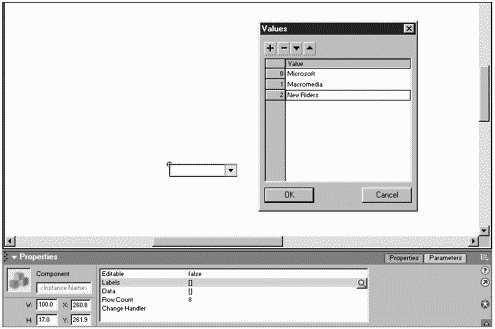
First, let's populate a ComboBox component. (We can skin it later.) From the Components panel, drag an instance of the ComboBox component onto the Stage. From the Parameters tab in the Properties panel, click to enter values into the Labels parameter. Click the plus button and enter three values such as "Macromedia,""Microsoft," and "New Riders" (see Figure W7.1).
Figure W7.1. Parameters that contain multiple values are populated through this dialog box.
-
Next, populate the Data parameter with three URLs to match the three items entered as labels (for example, http://www.macromedia.com, http://www.microsoft.com, and http://www.newriders.com).
-
Finally, specify the Change Handler to read jumpTime. We'll have to also write this function. (Some programming tools use the term "handler" to mean "function.") Anyway, in the first frame of the main timeline, type this jumpTime() function:
function jumpTime(who){ trace(who.getValue()); }If you test the movie, you'll see the URL any time an item is selected from the ComboBox component. Even though we didn't specify a parameter for the jumpTime() function, this component automatically passes a reference to the component that triggers the function. That's nice in this case because we won't have to name the instance. If you had several ComboBox instances on the Stage, you'd probably want to know which one triggered the function (instead of, perhaps, making a different function for each one). Anyway, I found the getValue() method under FlashUIComponents, FComboBox in the Actions panel. It returns the currently selected value (not just item number).
Obviously, you could change the trace statement to do a getURL (for example, getURL(who.getValue())). Before you do that, I'll just show a solution to making this ComboBox component trigger only when the user changes the selected item.
-
To modify the way the ComboBox component works, we won't really change the component but rather how our function responds to it. Check out this finished version of the jumpTime() function:
function jumpTime(who){ if (lastTime==who.getSelectedIndex()){ return; } lastTime=who.getSelectedIndex(); getURL(who.getValue()) }Now you can't navigate to the same place twice in a row. For example, if the user makes a selection, and then selects the menu and decides not to change anything, it won't take them anywhere (the way it did before). The code stores the last selected item number in the lastTime variable. Then, every time this function is triggered, we first check to see whether the current selected index (using another ComboBox method, getSelectedIndex()) is the same; if it is, we return and skip the rest of the code. This is just one solution. We'll come back to this ComboBox component to add a new skin. Now let's go and tweak the code in some of the other components.
To follow the next section, you need to download and install the Extension Manager and the Flash UI Components Set 2. You can find them both at www.macromedia.com/exchange/flash.
Editing Scripts in Components
The Flash UI Components Set 2 came out only days after Flash MX was released, and they're pretty sweet. For example, the DraggablePane component is similar to the ScrollPane component that is installed with Flash MX. Both these components enable you to identify a symbol (by its linkage "identifier") and it automatically appears inside a scrollable window. This is great for when an image is larger than the space you want to allot to it. The DraggablePane component adds features for dragging, resizing, and collapsing. However, those extra features seem to be a tad sluggish, especially when your movie's framerate is low. Let me walk you through how to adjust this component not as a way to "dis" an otherwise great component, but to practice our bug-finding skills.
-
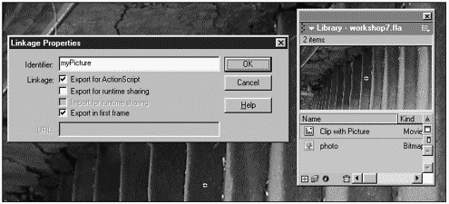
Import a photograph or draw a large graphic. Convert it into a Movie Clip symbol. Access the Linkage settings for the Movie Clip you just created (from the Library's options menu). Click the Export for ActionScript option and set the Identifier to read myPicture (see Figure W7.2). You can trash any clips or photos on the Stage. (They're both safe in the Library.)
Figure W7.2. You need to set a linkage identifier for clips used with the DraggablePane component
-
Drag a DraggablePane component onto the stage. You might need to change the currently visible set of components (to view "Flash UI Components Set 2") by clicking the little arrow inside the Components panel. With the instance on the Stage selected, use the Parameters tab of the Properties panel to specify a value for Scroll Content that is, make it read myPicture.
-
Set the movie's frame rate to 3 fps, and then select Control, Test Movie. You should notice that whereas scrolling the image is very snappy, dragging and resizing it (from the bottom-right corner of the window) is very sluggish. We can try to fix this.
Back in Flash, we'll need to snoop through the code in the component. Even if we mess up, the original component won't be affected (just the one in this movie). Anyway, there's a ton of code, so let me walk you through the way I found to fix these issues.
-
Because you can't just double-click a component instance, you have to select it and then choose Edit, Edit In Place. Nearly all the code for this component is in the first layer: "Actions : Class." Even though there are nearly 700 lines of code, we can get to what we want very quickly by using the Find button. I know that scripts that include the ActionScript fragments _xmouse, mouseMove, or startDrag likely affect dragging. Select the first frame and then open the Actions panel. Click the Find button and search for mouseMove. The first instance I found was on line 494. This is line 494:
this.onMouseMove = this.controller.dragResizeCursor;
We don't have to know everything this says except that we're assigning a callback for the onMouseMove event namely, the function called dragResizeCursor. We'll find dragResizeCursor defined on line 502. (It's so close, you don't have to search for it.)
-
The key problem with the definition of dragResizeCursor is that there's no updateAfterEvent() script. Insert a line of code before the closing curly brace (in line 506) that reads:
updateAfterEvent();
When you test the movie, the resizing feature should be very smooth despite having a low frame rate. (That was an easy fix.)
-
Now to fix the dragging issue. If you continue to search for likely drag-related-scripts, you'll find that startDrag appears around line 561. This is an older Flash feature. Just replace the line of code (this.controller.startDrag()) with the following:
this.controller.onMouseMove=function(){ this._x=_root._xmouse; this._y=_root._ymouse; updateAfterEvent(); }Notice that right after what you see here, there should be a closing curly brace (for the titleTrackBegin definition of which we are currently inside). Also, there are two lines of code that appear above what I just told you to insert. You're just replacing the one startDrag() line of code. Notice that we didn't say this.onMouseMove; we said this.controller.onMouseMove because the line we replaced said this.controller.startDrag.
-
A few lines after where startDrag() used to be, you'll find the stopDrag() command. (It's in the titleTrackEnd definition.) Replace that line with the following:
this.controller.onMouseMove=null;
This stops our code from functioning (at the same instance that the old stopDrag() was doing its thing).
If you test the movie now, you'll see that it's much smoother although it looks as though you're always dragging from the top-left corner. That's because the center of the component is that top-left corner and our code says to position the _x and _y to where the mouse is meaning the "center" of the clip goes to where the mouse is. We need something here like the extra touch we did in Workshop Chapter 3, "Creating a Horizontal Slider."
-
To use an offset, change the two lines that set the _x and _y (in the code that replaced the startDrag() code) so that those lines appear as follows:
this._x=_root._xmouse+this.offsetX; this._y=_root._ymouse+this.offSetY;
This just says "move to where the mouse is plus the offset variables" (that we're about to define).
-
To assign the values for our offset variables, add the following code anywhere in this frame script (except inside another function):
FDraggablePaneClass.prototype.onMouseDown=function(){ this.offsetX=this._x-_root._xmouse; this.offsetY=this._y-_root._ymouse; }Put simply, when the user clicks, this script figures out how far off center the mouse is and stores that information in the two variables (offsetX and offsetY).
Test it out. It works pretty well. One thing you probably want to do is test to see that the changes we made didn't break anything else. By the way, you might try your hand at fixing the same issue in the MessageBox component; the fix is nearly the same as what we just did.
Generally, you won't need to change the code in a component; I just thought it would be good practice. Skinning a component makes a much more visually striking change (provided that the component creator made it "skin-able"). In the most basic sense, skinning is nothing more than replacing the contents of various clips used in the component. It's just that there are a few details worth understanding. Let's walk through how to make a few graphic and color changes to a simple component.
Skinning a Component
-
Drag a few instances of the PushButton component and one ComboBox component into a new movie. Populate the ComboBox component with a few labels (like you did in the first part of this workshop chapter). Test the movie. You should see the default _sans typeface.
-
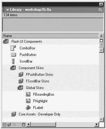
You can change the font choice for all components in just one move. Open the Library window and notice the folder structure shown in Figure W7.3. Navigate to the Component Skins folder and then to the Global Skins folder, and finally double-click to edit the FLabel symbol.
Figure W7.3. All the skins for components that ship with Flash are contained in a single folder.
-
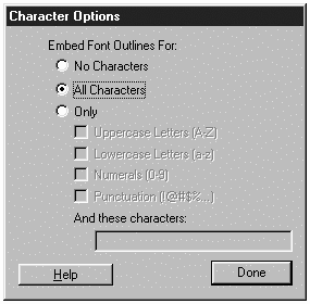
Once inside the FLabel symbol, unlock the layers and select the text field on the Stage. Use the Properties panel to select a different font and font size. Test the movie again. Depending on the font choice, you might want to return to the FLabel symbol and click the Character button so that you can select to Embed Font Outlines for All Characters (see Figure W7.4).
Figure W7.4. Embedding all characters with a text field will often make the text appear clearer (although this also adds to the filesize).
Although we changed only the font, you can also change any graphic element in the component. For example, in the FPushButton Skins Library folder you'll find a symbol called fpb_up. That's basically the button in its Up state. Replacing graphical elements in components can be tedious because there are often skin elements. The PushButton component has five separate skin elements (independent instances within the component).
Because skinning a component can be a bit of work, you certainly don't want to do it for every movie. However, once you complete one component "makeover," you can save it to use later. In the remaining steps, I'll show you how to save the modified PushButton component.
-
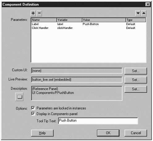
To make components available to other movies, you need to confirm two things: that the source .fla is saved in Flash's Configuration folder and that the component is set to display in the Components panel. Select the PushButton component symbol in the Library of your working file. (It should be in a folder called Flash UI Components.) Select Component Definition from the Library options menu and verify that the Display in Components panel check box is selected (see Figure W7.5).
Figure W7.5. Before a component will appear in the Components panel, you must select the Display in Components panel option in the Component Definition dialog box.
-
Next we need to save a copy of our working file inside Flash's Configuration folder. This folder's location varies based on your operating system. You can find the exact location in the readme.html file located in the Configuration folder adjacent to your installed version of Flash MX. On Windows 98, for example, you'll find the Configuration folder inside C:\WINDOWS\Application Data\Macromedia\Flash MX\. Inside the Configuration folder are several subfolders, including the Components folder. It is into this folder that you should save the working file containing the modified component. Save the file as myComponents.fla.
-
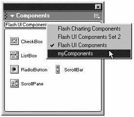
Quit Flash and restart the program to implement the changes (that is, so that the component will appear in the Components panel). Now, you'll find an additional sub-menu item in the Components panel based on the filename you provided in Step 5 (see Figure W7.6).
Figure W7.6. Components that you add to Flash's Configuration folder appear in the Components panel.
//After you save a .fla file inside the Components folder (inside the Configuration folder), you will not be able to edit it from Flash. If you need to make an edit, just copy the folder to another location, make the edit, and then return it to the Components folder. |
The intention of this workshop chapter was not to show you the "ultimate" component; rather, the purpose was to show you some of the ways that you can modify existing components. You should also have learned some ways to analyze the work of others. In particular, the hundreds of lines of code in the DraggablePane component are not that terrible if you study only a part at a time. Actually, looking through all the components is a great way to learn. Not only do they show some fancy class inheritance (introduced in Chapter 13, "Homemade Objects," and Chapter 14, "Extending ActionScript"), they exhibit elements of good programming style (as discussed in Chapter 3, "The Programmer's Approach").
| | CONTENTS | |
- Structures, Processes and Relational Mechanisms for IT Governance
- Linking the IT Balanced Scorecard to the Business Objectives at a Major Canadian Financial Group
- Technical Issues Related to IT Governance Tactics: Product Metrics, Measurements and Process Control
- The Evolution of IT Governance at NB Power
- Governance Structures for IT in the Health Care Industry