COLOR COMBINATIONS AFFECT SIZE AND PROPORTION
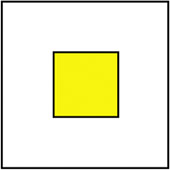
| One thing to keep in mind when choosing color combinations is how different colors, and the balance between the colors themselves, affect how we perceive them. For example: Take a yellow square and place it over a white background. Now, take the same size square and place it over a black background. The square on the black background will appear to be smaller, even though the squares are exactly the same size. It's just how we perceive the color combination together. Remember that darker colors tend to look heavier and may overpower lighter colors. Along the same lines, when you place white text or reverse text over a black background, the text appears bold. It's one of those funky eyes-playing-tricks-on-you sort of things.
|

The Digital Photography Book
ISBN: 735713561
EAN: 2147483647
EAN: 2147483647
Year: 2006
Pages: 429
Pages: 429
Authors: Scott Kelby