7.4 Custom Component Designers
| Type converters and custom UI editors enable us to provide specialized editing facilities for custom property types. But what if we are writing controls and want to be able to customize the way they are presented on forms? Visual Studio .NET even lets us provide custom editing facilities for controls hosted in the forms designer, by writing a custom designer . A custom designer is a class that derives from ComponentDesigner (which is defined in the System.ComponentModel.Design namespace). Designers for nonvisual components derive directly from this class, but control designers derive from one of the two ControlDesigner classes. (The System.Windows.Forms.Design and System.Web.UI.Design namespaces each have a ControlDesigner class. These are used for Windows Forms and Web Forms designers, respectively.)
Whether for Web Forms Controls, Windows Forms Controls, or plain components, designer classes have certain commonalities. They are associated with their components by applying the Designer attribute (in the System.ComponentModel namespace) to the component class. And although most of the integration features are specific to either Windows Forms or Web Forms, all designer classes can add extra menu items to the Visual Studio .NET context menu. 7.4.1 Adding Menu VerbsTo add extra items to the context menu for a component in the forms designer, we must override the associated designer class's Verbs property. This property is of type DesignerVerbCollection , which is defined in the System.ComponentModel.Design namespace. Example 7-15 shows a control designer with an example Verbs property. Example 7-15. Adding custom menu verbs public class MyComponentDesigner : ComponentDesigner { public override DesignerVerbCollection Verbs { get { DesignerVerb[ ] verbs = new DesignerVerb[ ] { new DesignerVerb("Add Widget", new EventHandler(OnAddWidget)), new DesignerVerb("Remove Widget", new EventHandler(OnRemoveWidget)) }; return new DesignerVerbCollection(verbs); } } private void OnAddWidget (object sender, EventArgs e) { MyComponent ctl = (MyComponent) this.Component; . . . } private void OnRemoveWidget(object sender, EventArgs e) { MyComponent ctl = (MyComponent) this.Component; . . . } } The easiest way to build a DesignerVerbsCollection is to construct one from an array of DesignerVerb objects. Each DesignerVerb is relatively simpleit simply needs the text that will appear on the menu and a delegate referring to the event handler that should be called when the relevant menu item is clicked. So when you right-click on an item with this custom designer, Visual Studio .NET will show a context menu with extra Add Widget and Remove Widget menu items, as Figure 7-9 shows. It will call our OnAddWidget or OnRemoveWidget method, respectively, when these menu items are selected. (The component being edited can be retrieved from the ComponentDesigner base class property Component , as Example 7-15 shows.) Figure 7-9. Visual Studio .NET context menu with custom items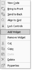 Any menu verbs added like this will also appear in the property grid. Visual Studio .NET adds an extra panel to the grid and shows verbs there using a hyperlink style (a blue, underlined word), as Figure 7-10 shows. Figure 7-10. Custom verbs in the property grid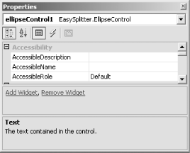 7.4.2 Windows Forms Control DesignersWindows Forms custom control designers are essentially specialized component designers. They can provide extra menu items, just like a normal component designer. They can also modify how resizing and positioning are handled, paint adornments (such as extra handles) on your control, and manage mouse clicks in the Visual Studio .NET Windows Forms designer. Example 7-16 shows a control with a custom designer, specified with the Designer attribute. The designer class itself must derive from the ControlDesigner class. ( ControlDesigner itself derives from ComponentDesigner .) We choose which methods to override in the designer class based on which aspects of the control's design-time functionality we would like to customize. Example 7-16. A Windows Forms control with a custom designer [Designer(typeof(MyControlDesigner))] public class MyControl : System.Windows.Forms.Control { . . . } 7.4.2.1 Resizing and movingThe forms designer will automatically provide all controls with an outline allowing them to be moved and resized. However, this is not always appropriatesome controls need to have a fixed size . (For example, the TabPage control's size and position are always determined by its parent TabControl .) Visual Studio .NET therefore lets us specify whether our control should be movable and which edges should be resizable. We simply override the SelectionRules property in our designer class, returning the required combination of bits from the SelectionRules enumeration (defined in the System.Windows.Forms.Design namespace). Example 7-17 specifies SelectionRules.Visible , meaning that the resize/move outline should be displayed; it also indicates that the lefthand side of the outline should be resizable, with SelectionRules.LeftSizeable . (So, this particular control will not be vertically resizable. It cannot be moved eitheryou must specify SelectionRules.Moveable to enable that.) The default implementation of SelectionRules returns SelectionRules.AllSizable SelectionRules.Moveable SelectionRules.Visible . Example 7-17. Modifying support for moving and resizing public override SelectionRules SelectionRules { get { return SelectionRules.Visible SelectionRules.LeftSizeable; } } Figure 7-11 shows how the control with the designer class in Example 7-17 will look in the forms designer. Notice that all of the resize handles are gray, with the exception of the one halfway up the lefthand side, which is white. (Visual Studio .NET also uses the mouse cursor to indicate which edges can be resized. In this example, a resize cursor will appear only when the mouse is over the handle halfway up the lefthand side.) Resizing with all of the other handles has been disabled because we told Visual Studio .NET that the control cannot be moved, and only the lefthand side can be resized. VS.NET colors handles that cannot be moved gray. Figure 7-11. A control with one resizable edge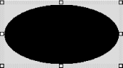 7.4.2.2 AdornmentsSometimes it is useful to add extra visual features to a control at design time, to allow developers to change properties visually. The outline and handles that Visual Studio .NET adds to controls to enable them to be moved and resized are an example of this. With a custom designer class, it is possible to add further such adornments of your own. We could simply modify our control's OnPaint method to draw adornments at design time. (It is possible to detect that a control is hosted in a designer by examining the Control class's DesignMode property.) However, adornments are normally drawn only when the control is selected, and it is hard to detect this in OnPaint . Moreover, to do this would defeat the ability to separate runtime and design-time facets into separate components. Fortunately, Visual Studio .NET gives us an opportunity to paint adornments in our designer class. It will call the OnPaintAdornments method when the control is selected. Example 7-18 illustrates the basic principle. Example 7-18. Drawing custom adornments protected override void OnPaintAdornments(PaintEventArgs pe) { pe.Graphics.DrawString("Hello", Control.Font, Brushes.Red, 0, 0); } The results are shown in Figure 7-12. Normally, you would draw an adornment that reflected some aspect of the component's control, of course. But as this example shows, you draw adornments in just the same way that you draw in a normal OnPaint methodsimply use the Graphics object supplied in the PaintEventArgs object. Figure 7-12. A custom adornment
Visual Studio .NET provides extra visual feedback for its adornmentswhenever the mouse moves over a grab handle or control outline, the mouse cursor changes. You can do the same thing for your adornments. If the mouse pointer is over your control, Visual Studio .NET will call your designer class's OnSetCursor method every time it moves. You can write code in here to detect whether the cursor is over any of your grab handles (or other adornments) and set the cursor. Just set the Cursor class's Current property. Unfortunately, OnSetCursor is not passed the cursor's current position, so you must retrieve that from the Cursor class and map the coordinates to your control's coordinate space, using the technique shown in Example 7-19. Example 7-19. Modifying the cursor protected override void OnSetCursor( ) { Point cp = Control.PointToClient(Cursor.Position); if (IsPointOverAnAdornment(cp)) { Cursor.Current = Cursors.SizeWE; } else base.OnSetCursor( ); } private bool IsPointOverAnAdornment(Point p) { . . . Do hit testing }
Most adornments are designed for clicking on and dragging. (Especially those drawn with ControlPaint.DrawGrabHandle .) You will, therefore, usually want to handle mouse input if you draw any adornments. 7.4.2.3 Handling mouse inputVisual Studio .NET will notify a designer class of certain types of mouse activity. It presumes that controls will typically be interested in drag operationsthe three methods it calls to indicate mouse activity are OnMouseDragBegin , OnMouseDragMove , and OnMouseDragEnd . Override these to be notified when the mouse button is first pressed, when the mouse moves while the button is pressed, and when the button is released, respectively. All three methods are passed the current mouse position as a pair of integers. However, despite what the documentation claims, these are screen coordinates, so, as with OnSetCursor , you must use Control.PointToClient to map them back into your control's coordinate space.
7.4.3 Example Windows Forms Control with DesignerThis section presents a complete example of a custom Windows Forms control with an associated designer class to illustrate all of the points raised in the previous section. The control is a directional label control. It is similar to the built-in Label class, except it allows text to be displayed at any angle. Figure 7-13 shows an application using this control. Figure 7-13. DirectionalLabel control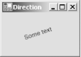 The source for the DirectionalLabel control is shown in Example 7-20. The structure of the class is fairly straightforward. It begins with a constructor. The OnPaint method followsthis contains the code that draws the rotated text. After the redraw code are two properties, Origin and Direction . These set the start position of the text and the direction in which it should be drawn. These properties have been annotated with the Category and Description attributes, to make sure that they are displayed correctly in the property grid. These properties also provide change notifications (through OnOriginChanged and OnDirectionChanged methods and associated events). Because the Origin and Direction properties use the Point and Size types, respectively, it is not possible to use the DefaultValue attribute. (Attributes must be initialized with constant values. Here, the default values are new Point(0,0) , and new Size(30,0) . You cannot construct an attribute with these values.) These properties, therefore, have corresponding ShouldSerialize methods. This enables Visual Studio .NET to know whether the properties currently have their default values or not despite the absence of the DefaultValue attribute. The control's appearance depends on several properties. As well as using the Origin and Direction properties, the redraw code in OnPaint uses the standard Text , Font , ForeColor , and BackColor properties. The control needs to be redrawn whenever any of these properties changes, so the control ends with a series of change handlers, all of which call Invalidate to redraw the control. Example 7-20 shows the source code for this control. Example 7-20. DirectionalLabel control class using System; using System.ComponentModel; using System.Drawing; using System.Drawing.Text; using System.Windows.Forms; [ToolboxBitmap(typeof(DirectionalLabel))] [Designer(typeof(DirectionalLabelDesigner))] public class DirectionalLabel : Control { public DirectionalLabel( ) { // Enable double-buffering -- reduces flicker when the // user adjusts the control in the designer. SetStyle(ControlStyles.AllPaintingInWmPaint ControlStyles.DoubleBuffer ControlStyles.UserPaint, true); } protected override void OnPaint(PaintEventArgs pe) { Graphics g = pe.Graphics; float angle = (float) (Math.Atan2(Direction.Height, Direction.Width) / Math.PI * 180.0); g.TranslateTransform(Origin.X, Origin.Y); g.RotateTransform(angle); g.TextRenderingHint = TextRenderingHint.AntiAlias; using (Brush b = new SolidBrush(ForeColor)) { g.DrawString(Text, Font, b, 0, 0); } base.OnPaint(pe); } [Category("Appearance")] [Description("The starting point (top left) of the label's text")] public Point Origin { get { return originVal; } set { if (value != originVal) { originVal = value; OnOriginChanged(EventArgs.Empty); } } } private Point originVal = new Point(0, 0); public event EventHandler OriginChanged; protected virtual void OnOriginChanged(EventArgs e) { if (OriginChanged != null) OriginChanged(this, e); Invalidate( ); } public bool ShouldSerializeOrigin( ) { return Origin != new Point(0, 0); } [Category("Appearance")] [Description("The direction in which the text will be drawn")] public Size Direction { get { return directionVal; } set { if (value != directionVal) { directionVal = value; OnDirectionChanged(EventArgs.Empty); } } } private Size directionVal = new Size(30, 0); public event EventHandler DirectionChanged; protected virtual void OnDirectionChanged(EventArgs e) { if (DirectionChanged != null) DirectionChanged(this, e); Invalidate( ); } public bool ShouldSerializeDirection( ) { return Direction != new Size(30, 0); } protected override void OnForeColorChanged(System.EventArgs e) { Invalidate( ); base.OnForeColorChanged(e); } protected override void OnBackColorChanged(System.EventArgs e) { Invalidate( ); base.OnBackColorChanged(e); } protected override void OnFontChanged(System.EventArgs e) { Invalidate( ); base.OnFontChanged(e); } protected override void OnTextChanged(System.EventArgs e) { Invalidate( ); base.OnTextChanged(e); } } The control has had the ToolboxBitmap attribute applied. This means that the custom embedded bitmap will be used when the control is displayed in a Visual Studio .NET toolbox. (You can add a control to a toolbox either by dragging the DLL from a Windows Explorer window onto the toolbox or by using the toolbox's customization menu option.) The control also has the Designer attribute, indicating that it has an associated designer class. The designer allows the position and direction of the text to be adjusted in the Visual Studio .NET Forms Editor using a pair of grab handles, as shown in Figure 7-14. These grab handles have an arrow drawn between them to make it clear in which direction the text will be displayed. Either grab handle can be moved with the mouse at design time. The designer class that supplies this editing facility, DirectionalLabelDesigner , is shown in Example 7-21. Figure 7-14. The DirectionalLabel at design time Example 7-21. The direction label control's designer class using System; using System.Drawing; using System.Drawing.Drawing2D; using System.Windows.Forms; using System.Windows.Forms.Design; using System.ComponentModel; using System.ComponentModel.Design; public class DirectionalLabelDesigner : ControlDesigner { public override void Initialize(IComponent component) { base.Initialize(component); selectionService = GetService(typeof(ISelectionService)) as ISelectionService; if (selectionService != null) { selectionService.SelectionChanged += new EventHandler(OnSelectionChanged); } } private ISelectionService selectionService; private void OnSelectionChanged(object sender, EventArgs e) { Control.Invalidate( ); } protected override void OnPaintAdornments(PaintEventArgs pe) { DirectionalLabel label = (DirectionalLabel) Control; if (selectionService != null) { if (selectionService.GetComponentSelected(label)) { // Paint grab handles. Graphics g = pe.Graphics; Rectangle handle = GetHandle(label.Origin); ControlPaint.DrawGrabHandle(g, handle, true, true); handle = GetHandle(label.Origin + label.Direction); ControlPaint.DrawGrabHandle(g, handle, true, true); // Paint a line with an arrow--this makes it // more clear which grab handle is which. // // The built-in line caps are a bit small, so we'll // draw our own arrow on the end. The easiest way // to do this is to translate and rotate the transform. float angle = (float) (Math.Atan2(label.Direction.Height, label.Direction.Width) / Math.PI * 180.0); g.TranslateTransform(label.Origin.X, label.Origin.Y); g.RotateTransform(angle); float distance = (float) Math.Sqrt( label.Direction.Width * label.Direction.Width + label.Direction.Height * label.Direction.Height); g.SmoothingMode = SmoothingMode.AntiAlias; using (Pen p = new Pen(Color.Blue)) { g.DrawLine(p, 0, 0, distance, 0); g.DrawLine(p, distance, 0, distance - 5, -4); g.DrawLine(p, distance, 0, distance - 5, 4); } } } } // Get a standard-sized grab handle rectangle centered on // the specified point. private Rectangle GetHandle(Point pt) { Rectangle handle = new Rectangle(pt, new Size(7, 7)); handle.Offset(-3, -3); return handle; } protected override void OnSetCursor( ) { // Get mouse cursor position relative to // the control's coordinate space. DirectionalLabel label = (DirectionalLabel) Control; Point p = label.PointToClient(Cursor.Position); // Display a resize cursor if the mouse is // over a grab handle; otherwise show a // normal arrow. if (GetHandle(label.Origin).Contains(p) GetHandle(label.Origin + label.Direction).Contains(p)) { Cursor.Current = Cursors.SizeAll; } else { Cursor.Current = Cursors.Default; } } // Drag handling state and methods. private bool dragging = false; private bool dragDirection; private Point dragOffset; protected override void OnMouseDragBegin(int x, int y) { DirectionalLabel label = (DirectionalLabel) Control; Point p = label.PointToClient(new Point(x, y)); bool overOrigin = GetHandle(label.Origin).Contains(p); bool overDirection = GetHandle(label.Origin + label.Direction).Contains(p); if (overOrigin overDirection) { dragging = true; dragDirection = overDirection; Point current = dragDirection ? (label.Origin + label.Direction) : label.Origin; dragOffset = current - new Size(p); } else { dragging = false; base.OnMouseDragBegin(x, y); } } protected override void OnMouseDragMove(int x, int y) { if (dragging) { DirectionalLabel label = (DirectionalLabel) Control; Point p = label.PointToClient(new Point(x, y)); Point current = p + new Size(dragOffset); if (dragDirection) { label.Direction = new Size(current) - new Size(label.Origin); } else { label.Origin = current; } } else { base.OnMouseDragMove(x, y); } } protected override void OnMouseDragEnd(bool cancel) { if (dragging) { // Update property via PropertyDescriptor to // make sure that VS.NET notices. DirectionalLabel label = (DirectionalLabel) Control; if (dragDirection) { Size d = label.Direction; PropertyDescriptor pd = TypeDescriptor.GetProperties(label)["Direction"]; pd.SetValue(label, d); } else { Point o = label.Origin; PropertyDescriptor pd = TypeDescriptor.GetProperties(label)["Origin"]; pd.SetValue(label, o); } dragging = false; } // Always call base class. base.OnMouseDragEnd(cancel); } } The grab handle and line adornments are drawn only when the control is selected, so the class starts with code that causes the control to be redrawn each time a selection change event occurs. This is followed by the OnPaintAdornments method, which renders the grab handles and the line. The remaining code handles mouse input. OnSetCursor is used to display the resize cursor whenever the mouse is over one of the grab handles. The remaining three methods update the appropriate properties when a drag operation occurs. The only surprising code here is the use of the PropertyDescriptor class in OnMouseDragEnd . Without this code in place, Visual Studio .NET does not notice when a drag operation causes a control's property to change. However, if we update the property through a PropertyDescriptor , it will detect the change and save the modified property in the form's InitializeComponent method. 7.4.4 Web Forms Control DesignersA Web Forms Control custom designer is a class derived from the ControlDesigner class defined in the System.Web.UI.Design namespace . This class derives from ComponentDesigner and inherits the standard designer features such as the ability to add extra context menu items. As Example 7-22 shows, a web control designer is associated with a control in exactly the same way as any other component designer. It can also control its resizability in the designer, and it can influence the way it appears in Visual Studio .NET's design-time HTML view. Example 7-22. A Web Forms control with a custom designer [Designer(typeof(MyControlDesigner))] public class MyControl : System.Web.UI.Control { . . . } 7.4.4.1 ResizingA Web Forms control has less power than a Windows Forms control over the way in which it can be resized. With Web Forms, it is a yes/no choicewe can override the AllowResize property and return a Boolean indicating whether we want the control to be resizable in the designer. 7.4.4.2 Design-time renderingWhen your control is hosted in the designer, Visual Studio .NET will create an instance of it and ask it to render itself in the normal way. This means that the control will look the same at design time as it does at runtime. Most of the time, this will be the behavior that you require. However, sometimes you will want to provide a different appearance at design time. For example, your control may not be visible at runtime, in which case it is useful to be able to make something appear in the designer so that developers can see and select your control. To modify the control's design-time appearance, override the GetDesignTimeHtml method in the designer class. This method returns a string, which should be HTML. Although you can return whatever you like here, the ControlDesigner class provides a protected method called CreatePlaceHolderDesignTimeHtml that will generate a placeholder for you. Example 7-23 shows how to use this. It just generates a gray box containing the specified text. Example 7-23. Providing design-time HTML public class WebControlDesigner : System.Web.UI.Design.ControlDesigner { public override string GetDesignTimeHtml( ) { return CreatePlaceHolderDesignTimeHtml("My control"); } } There is another popular use of the GetDesignTimeHtml method. Data-bound controls might be invisible unless they have some information to display. It is common practice for such controls to preload some fake data at design time so as to be visible. You can do this in the GetDesignTimeHtml method and then call the base class's implementation to get your control to render itself as usual. |

EAN: 2147483647
Pages: 147