Blooper 24: No Defaults
| < Day Day Up > |
Blooper 24: No Defaults
An important design principle for websites , Web applications, and software in general is that the less a user has to specify to get what he or she wants, the better (Johnson, 2000, Chapter 1). One specific implication of this principle is that choices in forms and control panels should have default values. The default values should be the most likely ones. This frees users from having to set everything explicitly. Instead, they can simply scan the settings, maybe change a few, and proceed.
Unfortunately, this important design principle is not widely known. Millions of websites and Web applications offer choices with no defaults or with defaults that are unlikely to be what users want.
At best, such choices force users to make explicit decisions and choices, consuming valuable time. Often, however, the result of missing defaults is that users overlook the settings, try to proceed, and then either get scolded for omitting required information (Figure 4.17) or end up with results they didn't want.
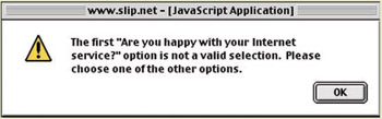
Figure 4.17: www.Slip.net (July 2001) ”Error message displayed when user submits form without changing a menu from its default value.
Reasons for Not Providing a Default
On the other hand, some choices offered by websites cannot offer a default value. There are two reasons why this might be so:
-
No useful default value. For example, a membership application form at an organization's website might have a menu for applicants to indicate their home state. If the organization is nationwide , such as the American Civil Liberties Union (ACLU), there probably is no basis for making any one of the fifty U.S. states the default. However, if the organization is local, such as the San Francisco chapter of the ACLU, it would make sense to make California the default state on the membership application.
-
Social, political, or legal requirement. In some situations, Web designers must try not to offend anyone by being presumptuous. Imagine the trouble a Canadian government website would be in if, in offering visitors a choice of English versus French, it defaulted the choice to English. It would be a faux pas, to say the least.
Despite these exceptions, most choice controls on websites should have default values. Let's look at some examples of websites that in one way or another failed to provide defaults for choices.
Radiobuttons with No Default
On the Web, one often sees radiobutton choices that start with none of the buttons selected.
Sometimes, this is simply a bug: the result of the radiobuttons having been defined incorrectly. Often, however, Web designers do this intentionally. They want to do one of the following:
-
Avoid any presumptions about what users will choose, as discussed previously
-
Force users to choose explicitly
-
Allow users not to choose (although this reason is much rarer than the first two)
The website of sporting goods retailer L.L. Bean provides examples, from two separate forms, of radiobuttons with no default value (Figure 4.18). In these cases, the lack of defaults makes sense. Defaulting either choice to one of its two values would be at least presumptuous, perhaps even illegal.
Figure 4.18: www.LLBean.com (Nov. 2000) ”Radiobuttons with no valid initial value, from two different forms at the site. In both cases, not having a default is justifiable, perhaps even required.
Although radiobuttons with no default value may be justifiable in rare cases, they are usually bad design. They violate users' expectations about how radiobuttons work. They violate the logical type of a radiobutton set: a one-from-N choice, not a zero-or-one-from-N choice. They are impossible to set back to their initial unset state. They violate the design guideline that in cases where no default makes sense, menus are preferable to radiobuttons (see later discussion). Finally, they violate the aforementioned interaction design principle about letting users do as little as possible to get what they want.
Therefore, designers should have a very compelling reason for presenting radiobuttons without a default value. Far too often, no such compelling reason exists.
Look, for example, at Agilent.com . The site provides a Feedback page where visitors can comment on the website. In submitting comments, visitors have to specify whether they do or do not want a response (Figure 4.19). I repeat: "have to specify." There is simply no good reason why this choice could not default to "No, a response is not necessary."
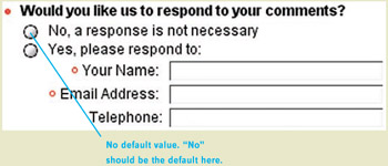
Figure 4.19: www.Agilent.com (Jan. 2002) ”Website comment form has radiobuttons with no default value. The "No" response should be the default in this case.
Menus with No Default
Drop-down menus with no initial value are even more common on the Web than radiobuttons with no initial value. Generally speaking, this is okay, for two reasons:
-
A menu with no value is not as unnatural as a radiobutton choice with no value. "No value" on radiobuttons means that it is set to none of its possible values. In contrast, "No value" on a menu is just one of the values in the menu, albeit a special value.
-
Menus are often used to present more options than radiobuttons can present. Radiobuttons are best for from two to about eight choices. [3] Menus can present dozens of options. The larger number of options ”such as in a menu for specifying one's state of residence ”makes it less likely that any of them would be a suitable default value.
Bolstering the commonness of menus with no initial value is a newly emerged Web-design idiom in which a menu's initial value is also its label or an instruction to users. For example, a menu to indicate your home state in the United States might be set to a prompt such as "Select State" or "State" (Figure 4.20[A]). This contrasts with the traditional menu design, in which a menu is set to a real value such as "Delaware," with an external label "State" (Figure 4.20[B]).
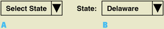
Figure 4.20: Contrasting menu designs. A ” Emerging Web menu design. B ” Traditional menu design.
This new way of designing menus is okay as long as Web designers follow these guidelines:
-
It should be used only for menus that have no useful default.
-
Menu labels ”including the initial value that serves as a prompt ”must be carefully worded to make clear what the choice is.
If these two guidelines are not followed, the result is either menus that needlessly force users to make explicit choices instead of letting them simply accept defaults, menus that users have to pull open even just to see what the choice is, or both. Sadly, these guidelines are often not followed. Considering the millions of menus on websites worldwide, multiplied by millions of Web users, mind-boggling amounts of Web-user time is being wasted .
A good example of a website that wastes customers' time by failing to provide defaults for menus is the Stanford University Bookstore. The Shopping Cart page has a menu with a long, confusing description and "Please choose" as its initial value (Figure 4.21[A]). The menu's purpose is to allow the store to substitute used books for new books or new books for used books depending on what is in stock. Its values are "yes" or "no." Because of the verbose instruction and the menu's position on the page, it is easy to ignore. However, you can't proceed until you set it (Figure 4.21[B]).
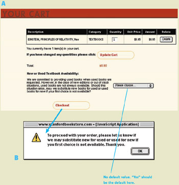
Figure 4.21: www.StanfordBookstore.com (Sept. 2002) ”Menu that should have a default value but doesn't. A ” Shopping cart page includes an easily missed menu with a long confusing description and no valid initial value. B ” Error message displayed if user clicks Checkout without setting "Please choose" menu to "yes" or "no."
A better design would (1) assign the choice control a default value that allows book substitutions, requiring customers to change the control to disallow them, and (2) make the control more prominent. In the following Avoiding the Blooper section, I offer an improved design.
At LLBean.com, an online sporting goods and clothing store, I found a more serious example of a menu lacking a valid default for no good reason. I was shopping for a backpacking tent. I found one I liked , looked at its product page (Figure 4.22), then clicked "Add to Shopping Cart." Instead of taking me to my shopping cart, the site displayed an error message: "We're sorry, more information is needed to order this item. Please complete Step 2 then continue your order." I clicked OK and went back to the product page. What had I missed? Step 2 included a Quantity field, which I had left set to the sensible default of 1, but it also included a Color /Style menu, which I had also left as it was.
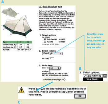
Figure 4.22: www.LLBean.com (Nov. 2000) ”Menu with no valid initial value. A ” The menu in step 2 is initialized to a label "Color/Style," not to a valid value. B ” This is true even though the product comes in only one color. (c) If customers try to proceed without setting the Color/Style menu, they get an error message.
Okay, so I had neglected to choose a color. I opened the menu and saw that the tent comes in only one color: Sea Grass.
Why didn't LLBean.com set the menu to "Sea Grass" by default? Because product pages are generated automatically from product databases, so they are designed generically rather than being carefully designed for each product. Different products have different options, so step 2 is generically labeled "Select options" rather than "Select Color." The menu choices are generated dynamically, with an initial value labeling the options for that product. This example shows that automatically generated pages, although they have economic advantages, have strong usability disadvantages, which can translate into economic disadvantages.
L.L. Bean's website also provides another instructive example. Recall the guideline: If menus are designed according to the new Web-design trend of having their initial value be a prompt, the labels ”including the prompt value ”must be carefully worded to make clear what the choice is. The menu on LLBean.com's credit card application follow the new trend, but the labels are vague: "select" (Figure 4.23). One menu is labeled "Are you:" Users have to open it to see what it sets. It could be about anything: Are you ... rich? Are you ... in prison ? Are you ... annoyed by poorly labeled menus?
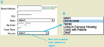
Figure 4.23: www.LLBean.com (Feb. 2002) ” A ” The second menu is labeled so vaguely, users have to open it B ” to see that it is asking the applicant 's type of residence.
Similarly, at Agilent.com , the lack of initial values in menus, combined with vague labels ”"Select" ”yields a confusing trio of menus. Do the three menus each represent a product, with product options on the menus, or does each menu represent a product category, with products on the menu? Customers can't tell. All three menus should have meaningful defaults (Figure 4.24).
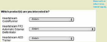
Figure 4.24: www.Agilent.com (Feb. 2001) ”Menus with no initial value and vague labels. Do the three menus represent three products, with product options on the menus, or do the they represent product categories, with products on the menus?
Avoiding the Blooper
In presenting and discussing examples of bloopers concerning defaults, I touched on most of the important design principles for avoiding such bloopers. I now summarize the principles.
Provide a Default Value If Possible
Make it as easy as possible for your site's users to accomplish their goals. One way to do that is to provide default values for as many data fields and choices as possible, so they can focus on just those they need to change.
A good example of providing a default comes from L.L. Bean's competitor, REI. The color choice shown in Figure 4.25 is similar to the previously discussed choice of tent color at LLBean.com , where no default is provided (Figure 4.22). Why does REI provide a default color while L.L. Bean does not? The relative popularity of the color options cannot be the reason, as L.L. Bean's tent is available in only one color. Perhaps REI's Web designers were more aware than L.L. Bean's of the value of good defaults.
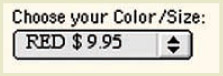
Figure 4.25: www.REI.com (Nov. 2000). ”Menu with default. Contrast with L.L. Bean tent example in Figure 4.23.
However, LLBean.com does provide defaults for some choices. For example, when asking for a phone number, the site asks whether the number is a home or business phone number, with "Home" as the default (Figure 4.26).
Figure 4.26: www.LLBean.com (Feb. 2002) ”Radiobuttons with default.
When "None Yet" Is an Important Option, Make It Explicit and Make It the Default
Some choices have to indicate that the user has not yet selected an option. In such cases, it is recommended to make "none" an explicit value and make it the default. A course-registration form on the website of the Usability Professionals Association includes such a choice (Figure 4.27).
Figure 4.27: www.UPAssoc.org (July 2001) ”Radiobuttons with default "none" value.
When No Default Can Be Assumed, Menus Are Better than Radiobuttons
Sometimes you can't provide a default value for a choice, for pragmatic or political reasons ”when asking the user's gender, for example. In such cases, it is better to use a menu than a radiobutton, because, as discussed previously, menus with no value are more natural than radiobuttons with no value. This means that in some cases, you will be using menus even though there are only a few options or even though there would be plenty of space on the page for radiobuttons.
Radiobuttons with no initial value should be avoided. At the very least, using them should require very strong justification.
Use the Web Menu Style Carefully
The new Web-design trend, in which menus contain their own prompt as a default value, works as long as Web designers follow the two design guidelines stated previously. For convenience, I provided them again here:
-
This type of menu should be used only for menus that have no useful default.
-
Menu labels ”including the initial value that serves as a prompt ”must be carefully worded to make clear what the choice is.
Some Binary Choices Are Better Expressed as Checkboxes
Menus and radiobuttons are not the only way to express choices. When a choice has two clearly opposite values, it can be represented by a checkbox. A checkbox is always either on or off, so it has a default value by definition.
Recall that the Stanford Bookstore's Shopping Cart page had a mandatory "yes/no" choice, presented in a menu initially set to the prompt "Please choose." Let's consider how a checkbox might be used to improve that design.
To improve that page, I would change several things. I would keep only the last sentence of the long instruction paragraph and make it the heading for the control. I would present the new/used substitution question as a checkbox, positioned prominently, with the simple label "Substitutions OK." The checkbox would be checked (on) by default (Figure 4.28).
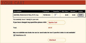
Figure 4.28: Improved design for StanfordBookstore.com ”Label drastically shortened . Substitution choice presented as Checkbox is defaulted to accept substitutions.
On the other hand, Web designers should be careful not to misuse checkboxes. Checkboxes should be used only for choices for which a particular attribute ”such as "italics" ”is on or off, true or false, present or absent. They should not be used for choices that have two values, such as alignment (left/right), gender (male/ female ), or color (black/white). (See Blooper 28: Checkboxes or Radiobuttons, in this chapter.)
[3] In special cases, carefully designed arrays of radiobuttons can be used to present more choices.
| < Day Day Up > |
EAN: 2147483647
Pages: 128
- Structures, Processes and Relational Mechanisms for IT Governance
- Measuring and Managing E-Business Initiatives Through the Balanced Scorecard
- A View on Knowledge Management: Utilizing a Balanced Scorecard Methodology for Analyzing Knowledge Metrics
- Managing IT Functions
- Governing Information Technology Through COBIT