Section 9.7. DetailsView Control: Examining One Record at a Time
Another way to look at your data is one record at a time. ASP.NET offers a control explicitly for this purpose: the DetailsView . This control allows you to edit, delete, and insert records.
The DetailsView control is derived from the BaseDataBoundControl class as is the GridView . As such it shares many of the same properties with GridView . Many of the commonly used properties of the DetailsView control that are not inherited from Control or WebControl are listed in Table 9-8.
Table 9-8. DetailsView properties not inherited from WebControl
| Property | Type | Get | Set | Values | Description |
|---|---|---|---|---|---|
| AllowPaging | Boolean | x | x | true , false | Specifies if paging is enabled. Default is false . |
| Alternating-RowStyle | TableItemStyle | x | Derived from the WebControls.Style class, the style properties for the alternate rows. | ||
| AutoGenerate-DeleteButton | Boolean | x | x | true , false | If true , a Delete button will be automatically added to each data row. The default is false . |
| AutoGenerate-EditButton | Boolean | x | x | true , false | If true , an Edit button will be automatically added to each data row. The default is false . |
| AutoGenerate-InsertButton | Boolean | x | x | TRue , false | If true , an Insert button will be automatically added to each data row. The default is false . |
| AutoGenerateRows | Boolean | x | x | true , false | If true , the default, automatically generated data-bound fields will be displayed. |
| BottomPagerRow | GridViewRow | x | Returns the bottom pager row as a DetailsViewRow object. | ||
| Caption | String | x | x | Text rendered to an HTML caption element. | |
| CaptionAlign | TableCaption-Align | x | x | Bottom , Left , NotSet , Right , Top | Specifies placement of the caption element. |
| CellPadding | Integer | x | x | Number of pixels between a cell 's contents and its border. | |
| CellSpacing | Integer | x | x | Number of pixels between the cells of the grid. | |
| CommandRowStyle | TableItemStyle | x | Derived from the WebControls.Style class, the style properties for a command row. | ||
| CurrentMode | DetailsView-Mode | x | Edit , Insert , ReadOnly | Returns the current edit mode of the control. Unless set otherwise with the DefaultMode property, the default is ReadOnly . | |
| DataItem | Object | x | Returns a reference to the current item displayed in the control. | ||
| DataItemCount | Integer | x | Returns the number of items in the data source. | ||
| DataItemIndex | Integer | x | x | Zero-based index of the current item in the data source. | |
| DataKey | DataKey | x | Returns the primary key of the current item. | ||
| DataKeyNames | String | x | x | An array of the primary key fields of the items. | |
| DataMember | String | x | x | Specifies the data member in a multimember data source. | |
| DataSource | Object | x | x | Specifies the data source for the control. | |
| DefaultMode | DetailsView-Mode | x | x | Edit , Insert , ReadOnly | The default edit mode of the control. The default is ReadOnly . |
| EditRowStyle | TableItemStyle | x | Derived from the WebControls.Style class, the style properties for the row currently selected for editing. | ||
| EmptyDataRowStyle | TableItemStyle | x | Derived from the WebControls.Style class, the style properties for an empty data row. | ||
| EmptyDataTemplate | ITemplate | x | x | User -defined content to render a row with no data. | |
| EmptyDataText | String | x | x | Text to display when control is bound to a data source with no records. | |
| EnablePaging-Callbacks | Boolean | x | x | TRue , false | If true , client-side callbacks will be used for paging. The default is false . |
| FieldHeaderStyle | TableItemStyle | x | Derived from the WebControls.Style class, the style properties for the field header section. | ||
| Fields | DataControl-FieldCollection | x | Returns a collection of all the fields in the control. | ||
| FooterRow | GridViewRow | x | Returns the footer row as a DetailsViewRow object. | ||
| FooterStyle | TableItemStyle | x | Derived from the WebControls.Style class, the style properties for the footer section. | ||
| FooterTemplate | ITemplate | x | x | User-defined content to render a footer row. | |
| FooterText | String | x | x | The text displayed in a footer row. | |
| GridLines | GridLines | x | x | Both , Horizontal , None , Vertical | Specifies which gridlines to display. The default is None . |
| HeaderRow | GridViewRow | x | Returns the header row as a DetailsViewRow object. | ||
| HeaderStyle | TableItemStyle | x | Derived from the WebControls.Style class, the style properties for the header section. | ||
| HeaderTemplate | ITemplate | x | x | User-defined content to render a header row. | |
| HeaderText | String | x | x | The text displayed in a header row. | |
| HorizontalAlign | HorizontalAlign | x | x | Center , Justify , Left, NotSet , Right | Specifies the horizontal alignment for items within containers, such as cells. Default is NotSet . |
| InsertRowStyle | TableItemStyle | x | Derived from the WebControls.Style class, the style properties for an insert row. | ||
| PageCount | Integer | x | Number of pages required to display the data. | ||
| PageIndex | Integer | x | x | Zero-based index of the current page. | |
| PagerSettings | PagerSettings | x | Mode , FirstPageText , PageButtonCount , Position , PreviousPageText , NextPageText , LastPageText , FirstPageImageUrl , PreviousPageImage-Url , NextPageImage-Url , LastPageImage-Url , Visible | Returns a PagerSettings object, which allows the pager buttons to be configured. | |
| PagerStyle | TableItemStyle | x | Derived from the WebControls.Style class, the style properties for the pager row. | ||
| PagerTemplate | ITemplate | x | x | User-defined content to render a pager row. | |
| Rows | GridViewRow-Collection | x | Returns a collection of DetailsView-Row objects comprising the data in the control. | ||
| RowStyle | TableItemStyle | x | Derived from the WebControls.Style class, the default style properties for rows in the control. | ||
| SelectedValue | Object | x | Returns the data key value of the currently selected row. | ||
| TopPagerRow | GridViewRow | x | Returns the top pager row as a DetailsViewRow object. |
The DetailsView can raise a large number of events in response to user interactions.
To see a DetailsView in action, create a new page in your application ( DetailsView.aspx ) and drag a DetailsView control onto the page from the Toolbox.
The smart tag will open in Design view and will offer you the opportunity to create a new data source. Call this one CustomersDetailsViewDataSource and set it to get all the records in the Customers table. Use the Autoformat... smart tag menu choice to pick a nice color scheme, check the Enable Paging checkbox so you can page through the records, and run the application. Hey, presto! A quick and nice way to examine one record at a time.
Customizing the UI for this control is easy, using the style properties listed in Table 9-8 ( HeaderRowStyle , RowStyle , and so on) as well as by using templates.
In addition, you can set the AutoGenerateEditButton property to true , and the control will automatically render an Edit button. When the user clicks the Edit button, the control enters Edit mode, and the CurrentMode property changes from ReadOnly to Edit , and each field of the control is rendered in its Edit user interface (which can be customized using styles and templates), as shown in Figure 9-27.
Figure 9-27. Detail View editing mode
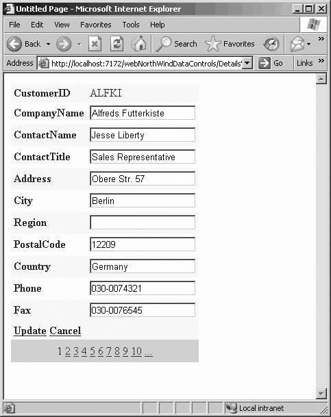
The Edit text boxes were created for you automatically, as were the links for Update and Cancel. If you set the data source to create the Update and Delete commands (using the Advanced button in the configuration dialogs), the Update link works with no additional code:
<asp:DetailsView runat="server" ID="DetailsView1" Height="50px" Width="125px" DataSourceID="CustomersDetailsViewDataSource" AutoGenerateRows="False" DataKeyNames="CustomerID" ForeColor="#333333" GridLines="None" CellPadding="4" AllowPaging="True" AutoGenerateEditButton="True" AutoGenerateDeleteButton="True" AutoGenerateInsertButton="True"> <FooterStyle ForeColor="White" Font-Bold="True" BackColor="#990000" /> <CommandRowStyle Font-Bold="True" BackColor="#FFFFC0" /> <RowStyle ForeColor="#333333" BackColor="#FFFBD6" /> <PagerStyle ForeColor="#333333" HorizontalAlign="Center" BackColor="#FFCC66" /> <Fields> <asp:BoundField ReadOnly="True" HeaderText="CustomerID" DataField="CustomerID" SortExpression="CustomerID"/> <asp:BoundField HeaderText="CompanyName" DataField="CompanyName" SortExpression="CompanyName"/> <asp:BoundField HeaderText="ContactName" DataField="ContactName" SortExpression="ContactName"/> <asp:BoundField HeaderText="ContactTitle" DataField="ContactTitle" SortExpression="ContactTitle"/> <asp:BoundField HeaderText="Address" DataField="Address" SortExpression="Address" /> <asp:BoundField HeaderText="City" DataField="City" SortExpression="City" /> <asp:BoundField HeaderText="Region" DataField="Region" SortExpression="Region" /> <asp:BoundField HeaderText="PostalCode" DataField="PostalCode" SortExpression="PostalCode" /> <asp:BoundField HeaderText="Country" DataField="Country" SortExpression="Country" /> <asp:BoundField HeaderText="Phone" DataField="Phone" SortExpression="Phone" /> <asp:BoundField HeaderText="Fax" DataField="Fax" SortExpression="Fax" /> </Fields> <FieldHeaderStyle Font-Bold="True" /> <HeaderStyle ForeColor="White" Font-Bold="True" BackColor="#990000" /> <AlternatingRowStyle BackColor="White" /> </asp:DetailsView>
EAN: 2147483647
Pages: 173