Section 4.11. Images
Images are an important aspect of most web sites. ASP.NET provides several ASP.NET server controls for displaying images. Two of them, the Image and the ImageMap controls, are covered in this section. The AdRotator control will be covered in the next chapter.
4.11.1. Image Control
The Image control has limited functionality: it is used for displaying an image on a web page or, alternatively, displaying some text if the image is unavailable. It raises no events for user interaction, other than those inherited from Control , such as Init and Load . If you need to have button functionality (i.e., to capture mouse clicks), you should use the ImageButton control, described earlier in this chapter.
In addition to the properties inherited from the WebControl class, the Image control has the properties shown in Table 4-18.
Table 4-18. Properties of the Image control
| Name | Type | Get | Set | Values | Description |
|---|---|---|---|---|---|
| AlternateText | String | x | x | The text displayed in the control if the image is unavailable. In browsers that support the ToolTips feature, this text is also displayed as a ToolTip. | |
| ImageAlign | ImageAlign | x | x | See Table 4-19. | Alignment options relative to the text of the web page. See Table 4-19. |
| ImageUrl | String | x | x | The URL pointing to the location of an image to display. |
The ImageUrl property can be either relative or absolute , as described fully in the sidebar "File Locations" in the section "Button Controls."
There are ten possible values for the ImageAlign property, as shown in Table 4-19. If you need better control of image and text placement, you will probably want to put the Image control in a table.
Table 4-19. Members of the ImageAlign enumeration
| Values | Description |
|---|---|
| NotSet | Not set. This is the default value. |
| AbsBottom | Aligns the lower edge of the image with the lower edge of the largest element on the same line. |
| AbsMiddle | Aligns the middle of the image with the middle of the largest element on the same line. |
| Top | Aligns the upper edge of the image with the upper edge of the highest element on the same line. |
| Bottom | Aligns the lower edge of the image with the lower edge of the first line of text. Same as Baseline . |
| Baseline | Aligns the lower edge of the image with the lower edge of the first line of text. Same as Bottom . |
| Middle | Aligns the middle of the image with the lower edge of the first line of text. |
| TextTop | Aligns the upper edge of the image with the upper edge of the highest text on the same line. |
| Left | Aligns the image on the left edge of the page with text wrapping on the right. |
| Right | Aligns the image on the right edge of the page with the text wrapping on the left. |
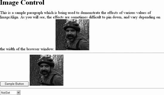
In Example 4-36, ImageDemo, shown in Figure 4-21, you will see how the various ImageAlign values affect the appearance of a web page. The code-behind for this example is listed in Example 4-37.
Example 4-36. default.aspx for ImageDemo
<%@ Page Language="C#" AutoEventWireup="true" CodeFile="Default.aspx.cs" Inherits="_Default" %> <!DOCTYPE html PUBLIC "-//W3C//DTD XHTML 1.1//EN" "http://www.w3.org/TR/xhtml11/DTD/xhtml11.dtd"> <html xmlns="http://www.w3.org/1999/xhtml" > <head runat="server"> <title>Image Control</title> </head> <body> <form id="form1" runat="server"> <div> <h1>Image Control</h1> <font name="Garamond" size ="4"> This is a sample paragraph which is being used to demonstrate the effects of various values of ImageAlign. As you will see, the effects are sometimes difficult to pin down, and vary depending on the width of the browser window. </font> <asp:Image ID="img1" runat="server" AlternateText="Dan" ImageUrl="Dan at vernal pool.jpg" /> <hr /> <asp:Button runat="server" Text="Sample Button" /> <asp:Image ID="img2" runat="server" AlternateText="Dan" ImageUrl="Dan at Vernal pool.jpg" /> <hr /> <asp:DropDownList ID="ddl" runat="server" AutoPostBack="True"> <asp:ListItem text="NotSet" /> <asp:ListItem text="AbsBottom" /> <asp:ListItem text="AbsMiddle" /> <asp:ListItem text="Top" /> <asp:ListItem text="Bottom" /> <asp:ListItem text="BaseLine" /> <asp:ListItem text="TextTop" /> <asp:ListItem text="Left" /> <asp:ListItem text="Right" /> </asp:DropDownList> </div> </form> </body> </html>
Figure 4-21. ImageDemo
Example 4-37. default.aspx.cs for ImageDemo
using System; using System.Data; using System.Configuration; using System.Web; using System.Web.Security; using System.Web.UI; using System.Web.UI.WebControls; using System.Web.UI.WebControls.WebParts; using System.Web.UI.HtmlControls; public partial class _Default : System.Web.UI.Page { protected void Page_Load(object sender, EventArgs e) { switch (ddl.SelectedIndex) { case 0: img1.ImageAlign = ImageAlign.NotSet; img2.ImageAlign = ImageAlign.NotSet; break; case 1: img1.ImageAlign = ImageAlign.AbsBottom; img2.ImageAlign = ImageAlign.AbsBottom; break; case 2: img1.ImageAlign = ImageAlign.AbsMiddle; img2.ImageAlign = ImageAlign.AbsMiddle; break; case 3: img1.ImageAlign = ImageAlign.Top; img2.ImageAlign = ImageAlign.Top; break; case 4: img1.ImageAlign = ImageAlign.Bottom; img2.ImageAlign = ImageAlign.Bottom; break; case 5: img1.ImageAlign = ImageAlign.Baseline; img2.ImageAlign = ImageAlign.Baseline; break; case 6: img1.ImageAlign = ImageAlign.Middle; img2.ImageAlign = ImageAlign.Middle; break; case 7: img1.ImageAlign = ImageAlign.TextTop; img2.ImageAlign = ImageAlign.TextTop; break; case 8: img1.ImageAlign = ImageAlign.Left; img2.ImageAlign = ImageAlign.Left; break; case 9: img1.ImageAlign = ImageAlign.Right; img2.ImageAlign = ImageAlign.Right; break; default: img1.ImageAlign = ImageAlign.NotSet; img2.ImageAlign = ImageAlign.NotSet; break; } } }
|

4.11.2. ImageMap Control
HTML provides the <map> element to implement images with multiple hyperlinks . These are known as image maps . The ImageMap server control provides this functionality in ASP.NET.
The ImageMap control derives from the Image class, and adds a number of properties and a single event, Click , to that class to provide the image map functionality. These properties are listed in Table 4-20.
Table 4-20. Properties of the ImageMap control
| Name | Type | Get | Set | Values | Description |
|---|---|---|---|---|---|
| AlternateText | String | | | The text will be displayed in the control if the image is unavailable. In browsers that support the ToolTips feature, this text is also displayed as a ToolTip. | |
| GenerateEmptyAlternateText | Boolean | | | true , false | If true , forces an empty alt attribute in the rendered HTML even if the AlternateText property is empty ("") or not specified. The default is false . This property is provided to support the web pages compatible with assistive technology devices, such as screen readers. |
| HotSpotMode | HotSpotMode | | | Inactive , Navigate , NotSet , PostBack | Specifies the default hotspot mode, or action taken when a hotspot is clicked, for the control. Individual hotspots may specify different modes. Navigate immediately navigates to the URL specified by the NavigateUrl property, while PostBack causes a postback to the server. |
| HotSpots | HotSpotCollection | | A collection of HotSpot objects contained by the ImageMap control. |

Each ImageMap control contains a collection of HotSpots : clickable regions of the image corresponding to HTML <area> tags within the image map. HotSpots will either raise a Click event on the server, if the HotSpotMode is set to PostBack , or will immediately navigate to the URL specified by the NavigateUrl property, if the HotSpotMode is set to Navigate .
There are three types of hotspots:
-
RectangleHotSpot
-
Defines a rectangular region of the image with Top , Bottom , Left , and Right properties, all in pixels relative to the upper-left corner of the image.
-
CircleHotSpot
-
Defines a circular region of the image with X and Y properties specifying the center of the circle, in pixels relative to the upper-left corner of the image, and the Radius property, specifying the radius of the circle in pixels.
-
PolygonHotSpot
-
Defines a many-sided region of the image with a comma-separated list of X and Y coordinates of endpoints of line segments outlining the region, in pixels relative to the upper left corner of the image.
All of the HotSpot objects have in common the properties listed in Table 4-21.
Table 4-21. Properties of the HotSpot object
| Name | Type | Get | Set | Values | Description |
|---|---|---|---|---|---|
| AlternateText | String | | | The text displayed in the control if the image is unavailable. In browsers that support the ToolTips feature, this text is also displayed as a ToolTip. | |
| HotSpotMode | HotSpotMode | | | Inactive , Navigate , NotSet , PostBack | Specifies the default hotspot mode, or action taken when a hotspot is clicked, for the control. Individual hotspots may specify different modes. Navigate immediately navigates to the URL specified by the NavigateUrl property, while PostBack causes a postback to the server. |
| NavigateUrl | String | | | Specifies the URL to navigate to when a hotspot with a HotSpotMode set to Navigate is clicked. Allows either relative or absolute references, as described in the sidebar, "File Locations" in the section, "Button Controls". | |
| PostBackValue | String | | | The value of the clicked HotSpot object passed by the ImageMapEventArgs event argument. Only relevant if the HotSpotMode is set to PostBack . | |
| Target | String | | | Specifies the browser window in which the target page will be displayed. The values of the Target property are the same as those listed in Table 4-3 for the HyperLink control. Only relevant if the HotSpotMode is set to Navigate . |
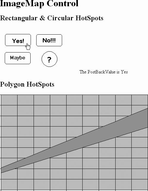
All of these properties and the Click event are demonstrated in the next example, ImageMapDemo. This web page is shown in Figure 4-22 after the Yes hotspot has been clicked. This example has two image maps. The one at the top of the page contains three rectangular hotspots and a circular hotspot. The second image map has three polygonal hotspots defined: one above the band, one below, and the band itself.
Figure 4-22. ImageMapDemo
The content file for this example is shown in Example 4-38 and the code-behind file is shown in Example 4-39. The only code of interest in the latter is the event handler method, imgmapYesNoMaybe_Click (highlighted), which is executed whenever a hotspot with a HotSpotMode set to PostBack is clicked.
Example 4-38. default.aspx for ImageMapDemo
<%@ Page Language="C#" AutoEventWireup="true" CodeFile="Default.aspx.cs" Inherits="_Default" %> <!DOCTYPE html PUBLIC "-//W3C//DTD XHTML 1.1//EN" "http://www.w3.org/TR/xhtml11/DTD/xhtml11.dtd"> <html xmlns="http://www.w3.org/1999/xhtml" > <head runat="server"> <title>ImageMapDemo</title> </head> <body> <form id="form1" runat="server"> <div> <h1>ImageMap Control</h1> <h2>Rectangular & Circular HotSpots</h2> <asp:ImageMap ID="imgmapYesNoMaybe" runat="server" ImageUrl="YesNoMaybe.gif" HotSpotMode="Postback" OnClick="imgmapYesNoMaybe_Click"> <asp:RectangleHotSpot PostBackValue="Yes" Bottom="60" Top="21" Left="17" Right="103" AlternateText="Damn right" /> <asp:RectangleHotSpot HotSpotMode=PostBack PostBackValue="No" Bottom=60 Top=21 Left=122 Right=208 AlternateText="Hell no"/> <asp:RectangleHotSpot PostBackValue="Maybe" Bottom=122 Top=83 Left=16 Right=101 AlternateText="Well..., I'll think about it"/> <asp:CircleHotSpot HotSpotMode="Navigate" X=165 Y=106 Radius=25 NavigateUrl=http://localhost/websites/targetpage.aspx Target=_blank AlternateText="I'll have to think about it."/> </asp:ImageMap> <asp:Label ID="lblMessage" runat="server" /> <h2>Polygon HotSpots</h2> <asp:ImageMap ID="imgmapPlot" runat="server" ImageUrl="plot.gif" HotSpotMode="PostBack" OnClick="imgmapYesNoMaybe_Click"> <asp:PolygonHotSpot Coordinates="4,245,4,3,495,3,495,45," AlternateText="Above the band" PostBackValue="Above the band" /> <asp:PolygonHotSpot Coordinates="4,245,495,45,495,112,3,264" AlternateText="In the band" PostBackValue="In the band" /> <asp:PolygonHotSpot Coordinates="495,45,495,112,495,320,4,320" AlternateText="Below the band" PostBackValue="Below the band" /> </asp:ImageMap> </div> </form> </body> </html>
Example 4-39. default.aspx.cs for ImageMapDemo
using System; using System.Data; using System.Configuration; using System.Web; using System.Web.Security; using System.Web.UI; using System.Web.UI.WebControls; using System.Web.UI.WebControls.WebParts; using System.Web.UI.HtmlControls; public partial class _Default : System.Web.UI.Page { protected void Page_Load(object sender, EventArgs e) { } protected void imgmapYesNoMaybe_Click(object sender, ImageMapEventArgs e) { lblMessage.Text = "The PostBackValue is " + e.PostBackValue; } } In the declaration of the first image map, imgMapYesNoMaybe , an image file is specified, YesNoMaybe.gif , which is located in the same directory as the page itself. Alternatively, a relative directory path could be specified, such as:
ImageUrl="images\YesNoMaybe.gif"
or an absolute directory path, such as:
ImageUrl="c:\websites\images\YesNoMaybe.gif"
or an Internet or intranet location, such as the following:
ImageUrl="HTTP://www.SomeWebSite.com/images/YesNoMaybe.gif"
The default HotSpotMode for this image map is set to PostBack . The Yes and Maybe hotspots assumes this value, the No hotspot explicitly specifies the same value, and the question mark hotspot uses a different HotSpotMode of Navigate . In this latter case, the NavigateUrl and Target properties provide direction as to where and how to navigate. For the postback hotspots, the OnClick attribute of the image map hooks the Click event to the imgmapYesNoMaybe_Click method contained in the code-behind file, shown highlighted in Example 4-39.
The second image map, imgmapPlot , defines three irregularly shaped hotspots, defined by a set of X,Y coordinates. In this example, the hotspots are simple, with only four straight sides each. In a more typical usage, say a map of the United States with each state defined as a hotspot, you might have many dozens of nodes specified. The more nodes, the finer and more accurate the hotspot. However, don't go too crazy trying to make the outline perfect because most users click near the middle of the hotspot, and if they are too close to the edge of the region and get the adjoining region by mistake, they will just hit the Back button and try again a little more carefully .
The Click event argument is of type ImageMapEventArgs . It exposes a single public property. PostBackValue . This corresponds to the HotSpot property of the same name declared with each HotSpot in the example. This property is retrieved in the Click event handler in Example 4-39 and used to populate the Text property of the Label control on the page.
EAN: 2147483647
Pages: 173