Formatting a Chart
|
| < Day Day Up > |
|
Just as you can format particular parts of a table, so can you format particular parts of a chart. As you click individual components, BusinessObjects adds black markers to indicate what component you have selected. When you double-click a component, BusinessObjects launches the correct menu and tab for that component. Figure 17-9 shows the various chart components. The Y axis is selected as indicated with the black markers.
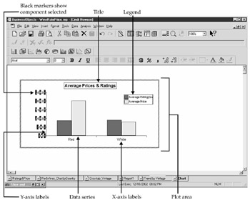
Figure 17-9: Chart components
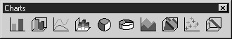
The Chart Toolbar
When formatting a chart, enable the chart toolbar by selecting View | Toolbars, then checking the Charts box. BusinessObjects adds the next toolbar to the menu. The chart toolbar allows you to change the entire chart type. For example, you can change a bar chart to a pie chart. To change the entire chart type, be sure you have selected the entire chart block. To change only one of the series to a line chart (as shown later in Figure 17-12), select the individual data series.
The Chart Pop-Up Menu
The chart pop-up menu allows you to format and insert individual chart components. To invoke the pop-up menu, click anywhere within a chart block and right-click to invoke the pop-up menu. The middle menu option changes depending on which individual component you have selected; for example, if you have selected a title, the middle menu option changes to show Format Chart Title. If you have selected a data series, the middle menu option displays Format Data Series. In previous Figure 17-9, the Y-axis label is selected, and the following pop-up menu shows Format Axis Label:
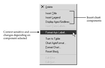
From the pop-up menu, you can insert a title, a legend, axes, or data labels. You can also insert these via the pull-down menu Insert | Chart Components or via various tabs within the Chart Format dialog box.
Chart AutoFormat
For each chart type displayed in the toolbar, BusinessObjects provides several default formats. For example, within the Line chart type, you can choose if you want each data point to be marked with a square, a diamond, or nothing; you can specify gridlines or not. You can manually set these options via the Chart Format dialog box shown in Figure 17-10; however, the Chart AutoFormat dialog box automates the most useful options.
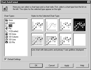
Figure 17-10: Chart AutoFormat provides several chart types with popular formatting options.
To apply a default format:
-
Within your report, select the chart block.
-
Use the pull-down menu Format | Chart AutoFormat or right-click to invoke the pop-up menu and select Chart AutoFormat.
-
Select a Chart Type.
-
Select a particular style for the chart type. BusinessObjects displays a detailed description for each chart type.
-
Click Apply to apply the autoformat to the chart. You will be able to see the effect of your selections in the background.
-
Click OK to close the Chart AutoFormat dialog box.
Caution When you use Chart AutoFormat, it resets any other formats you have applied to titles and legends. Be sure to use AutoFormat first to avoid having to reformat other chart components. If you change the chart type via the toolbar, formatting for other chart components is preserved.
Chart Format
Some of the options in the Chart Format dialog box are similar to the Cell Format and Table Format dialog box. The General, Series, and Pivot tabs contain the most differences.
The General Tab
Table 17-2 explains each of the options on the General tab.
| Titles | Needed |
|---|---|
| Name | Enter a name for the chart. This will be displayed in Report Manager and will become the title if you Click the Title box. If you rename a chart after clicking The Title box, you may need to remove the checkmark next to the Title box and then reenable it to get BusinessObjects to reflect the new name. |
| X-Axis | Displays values on the X axis. |
| Z-Axis | If you select a 3-D Chart Type, then this box is Automatically enabled. What you otherwise may have displayed as legends become the Z-axis labels. |
| Primary Y-Axis | Displays labels on the Y-axis. BusinessObjects sets default increments that you can override through Format | Axis Label, then the Scale tab. |
| Secondary Y-Axis | When you chart two measures that have different numeric ranges, it may be more meaningful to display two Y-axes. |
| Back Wall, Left Wall, Floor | These options apply to 3-D charts and determine if you want walls displayed along each of the axes of the chart. |
| Legend | Displays the variable names for the measures as a legend. You format the legend via Format | Legend Text. |
| Title | Creates a cell within the Chart to display a chart title. By default, it uses the text from the Name field. |
| Start on a new page | If your report contains only one chart, do not select this option. If you have multiple charts and block types, check this to have the chart printed on a new page. |
| Repeat on a new page | If you have a summary chart within a report and a long, detailed table beneath the chart, use this option to print the chart on each page. |
| Avoid page break in block | When you have multiple blocks in a report, check this to ensure the chart is printed on one page and that the chart does not get fragmented across multiple pages. |
| Adjust plot area to chart size | The plot area is one component within a chart, as shown earlier in Figure 17-9. By checking this box, you tell BusinessObjects to resize the bars, lines, or pie shape within the chart. This box does not remain checked. |
| Adjust scale to value range | Check this box for master/detail charts so that the Y-axis labels are rescaled according to the values. For example, French wines have a wider price range than American wines. By default, the Y-axis label shows 0 to 250. When this option is checked, the scale for French wines shows 0 to $400, and American wines shows 0 to $200. |
The Series Tab
The Chart Format, Series tab defines how you want to display the numeric values in the chart. A group refers to one measure or a set of measures that are graphed using the same Chart Type. By default, a chart contains one group and one chart type. However, you can create multiple groups to select a different chart type for each group. The new group can either use the same Y axis or a secondary Y axis. In Figure 17-11, Group 1 is a line chart that displays the Average Rating in a line. Group 2 is a bar chart that displays the Average Price in a bar, along a secondary Y axis. Note that the chart type icon is different next to each Group number.
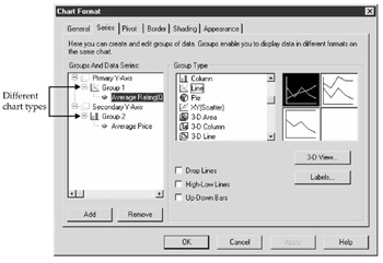
Figure 17-11: Chart Format, Series tab allows you to specify different formats for each measure.
The check boxes and buttons in the Group Type section will change depending on the type of chart you choose for a particular group. For example, with the line chart shown in Figure 17-11, you can choose if you want to display drop lines, high-low lines, or up-down bars. With the Chart type set to Column, you can choose how much of a gap you want between the different bars.
Labels
Data Labels correspond to each data series and may be a numeric value for a particular data point, a percentage, or a description of the measure. From the Series tab, click Labels to launch the Data Labels dialog box. You also can access Data Labels by selecting a series within the plot area of the chart, then right-clicking to call the pop-up menu and selecting Insert Data Labels. This dialog allows you to choose the following options to add to the plot area of the chart:
-
None By default, no label is added to the series.
-
Show Value Display the numeric value above the data point, bar, or pie wedge.
-
Show Percent For pie charts, display the percentage.
-
Show Label When there are multiple measures, display the name of the variable. This acts like a legend.
-
Show Label And Percent For pie charts, display the name of the measure as well as the percentage value.

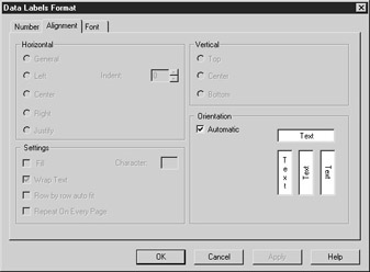
To modify the labels number format (for example, no decimal places, red if negative), alignment, or font, select the labels within the plot area and then right-click to call the pop-up menu or use Format | Data Labels. For charts, the Alignment tab has an additional option for Orientation. This affects how you want the labels rotated above each data point. Otherwise, BusinessObjects does not allow you to modify where the data label appears and all other Alignment options are grayed out.
Adding a Group to a Secondary Y Axis
Within the Series tab, you can specify a secondary Y axis when you are charting two measures that will have different numeric ranges. For example, wine ratings will only go to 100, whereas wine prices can go into the thousands. By displaying two different Y axes, the chart displays the different measures more effectively. In the following example, you will add a group to a secondary Y axis, as shown in Figure 17-12:
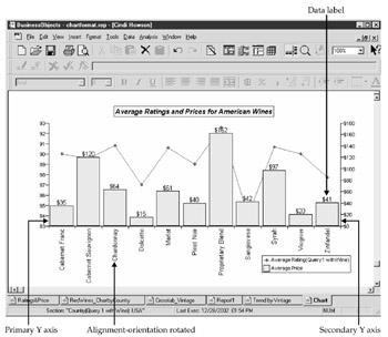
Figure 17-12: Charts can have two Y axes.
-
From within the Chart Format, Series tab, select Secondary Y Axis (Figure 17-11).
-
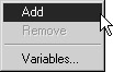
Right-click to call the pop-up menu shown here.
-
Select Add. BusinessObjects inserts a new group number.
-
With your mouse still positioned on the group number, choose the desired chart type for this group.
-
Right-click to call the pop-up menu and select Variables.
-
From the Variables dialog box, choose the measure that you want to associate with this group and click Insert.
-
With the secondary variable highlighted, click Labels and select Show Value.
Figure 17-12 shows a sample chart with two Y axes. Note that each axis has its own scale. By splitting the measures into two Y axes, you more clearly see when higher ratings do not necessarily result in higher prices. For example, the Merlot wines have high average ratings, as do the Syrahs. However, the Average Price for American Merlots at $61 is not nearly as high as the Average Price for Syrahs at $97.
The Pivot Tab
Within the Chart Format dialog box, the Pivot tab allows you to select which variables you want to display along the X axis, Z axis (for 3-D charts), and Y axis.
The Appearance Tab
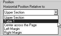
The Appearance tab is similar to the one shown in Figure 17-4 that also applies to free- standing cells and tables. When you have a report with multiple blocks such as charts and tables, it is important to set the position of the blocks relative to one another. If you leave the blocks relative to a section or margin and the size of the block changes (for example, when the number of rows in a table expands), the two blocks may run into and overwrite one another.
When you position a chart to the right of a table block:
-
Select Format | Chart from the pull-down menu, then click the Appearance tab.
-
Click the drop-down box for Horizontal Position Relative To and select Table 1.
-
Enter a number for how many 1/16ths of an inch you want between the table and the chart.
-
Click OK.
|
| < Day Day Up > |
|
EAN: 2147483647
Pages: 206