Block Types
|
| < Day Day Up > |
|
BusinessObjects allows three block types: table, crosstab, and chart. A master/detail is a type of report or section and not specifically a block style. Financial is a block type available in WebI; in BusinessObjects it is considered a way of formatting a table block. Frankly, this distinction is a little confusing, but it only matters when you are trying to format a block. A report can contain multiple block types. Figure 16-3, for example, has both a chart block and a table block within one report. The following table summarizes the different block types and when to use them:
| Block Type | Use When. . . |
|---|---|
| Table | You want to detail information in a list or spreadsheet style. You may break the list into sections in a master/detail report or with breaks. Tables can contain additional columns for many dimensions, details, and measures. |
| Chart | You want to discover trends and patterns by exploring summary, not detail, numbers in a graphical format. Charts are ideal for analyzing a limited number of measures by a limited number of dimensions. |
| Crosstab | You want to compare measures by different points within a given dimension. A crosstab is a particular kind of table layout that lets you compare actual sales with budget sales, for example, or to compare data from one period to the next. |
You can choose to add, modify, and delete blocks and reports either through the Report window or Report Manager. In the following examples, I will show how to use either approach.
Table
When you initially create a new document, BusinessObjects uses the default block type of table. A table is a spreadsheet-style block that lists data in rows and columns. When you are working with an existing document, you can choose to:
-
Insert a table into a new report or report tab
-
Convert a crosstab or chart block to a table
-
Insert a table into an existing report
Inserting a Table into a New Report
In this example, you will create a new report and insert a table through the Report window.
-
Use the pull-down menu to select Insert | Report.
-
BusinessObjects inserts a new report tab, named ReportN, where N is a sequential number. If you have one report tab, BusinessObjects creates Report2. When your report tabs contain meaningful names, as in the following example, BusinessObjects restarts the numbering. To modify the name of the report tab, double-click the tab and enter a meaningful name.

-
The Report window is initially blank. From the pull-down menu, select Insert | Table. Or, if the report toolbar is displayed, click Insert Table.
-
BusinessObjects converts the mouse pointer to a table icon. Drag the mouse to indicate where you want to position the table.

-
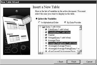
BusinessObjects presents you with the New Table Wizard. From here, you can choose to insert a table with data from the existing document, a new query on the existing universe, or a new query with a new data source. Select Use Existing Data From The Document.
-
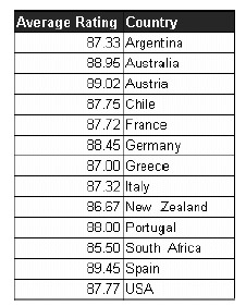
The New Table Wizard displays a list of variables from all data providers. When you have multiple data providers in a document, click By Data Provider to view the variables by query rather than alphabetically. Use CTRL-click to select which columns you want to appear in the report table. In the following example, I want a table listing the Country and Average Rating:
-
Click Finish to close the New Table Wizard and have BusinessObjects insert the new table. At this point, the table is fairly basic. Chapter 17 provides information on how to format the report.
Converting an Existing Block to a Table
If you have a report that contains a block and you want to view the same data in a different format, you can convert the block to a different type. In the following example, you will convert a chart to a table. You can also convert a small table to a chart. Use the Report Manager to ensure you have selected the correct block.
-
From Report Manager, set the view to Structure by selecting the Map tab and clicking the Structure icon at the bottom.
-
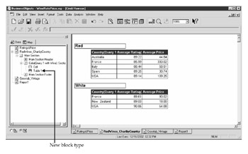
Select the report tab that contains a chart—in this example, RedWinesChartByCountry.
-
Within the Report Manager Map, select Chart1. Note that the chart block is correspondingly selected in the Report window. Right-click to invoke the pop-up menu and select Turn To Table. Note that the status bar tells you it will turn the chart into a table.
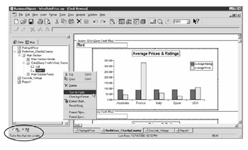
-
BusinessObjects replaces the chart block with a table block. The section headings by Color remain the same. Note that in the Report Manager window, the block type also now reflects Table 1.
Chart
Charts are a powerful way to uncover trends and patterns in your data. In many BusinessObjects deployments, charts are underutilized. Perhaps this is in part because a number of deployments grew out of replacements of mainframe or transaction-based reporting systems that do not provide charts. Also, many times, report readers do need to see the individual numbers. However, I would argue that a corresponding chart can help you take your analysis one step further to uncover opportunities and potential improvements and, therefore, recommend that all standard reports contain at least one chart. Table 16-2 provides some sample business questions to show which block type best answers certain questions.
| Table | Chart |
|---|---|
| What is the average rating and price for wines by individual producer, varietal, and vintage? | How do ratings compare by different countries? |
| What are my inventory levels for individual products? | Are any of my inventory levels significantly different for certain products; have the levels increased or decreased over time? |
| What are the actual and budgeted expenses for each department and quarter? | How big is the variance between actual and budgeted expenses? |
| How much product did our top ten customers buy for the last three years? | Do any customers buy significantly more than others, and how have the buying patterns changed over time? |
| Tip | As you build standard reports, make it a point to include at least one chart that shows an unusual pattern or trend. |
Inserting a Chart
As with tables, you can convert an existing table or crosstab to a chart, or you can create a chart based on a new query. Because charts generally involve fewer variables than tables and crosstabs, I rarely use Convert and recommend using Insert | Chart.
In this example, you will create a new report and insert a chart through the Report window. You could also create a chart within an existing report to have multiple block types within the same report.
-
Use the pull-down menu to select Insert | Report. BusinessObjects inserts a new report tab. Or, if the Report toolbar is displayed, click Insert Chart.
-
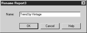
Double-click the report tab to enter a meaningful name and press OK.
-
From the pull-down menu, select Insert | Chart.
-
BusinessObjects converts the mouse pointer to a chart icon. Drag the mouse to indicate where you want to position the chart.
Note With tables, BusinessObjects automatically resizes the box you initially draw to fit all the columns in the table. With charts, it does not resize the box, so ensure that the size of your box is adequate for the number of columns or data points.
-
BusinessObjects presents you with the New Chart Wizard. Select the radio button Use existing data from the document.
-
The New Chart Wizard displays a list of variables from all data providers. When you have multiple data providers in a document, click By Data Provider to view the variables by query rather than alphabetically. Use CTRL-click to select which columns you want to appear in the chart. For most chart types, you want to limit the number of dimension objects but may have multiple measures.
-
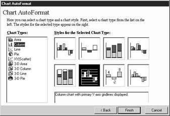
The New Chart Wizard prompts you to select a chart type. For each chart type, there are different styles and settings, which are discussed further in Chapter 17. Select the desired type and style.
-
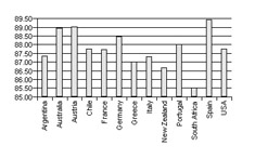
Click Finish to close the Wizard and see the newly inserted chart. The chart shown here is fairly basic. Chapter 17 describes how to add a title and legend, and format the X-axis descriptions.
Crosstab
A crosstab block allows you to compare information by different groupings and transposes what may originally be rows in a tabular report to column headings. People frequently use crosstabs for the following types of analysis:
-
Customers sales by year, quarter, or month
-
Financial measures by actual and budget
-
Product sales by region
Caution Columns and Rows are mislabeled in the BusinessObjects Pivot tab. So if you really want Year to appear as column headings in your crosstab, then you place this variable under Rows. Because of this confusion, I recommend using the Slice and Dice Panel in which you drag and drop the variables to create a crosstab (Chapter 18).
The columns may have multiple levels. In Figure 16-8, both Year and Quarter are column headings.
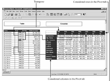
Figure 16-8: Tabular versus crosstab report blocks
You can either convert an existing table or chart to a crosstab or you can insert a new crosstab based on new data. In the next example, you will convert an existing table to a crosstab. The initial table contains the dimensions Color, Varietal, and Country and the measure Average Price. You want to create a crosstab to compare how prices vary by country for each varietal.
-
From within the Report window or Report Manager, select the table block.
-
Right-click to call the pop-up menu and select Format Table. Alternatively, use the pull-down menu to select Format | Table.
-
Select the Pivot tab from the Table Format dialog box. Under Available Variables, BusinessObjects displays all the variables in the microcube. Under Used Variables, Body, BusinessObjects displays the columns from the existing table.
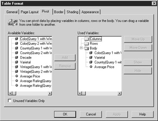
-
You want the Country as Columns in the crosstab. Under Body, select the Country variable and drag and drop it to the Rows folder (because you want it as a column heading!).
Note Move Up and Move Down work only within a specific part of the crosstab block, such as Columns. You cannot use Move Up and Move Down to move a variable from the Body of a crosstab to a Column heading.
-
Select Color and drag and drop it to the Columns folder (because you want it as a row!). Do the same for Varietal. Average Price and other measures remain in the Body folder. The Pivot definitions should be as follows:
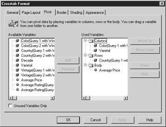
-
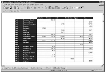
Click Apply. BusinessObjects converts the table to the following crosstab:
|
| < Day Day Up > |
|
EAN: 2147483647
Pages: 206