Section 4.5. Shining Things Up
4.5. Shining Things Up
Another request I often get is to create highlights and add shape to an object. There can be many reasons for this. The client loves the shot, but it requires some fixing up to make it more dramatic. There may be wine glasses that require a sparkly sheen to them or a piece of metal or paint requires a shiny look. Care must be taken though, as there are different types of sheen to objects. A very shiny, smooth surface will have a hard, bright shine to it, but an object with a flat, dull finish, like a brushed metal surface, should have a flatter sheen to it. Let's take a round circle of color, as in Figure 4-62. I just created the circle part of the image in Photoshop by filling a circle selection with color. Figure 4-62. Before: adding a basic circle of color in Photoshop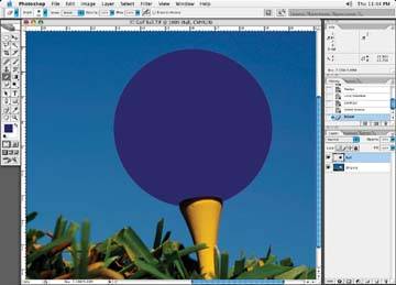 Once you have the object identified, create a new layer in your file, call it Highlights, and set the layer to normal (default). Create another new layer, set the attributes to multiply and call it Shadows. There are a couple of different highlights and shadows we could draw on this ball to achieve two completely different looks. One could be flat looking, as if the ball were sprayed with a flat paint. Another look could be that of a very shiny ball where the highlights and shadows appear very hard with little diffusion. In Figure 4-63, I've created a ball with a flat look to it, and in Figure 4-64, I've created a very shiny ball. Let's go through the steps to see how each was made. Figure 4-63. After: the flat spray paint technique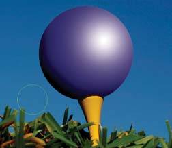 Figure 4-64. After: the high- gloss technique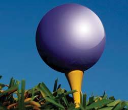 4.5.1. Creating a Flat FinishIf we want the ball to look like it's been painted with a flat purple spray paint, we'd use soft highlights without any hard edges to them. Using the Paintbrush tool with a very soft hardness setting, like 0%, again set to a very low opacity of 20%, spray on highlights in an area you think would need them, as Figure 4-65. Where you brush in highlights will be based on where the light is coming from. Let's assume the light is coming from the right side of this page, then the highlights on the ball will land on the right side of the ball. Imagining that this is the only light source, the shadows will fall to the left of the ball. I've added a shadow on the left side, and the result Figure 4-66. Figure 4-65. A selection of the ball is made and a white highlight is brushed in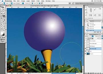 4.5.2. Creating a Very Shiny FinishNow let's see if we can shine our object up a bit. Using the Pen tool, draw in a shape in an area that I think will need highlights based on where I think the light is coming from. I'll usually make the bottom portion of the highlight shape larger than I need to because I like to go wide on the bottoms of the highlights, as it is typical for a highlight to fall off softly without a hard edge. I can also go back in with the Erase brush, if I have to, and adjust the extra highlight. When I finish making my shapes with the Pen tool, I have shapes that look like Figure 4-67. Figure 4-66. After adding a shadow for our dull ball, it is complete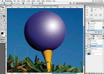 Figure 4-67. Leave the original highlight layer on, but add a shape with the Pen tool that you will use for the shine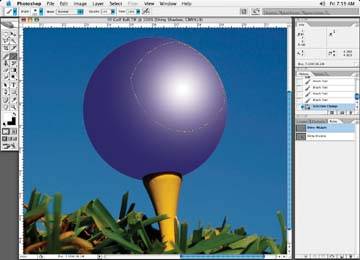 Next, I'll make a selection of the shape with a slight softness to it to match the look of any other hard edges on the ball. While on your highlight layer, use a low opacity, 20%, Airbrush. Now brush through the shape until you get the desired effect, as in Figure 4-68. Figure 4-68. The look of the ball with the shiny highlight painted in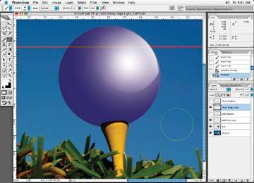 Highlights typically come from the top, so I usually make the tops of the highlights the brightest points and feather them off as they move down the ball. I usually do only one shape at a time if I have more than one shapewhat I brush in for one shape may not be suitable for the other shapes if they are too close together. Then, let's do the same thing for the shadow. I'll create a shape for it as well that will give it a harder edge, as shown in Figure 4-69. Figure 4-69. Give the shadow a hard edge as well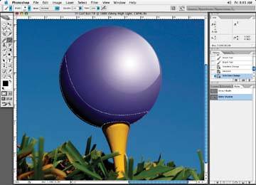 For a finishing touch, I added a reflection of the grass onto the bottom of the ball to appear as a very shiny ball. This was done with a low opacity Clone tool and a large brush size . I put the source of the Clone tool brush on the grass and cloned that information onto the ball. The final results are in Figure 4-70. Figure 4-70. A touch of highlight on the grass shows just how shiny the ball has become!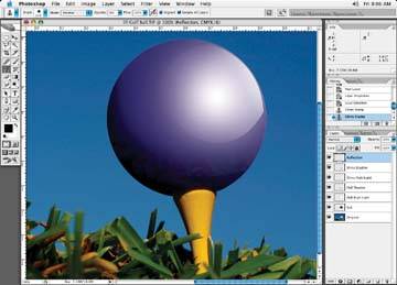 4.5.3. Reducing Windshield ShineAs a professional retoucher, you won't always be asked to create that which doesn't exist; sometimes you'll be asked to remove something undesirable. One of these types of requests I get often is to eliminate reflections from windows (of cars , or any window for that matter, or at least tone down the reflection so that it just contains basic light rather than a bunch of distracting objects. Figure 4-71 shows the before image with a very distinct reflection, whereas in Figure 4-72 the reflection is realistic but no longer distracts from the image of the car. Figure 4-71. Before: reflections in the car window are distracting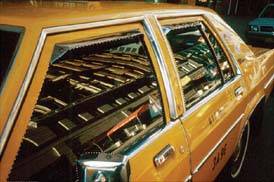 Figure 4-72. A sleek, subtle reflection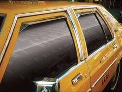 Let's start by selecting the area we wish to change with the Pen tool. Create a new layer for your selection. Use the Brush tool to paint in a darker color, as shown in Figure 4-73. Next, take readings of the existing color in the window (by clicking on it and noting the color information in the Info palette), and then paint with that color. If there are variations in the color of the window, take a few color readings and paint in with those colors. Choose tones for the darker and lighter colors based on what you see in the image. If there seems to be a large variation between the two colors, pick up some in-between colors to smooth the transition from dark to light. Paint in the highlight as shown in Figure 4-74. Figure 4-73. The darker shade of the window is painted in first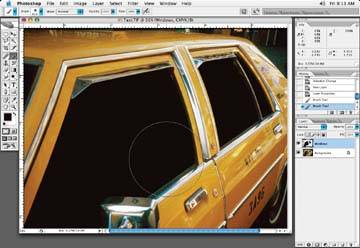 Figure 4-74. The highlight side of the window is now painted in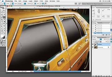 At this point, the window looks flat, so let's modify the window mask so we can add a hard highlight edge. Using the Polygonal Lasso tool, divide the window where you think a shine could existyou'll have to use your imagination ! Next, use the Lasso tool to subtract some of the selection. Add a small feather to the mask (Select Figure 4-75. Subtract some of the original window selection to create a shine line, and then brush highlight into the selection area to create a hard shiny edge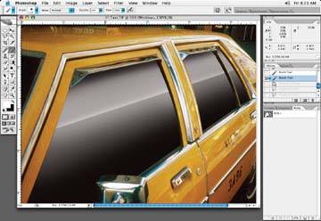 Next, modify the mask for the dark shadows under the top of the windows by the rain guards for the shadow area. Then, paint a hard shadow line in there, as you can see in Figure 4-76. Figure 4-76. Paint in a hard shadow under the rain gutter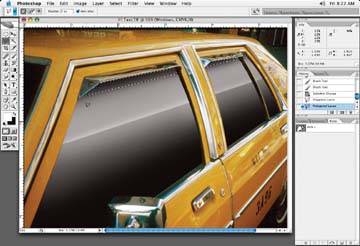 Next, add a tiny bit of noise to the window layer. I added a two-pixel amount to the example (Figure 4-77). This is done to help smooth out the transitions in the vignetted windows. Figure 4-77. Add a little bit of noise to smooth out transitions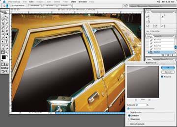 The window layer opacity can be changed to suit the client needs. It is typical for a client to play with the opacity of this layer. At least you have a lot to show them! In Figure 4-78, I've chosen 90% opacity to let a little of the building reflection shine through. This helps add a sense of realism . By all means, experiment with the layer opacity. 4.5.4. Learning a 3DFigure 4-78. The final look with a little bit of the original reflections showing to make a realistic reflection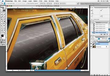
|
 Feather because the Lasso tool tends to make too hard an edge. A feather of .5 should do it. With a low opacity brush, paint in a white edge along the edge of the new selection, as in Figure 4-75.
EAN: N/A
Pages: 83