The ASP.NET List Controls
The fourth group of controls that are part of ASP.NET is the range of list controls . This includes the familiar listbox and drop-down list, implemented using the HTML <select> element. However, there are several other very useful list controls as well, as shown in the following table:
| Control | Description |
|---|---|
| <ASP:DropDownList> | Creates a <select> list element that includes the size ="1" attribute to create a drop-down listbox with only a single row visible. The list can be populated using <ASP:ListItem> controls or through data binding. |
| <ASP:ListBox> | Creates a <select> list element that includes the size=" x " attribute to create a normal single-select or multi-select list box with more than one row visible. The list can be populated using <ASP:ListItem> controls or through data-binding. |
| <ASP:CheckBoxList> | Creates an HTML <table> or a simple list containing HTML checkboxes. The list can be populated using <ASP:ListItem> controls or through data-binding. |
| <ASP:RadioButtonList> | Creates an HTML <table> or a simple list containing a mutually exclusive group of HTML radio buttons . The list can be populated using <ASP:ListItem> controls or through data-binding. |
| <ASP:ListItem> | Not actually a control, but an object that is used to create an item within a list control. The type of item that is created in the list depends on the type of the list control. For example, an <ASP:ListItem> creates an <option> element in a listbox, and a new checkbox control in a CheckBoxList control. |
| <ASP:Repeater> | Repeats content defined once, for each source item within the data source specified for the control. No integral formatting is applied except the layout and content information you define. This control is described in Chapter 7. |
| <ASP:DataList> | Creates an HTML <table> with a row for each source item you specify. You create templates that define the content and appearance of each row. This control is described in Chapter 7. |
| <ASP:DataGrid> | Creates an HTML <table> that is designed for use with server-side data-binding, and includes built-in features to support selection, sorting, and editing of the content rows. This control is described in Chapter 7. |
These controls further reinforce the fact that the Web Form controls can save huge amounts of effort when creating interactive web pages, in particular when the values for the lists come from some dynamic data source such as a database. We will look in detail at the concepts of data binding in Chapter 7, and we will postpone the discussion of the three more complex types of list control until then. In this chapter, let's concentrate on the first five of the controls just listed.
The ListControl Base Class
The four list controls described in this chapter are derived from the base class ListControl , which is part of the namespace System.Web.UI.WebControls . This class itself inherits from WebControl , and so provides the same properties, methods , and events as described in the previous section on the Web Form controls. It adds to these some other members , as the next table suggests, which are therefore available for all the list controls:
| Member | Description |
|---|---|
| AutoPostBack property | Sets or returns a Boolean value indicating whether the page will be posted back to the server automatically when the user changes the selection in the list. |
| DataMember property | Sets or returns the name of the table within the DataSource that will supply the values for the list when data binding is used to populate it. Used when the DataSource object contains more than one table (for example, when using a DataSet ). |
| DataSource property | Sets or returns a reference to the object that provides the values to populate the list. |
| DataTextField property | Sets or returns the name of the field within the current DataSource that provides the text to be used for the list items. |
| DataTextFormatString property | Sets or returns the formatting string that controls how the data bound to the list is displayed; for example, {0:C} for currency. |
| DataValueField property | Sets or returns the name of the field or column within the current DataSource that provides the values for the list items. |
| Items property | Returns a collection of the items (rows or <option> elements) within the list control. |
| SelectedIndex property | Sets or returns the integer index of the first selected item in the list. To set or retrieve multiple selected items use the Selected property of each individual ListItem object. |
| SelectedItem property | Returns a reference to the first selected item within the list control. To set or retrieve multiple selected items use the Selected property of each individual ListItem object. |
| SelectedValue property | Sets or returns the value of the currently selected item in the list, or the first selected item if more than one is selected. The Value property is returned if the list item has a value set for this property. If not, the value of the Text property (the visible text) is returned. Setting this property to a value that exists in the list selects that item. This property was added in version 1.1. |
| OnSelectedIndexChanged() event | Occurs on the server when the selection in the list is changed and the page is posted back to the server. |
The Specific List Control Classes
All the list controls described in this chapter add properties and a method to the base class from which they inherit, as shown in the following table:
| Control/Object | Properties | Methods |
|---|---|---|
| DropDownList | - none - | - none - |
| ListBox | Rows | - none - |
| CheckBoxList | CellPadding , CellSpacing , RepeatColumns , RepeatDirection , RepeatLayout , TextAlign | - none - |
| RadioButtonList | CellPadding , CellSpacing , RepeatColumns , RepeatDirection , RepeatLayout , TextAlign | - none - |
| ListItem | Attributes , Selected , Text , Value | FromString () |
Using the ASP List Controls
In general, use the list controls in the same way as the basic ASP.NET Web Form controls examined in the previous section of this chapter. Properties like AutoPostBack , AccessKey , ToolTip , and the various formatting properties work in just the same way. We have also used a HashTable as the data source for the examples in our demonstration application, in the same way as the HtmlSelect control in the previous chapter.
Here, we will concentrate on the properties specific to list controls, as shown in the previous tables. We will follow this up towards the end of this section with a look at the way details about the selected items in a list control are retrieved.
The ASP:DropDownList Control
The ASP.NET DropDownList control creates basically the same output in the browser as the default HtmlSelect list in the previous chapter. It generates an HTML <select> element with no size attribute. Thus, only one item in the list is visible and it behaves as a 'drop-down' selection list.
Since the control is bound to the same HashTable as the one used with the HtmlSelect control, you can see that it creates the same five <option> elements within the <select> element. Setting the BackColor , BorderColor , and ForeColor properties performs the formatting of the control, and we have also turned on AutoPostBack . This adds the onchange attribute to the <select> element, as shown in Figure 6-21:
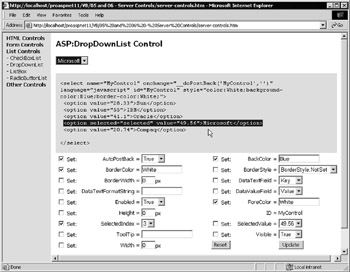
Figure 6-21:
Notice the SelectedValue property. We set the SelectedIndex property to 3 , and this selected the item Microsoft. The code in the example page then reads the properties of the control, including the SelectedValue , and sets the drop-down list in the lower half of the page to the matching values (in this case 49.56). As an alternative, uncheck the Set box next to the SelectedIndex property, choose a value in the SelectedValue drop-down list, and then click Update. This selects the item you choose in the list.
| Important | You get a runtime error if you set the SelectedValue to a value that does not exist in the list. |
The sourcecode used for creating the server control in this page is:
<ASP:DropDownList id="MyControl" runat="server" /> To see the effects of data binding to the HashTable data source, swap over the DataTextField and DataValueField properties. The list will show the contents of the 'field' selected as the DataTextField property, and use the contents of the 'field' specified as the DataValueField to fill the value attributes of each <option> element.
The ASP:ListBox Control
To create a listbox rather than a drop-down list, use the ListBox control, as shown in Figure 6-22. This has a couple of extra properties that specify the size and behavior of the list. Firstly, you can specify how many items will be displayed by setting the Rows property (which sets the size attribute “notice how the property names are common across the Web Form controls, hiding the inconsistent HTML attribute names ).
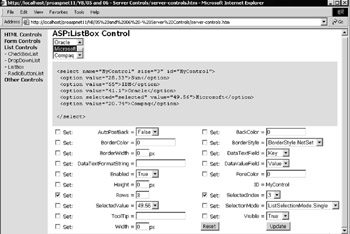
Figure 6-22:
The sourcecode used for creating the server control in this page is:
<ASP:ListBox id="MyControl" runat="server" /> You can also permit multiple selections to be made in the list by setting the SelectionMode property to a value from the ListSelectionMode enumeration. The Multiple value simply adds the multiple="multiple" attribute to the output so that the Shift and Ctrl key can be used to select more than one item in the list.
The ASP:CheckBoxList and ASP:RadioButtonList Controls
Two exciting and useful controls are part of the Web Form list control range: the CheckBoxList and RadioButtonList . These create a list containing one or more checkboxes or radio buttons, and they automatically set the value and the text (for the caption) of each one. When used in conjunction with data binding, as in the demonstration pages, these controls can really reduce development time.
Figure 6-23 shows the standard results for a RadioButtonList control when data-bound to the same HashTable as that used in the previous examples. The CheckBoxList control is identical except that it creates a list of checkboxes (as you'd expect). You can see that the output generated is an HTML table containing <input type="radio"> and <label> elements:
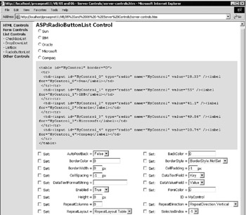
Figure 6-23:
The sourcecode for creating the server control in this page is:
<ASP:CheckBoxList id="MyControl" runat="server" /> However, this is not the only output format you can create. In Figure 6-24, you can see that the controls are laid out inline, rather than in a table. This is because the RepeatLayout property is set to Flow , and the RepeatDirection to Horizontal (using members of the appropriate enumerations). Also, the RepeatColumns property is set to 3 so that the controls appear in threes across the page:
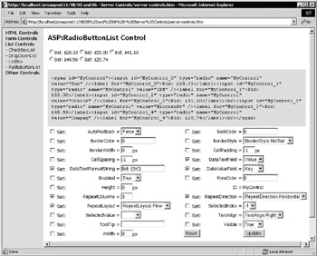
Figure 6-24:
The captions are now the values rather than the company names, which are now the value attributes of the radio buttons. This was achieved by simply swapping the DataTextField and DataValueField settings. As the numeric values are now visible for each option, they are formatted as currency by setting the DataTextFormatString to a suitable format expression. This example used Bid:{0:C} to output the literal characters Bid: and convert the numerical value to currency format, but you can substitute others to experiment.
Reacting to Change Events
The Events demonstration page used in the previous section to show the events for button controls also shows how you can react to the Change event exposed by all the Web Form list controls. When you make a selection in the RadioButtonList or the DropDownList control, the page displays information about that event (see Figure 6-25):
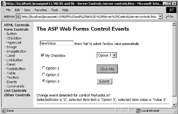
Figure 6-25:
The RadioButtonList and DropDownList controls are defined in the page using explicit values for their contents, rather than data-binding as in the previous examples. However, you must define the contents using ListItem elements rather than <option> elements. Notice that the Text property is set to the string you want appearing in the visible portion of the list in this example, and not provided as the content of the element as is done when <option> elements are used. However, either approach is valid.
<asp:DropDownList id="MyDropDownList" runat="server" OnSelectedIndexChanged="MyListChangeCode" AutoPostBack="true"> <asp:ListItem Text="Option 1" Value="Value 1" /> <asp:ListItem Text="Option 2" Value="Value 2" /> <asp:ListItem Text="Option 3" Value="Value 3" /> </asp:DropDownList> <asp:RadioButtonList id="MyRadioList" runat="server" OnSelectedIndexChanged="MyListChangeCode" AutoPostBack="true"> <asp:ListItem Text="Option 1" Value="Value 1" /> <asp:ListItem Text="Option 2" Value="Value 2" /> <asp:ListItem Text="Option 3" Value="Value 3" /> </asp:RadioButtonList>
You can also see how easy it is to define the individual radio buttons that make up the RadioButtonList control (the same technique is used with a CheckBoxList control). You have to specify only the ListItem element and its properties. The list control knows what type of items to create for the list, and automatically generates the correct HTML.
Extracting Values from List Controls
The two list controls have their AutoPostBack property set to True , so the page will be submitted to the server when the current selection is changed. They have their OnSelectedIndexChanged property set to point to an event handler named MyListChangeCode , which (as usual) is executed on the server when the page is submitted.
The Code for Handling Selection Changes
The code for the MyListChangeCode event handler is shown in the following code. It displays the ID of the control that raised the event, and then extracts the selected item Text and Value and displays these as well:
Sub MyListChangeCode(objSender As Object, objArgs As EventArgs) divResult.InnerHtml &= "Change event detected for control '" _ & objSender.ID & "'<br />SelectedIndex is '" _ & objSender.SelectedIndex _ & "', selected item text is '" _ & objSender.SelectedItem.Text _ & "', selected item value is '" _ & objSender.SelectedItem.Value & "'<br />" End Sub Notice how, in this case, you simply access the SelectedItem property of the list control, which returns a reference to the first item in the list that is selected. In version 1.1, the alternative is simply to query the SelectedValue property instead:
... & "', selected item value is '" _ & objSender.SelectedValue & "'<br />" ... Bear in mind that this returns the value of the Value property (or the value atttribute) of the first selected item. If there is no Value property or value attribute, it returns the value of the Text property (or the literal content of the ASP:ListItem element).
Extracting Multiple Selected Values from List Controls
Both the lists in the previous example allow only a single selection to be made. This is always the case with a RadioButtonList . However, you can specify that a ListBox control will accept multiple selections by setting the SelectionMode property to the value ListSelectionMode.Multiple . In a CheckBoxList , you will usually allow multiple item selection, as this is generally the sole reason for using this type of control.
Multiple selected values from a list control are extracted using exactly the same technique as with the HtmlSelect control in the previous section. Iterate through all the ListItem elements in the Items collection exposed by the list control, checking the Selected property of each one, and extracting the Text and Value properties for those that are selected:
Sub MyCode(objSender As Object, objArgs As EventArgs) Dim strResult As String strResult = "The following items were selected:<br />" Dim objItem As ListItem For Each objItem in objSender.Items If objItem.Selected Then strResult &= objItem.Text & " = " & objItem.Value & "<br />" End If Next outMessage.InnerHtml = strResult End Sub
EAN: 2147483647
Pages: 243