Writing a Simple Control
To demonstrate the basic principles of control development and to show how easy ASP.NET control development is, we'll kick off this chapter by writing a simple Label control, which can render a text message. We'll initially develop the control in C#, review the code, and then rewrite it using VB.NET. This example will hopefully prove to you that control development really isn't that difficult, and it is, at the very least, worth understanding how controls are written so you can better understand how ASP.NET renders pages.
Creating a C# Control
Fire up your text editor or IDE of choice and enter the following C# code:
using System; using System.Web; using System.Web.UI; namespace WroxControls { public class MyFirstControl : Control { protected override void Render(HtmlTextWriter writer) { writer.Write("<h1>ASP.NET Control Development in C#</h1>"); } } }
Save the file as MyFirstControl.cs . Let's briefly examine the code. The first few lines import three namespaces that controls typically use:
-
System : Contains core system classes like String . The code will compile without this, but as most controls make use of the core classes, it is always good practice to include it.
-
System.Web : The parent namespace for all ASP.NET classes. It contains classes such as HttpRequest (the ASP.NET Request object) and HttpResponse (the ASP.NET Response object). Again, the code will compile without this, but as with the System namespace, most control classes will use the ASP.NET intrinsic objects, and so it is good practice to include it.
-
System.Web.UI : Contains the ASP.NET control classes, many of which are divided up into namespaces based upon their family ( System.Web.UI.WebControls , System.Web.UI.HtmlControls , and so on). This reference is needed as you are using the Control and HtmlTextWriter classes.
The next line of the code marks the beginning scope of a new namespace called WroxControls chosen for the control:
namespace WroxControls { Anything declared within the next section of the code until the end of the namespace seven lines later is a member of the WroxControls namespace. This means that the full namespace-qualified reference to the control is WroxControls.MyFirstControl . Any code using our class must use this complete name unless the Using directive is included to import all definitions within the namespace into its default scope.
The next few lines of code declare the class for the server control:
public class MyFirstControl : Control { protected override void Render(HtmlTextWriter writer) { writer.Write("<h1>ASP.NET Control Development in C#</h1>"); } } The class is called MyFirstControl . It's derived from the Control class (which is part of the System.Web.UI namespace) declared as public , and has one protected method called Render . The Control class implements the basic plumbing code required by a server control to be used within an ASP.NET page.
The name of the class is arbitrary, and you can call your controls whatever you like, as they are defined in your namespace. Avoid using names that are already used by ASP.NET (or any other part of the runtime), as name conflicts will occur if two namespaces are imported using the @Import directive by a page, or the using directive inside of a source file. If you decided to create your label control, do not call it Label; call it MyLabel or some other meaningful name such as WroxLabel .
| Note | By marking your class public, you state that anybody can create an instance of the class and use it. If you specify that it is private (by omitting the public attribute), the class will only be usable by other classes within the same namespace. If an ASP.NET page attempts to access a private class, the runtime will raise an error saying the class/type is not defined. This is somewhat confusing when trying to track down an error, so it is always worth checking the access control of a class as it is easy to forget to add the public keyword when developing. |
The Render method is declared using the override keyword. This keyword tells the compiler that the Control base class implements the Render member, but our class wants to override the method so that it can control the output created at runtime itself. The implementation of this method calls the Write method of the HtmlTextWriter object, which results in the HTML "<h1>ASP.NET Control Development in C#</h1>" being written to the page output stream.
Once you have created a server control and compiled it (as we'll demonstrate shortly), you can use it in an ASP.NET page. To do this, use the @Register page directive to associate a tag prefix with a namespace containing a server control, and then use the tag prefix plus the class name of a server control, as shown here:
<%@ Register TagPrefix="Wrox" Namespace="WroxControls" Assembly="MyFirstControl" %> <html> <body> <Wrox:MyFirstControl runat="server" /> </body> </html>
This page tells the ASP.NET page compiler that when it sees any element starting with Wrox: , it should search the WroxControls namespace for a class whose name matches the element name ( MyFirstControl ). Furthermore, the assembly attribute defines the physical assembly in which the class is contained. At runtime, assuming ASP.NET located the class, it creates an instance of it, and calls its Render method to allow it to write data to the output stream being created (for example, the page).
The position of the HTML that a control creates in the final page depends upon where that control is declared inside the ASP.NET page code. In this page we'd expect the server controls output to be rendered after the body tag.
In this example, once the control has inserted its HTML into the output stream, the final page sent down to the client browser will look as follows :
<html> <body> <h1>ASP.NET Control Development in C#</h1> </body> </html>
The actual rendering is shown in Figure 18-1:
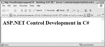
Figure 18-1:
To test the ASP.NET page yourself and view the output, you need to compile the C# sourcecode to create an assembly. This is placed in the bin directory of the application on the web server, causing the ASP.NET runtime to scan the assembly and make an internal note of the namespaces and classes/controls within it.
Compiling the C# Control and Creating an Assembly
To compile the server control class, bring up your text editor, enter the following batch commands, and save the file as make.bat :
set outdir=..\bin\MyFirstControl.dll set assemblies=System.dll,System.Web.dll csc /t:library /out:%outdir% /r:%assemblies% MyFirstControl.cs
| Note | For the class to compile correctly, you'll need to change the outdir parameter in line one, to match a directory configured as a virtual directory on your machine. |
The first two lines of the make.bat file declare a couple of variables . These make the line that actually does the compilation more readable. The compiler options are discussed in Chapter 3. The important points to note about this file are:
-
A reference to the System.dll and System.Web.dll assemblies is added using the /r parameter. This is done so that the compiler knows where to search for the namespaces or classes being imported into the control with the using directive. If you do not add a reference to the assembly containing referenced classes, you'll get a compile error.
-
The compiler's output (MyFirstControl.dll ) is placed directly into the Web application's bin directory. When ASP.NET has to create a class at runtime, this directory is searched. Using the meta data contained in your assembly, ASP.NET will know where to locate the WroxControls namespace specified in the page's @Register directive. By compiling the control directory to the bin directory, you are less likely to forget to copy the assembly.
Run the make.bat file, and you'll see some output, as in Figure 18-2:
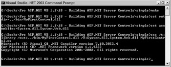
Figure 18-2:
If all goes well, the bin directory should contain the compiled assembly, and you should be able to open the ASP.NET page created earlier and see the output of the control.
Although the C# control we've just developed is about as simple as it gets, and doesn't really have any practical use as yet, you've just seen the full development cycle required for a simple ASP.NET control. Hopefully, you now realize that control development is nothing like it was in the COM days, and that control development seems worth checking out in more detail. Things will get more advanced from here on in, but all of the code is clean and fairly easy to understand once you've grasped the basic concepts.
To show that control development in Visual Basic is just as painless, we'll create an almost identical control called MyFirstControlInVB .
Control Development in Visual Basic
One of the great things about Visual Basic.NET is that the language has arrived in the 21st Century with a bang. It now has all the object-oriented ( OO ) features that make it a first-class programming language. However, as expected, the VB team and C# teams at Microsoft are competing with each other for adopters, and as a result have used different names for certain attributes and directives within their respective languages that they feel to be more suitable for their audience of programmers. This is fair enough, but it does mean that switching between the languages can be initially a little confusing.
Here are a few language differences that should help you convert any of the samples in this chapter between C# and VB:
| C# Example | VB Example |
|---|---|
usingSystem; | ImportsSystem |
namespaceWroxControls{ ... }; | NamespaceWroxControls ... EndNamespace |
publicclass A:B{ ... } | PublicClassA InheritsB ... EndClass |
public class A : B { ... } | Public Class A Implements B ... End Class |
| Note | This chapter will mainly discuss samples in C#, but whenever a new technique is introduced, the equivalent VB.NET code will also be shown. |
Creating an ASP.NET Server Control in VB.NET
Create a new file for the VB control called MyFirstControlInVB.vb and enter the following code:
Imports System Imports System.Web Imports System.Web.UI Namespace WroxControls Public Class MyFirstControlInVB Inherits Control Overrides Protected Sub Render(writer as HtmlTextWriter) writer.Write("<h1>ASP.NET Control Development in VB</h1>") End Sub End Class End Namespace
Using the comparison table, you should be able to see how the code has been translated from C#. The main changes are:
-
All references to using have been replaced with Imports .
-
All the trailing C-style syntax semicolons have been removed.
-
All opening curly brackets have been removed, and the closing curly brackets replaced with the more verbose VB syntax of End Class , End Namespace , and so on.
-
The Class declaration has had the trailing : Control text removed, and a separate line, Inherits Control , has replaced it.
-
The method declaration order has been switched around, as VB declares the name of a variable before the type, unlike C#.
The other change to note is that the HTML output says VB rather than C#, so the browser output is now rendered as in Figure 18-3:
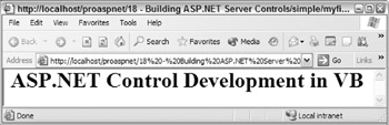
Figure 18-3:
To build the assembly containing this new class, create a makevb.bat file and enter the following commands:
set outdir=..\..\bin\MyFirstControlInVB.dll set assemblies=System.dll,System.Web.dll vbc /t:library /out:%outdir% /r:%assemblies% MyFirstControlInVB.vb
| Note | Again, substitute the '..' in the first line to point to your virtual directory. |
This is similar to the C# make file except that the compiler name is now vbc rather than csc , and the output file is MyFirstControlInVB.dll . Run the make file to compile the control, and then bring up your text editor and enter the following ASP.NET page code, and save it, replacing the original:
<%@ Register TagPrefix="Wrox" Namespace="WroxControls" Assembly="MyFirstControlInVB" %> <html> <body> <Wrox:MyFirstControlInVB runat="server" /> </body> </html>
The page is pretty much identical to the ASP.NET page that used the C# version of the control, but the assembly directive and line in the <body> element is changed to specify the class MyFirstControlInVB instead of MyFirstControl .
Two Controls on One Page
After you have viewed the page to and confirmed your VB control is working, update the page with the additional lines shown here:
<%@ Register TagPrefix="Wrox" Namespace="WroxControls" Assembly="MyFirstControlInVB" %> <%@ Register TagPrefix="WroxCSharp" Namespace="WroxControls" Assembly="MyFirstControl" %> <html> <body> <Wrox:MyFirstControlInVB runat="server" /> <WroxCSharp:MyFirstControl runat="server" /> </body> </html>
The additional register directive associates the assembly containing the C# control with the WroxCSharp tag prefix. This needs to be done since the controls used on this page are in different assemblies. If two controls were in the same assembly, you'd only need one directive.
View this updated page in the browser, and you should see the output from the two controls as shown in Figure 18-4:
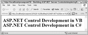
Figure 18-4:
As expected, both controls have rendered themselves in the output stream depending upon their location in the ASP.NET page. The ASP.NET page framework doesn't care what language the controls are written in, as long as they are directly or indirectly derived from the Control class.
Multi-Step Page Rendering
The rendering of a control is just one of many events that occur during its lifetime. As we progress, we'll discuss the other events that occur, and how these events are fired during the lifetime of an ASP.NET page. Unlike ASP, where a page essentially had one execution step, render , an ASP.NET page has many executions steps or phases. As such, control events are fired during different execution stages within a page.
Control Properties
For a server control to be useful, it needs to allow a page developer to influence how the control renders its UI. In ASP.NET pages, the basic way of achieving this is using attributes. For example, assuming you had a server control called MyLabel , which had a Text attribute specifying a label to be printed, you could declare the control a couple of times and make different labels appear:
<%@ Register TagPrefix="Wrox" Namespace="WroxControls" Assembly="MyLabel" %> <html> <body> <Wrox:MyLabel runat="server" Text="Hello" /> <Wrox:MyLabel runat="server" Text="World" /> </body> </html>
When the ASP.NET page framework processes attributes of an HTML element that are part of a server control declaration, it maps them to the public properties of the associated class. These values of the properties are set in the initialization stage of a page. During this stage, for each control, the OnInit method is called once all properties for a control have been set. In this method a control can perform validation of the properties and other operations such as default values.
| Note | During the initialization stage, a control should not try to access other server controls declared on a page, except child controls. Until the initialization stage is reached, other controls on the page will be in an inconsistent state. |
The following code implements the MyLabel control discussed:
using System; using System.Web; using System.Web.UI; namespace WroxControls { public class MyLabel : Control { string _text; public string Text { get{ return _text; } set{ _text = value; } } protected override void OnInit(EventArgs e) { base.OnInit(e); if ( _text == null ) _text = "Here is some default text"; } protected override void Render(HtmlTextWriter writer) { writer.Write("<h1>" + _text + "</h1>" ); } } }
The main areas of interest in this code are:
-
The Text property allows the value of the label to be set and retrieved.
-
The OnInit method sets the Text property to a default value if it's not specified. For our example, this shows that properties of the class are set just before OnInit is called.
-
The Render method has been updated to write the control's Text property out between the <h1> elements.
With these code changes in place, we can create a new ASP.NET page that has three MyLabel controls:
<%@ Register TagPrefix="Wrox" Namespace="WroxControls" Assembly="MyLabel" %> <html> <body> <Wrox:MyLabel runat="server" Text="Hello" /> <Wrox:MyLabel runat="server" Text="World" /> <Wrox:MyLabel runat="server"/> </body> </html>
This page should render two <h1> elements with the text Hello and World, and one <h1> element with the text Here is some default text, since not specifying the Text attribute should result in the default text appearing.
Figure 18-5 shows the output from this page:
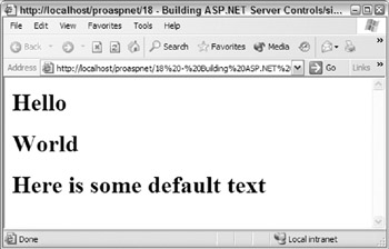
Figure 18-5:
Attribute Value Conversion
When ASP.NET matches an attribute to a property, it will perform intelligent conversion of the attribute value. If a class property is a string , ASP.NET will just do a simple mapping and initialize the attribute. If the property is an integer or long , the attribute value will be converted to a number, and then set. If a value is an enumeration, ASP.NET will match the string value against an enumeration name , and then set the correct enumeration value. The same type of logical conversion occurs for other types, such as Boolean . If a value cannot be converted “for example, if you try and use a string value for a numeric property “ASP.NET will generate a parse error.
To see some of these conversions, add a RepeatCount property to the control, which is defined as an integer , and a ForeColor property defined as System.Drawing. Color . These new properties will enable page developers to specify how many times a label should appear, and the color used for the text.
In this updated page, use the RepeatCount attribute to tell the first label to draw itself three times. Set the second label to Green and the third label to Orange , using the ForeColor attribute. Since no ForeColor attribute is specified for the first label, it will appear as the default color selected ( Blue ):
<%@ Register TagPrefix="Wrox" Namespace="WroxControls" Assembly="MyLabel" %> <html> <body> <Wrox:MyLabel runat="server" RepeatCount="3" Text="Hello" /> <Wrox:MyLabel runat="server" Text="World" ForeColor="Green" /> <Wrox:MyLabel runat="server" ForeColor="Orange" /> </body> </html>
The output for this new page is shown in Figure 18-6, where Hello now appears three times, and the text is in different colors:
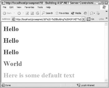
Figure 18-6:
Implementing these new properties in the server control is straightforward because ASP.NET provides all of the conversion processing, keeping the code clean and simple. There is nothing specific to ASP.NET in the code:
public class MyLabel : Control { int _repeatCount = 1; public int RepeatCount { get { return _repeatCount; } set { _repeatCount = value; } } Color _foreColor = Color.Blue; public Color ForeColor { get { return _foreColor; } set { _foreColor = value; } } }
| Note | The Color enumeration is defined in the System.Drawing namespace. So, you have to add a using statement for this to the code. |
In this code, the default RepeatCount is made equal to 1 , and the default color Blue . Both these defaults are set using member initializers rather than by adding code to the OnInit method. Typically, this is the best way to specify default values for a variable. You only really need to add initialization code in OnInit for more complex initialization. For example, in OnInit you could ensure the RepeatCount is within a valid range, throwing an ArgumentException if the count exceeds a reasonable number.
With these new properties in place, the Render method is updated to output the <h1> element and its associated text RepeatCount times. The color of the text will be set using a style attribute and a color selector. To convert the Color structure type, use the System.Drawing.ColorTranslator class. The ToHtml method of this class is used in the code to convert the _ foreColor enumeration value into the HTML color value. Here is the updated Render method:
protected override void Render(HtmlTextWriter writer) { int loop; for( loop=0; loop < _repeatCount; loop++ ) { writer.Write("<h1 style='color:" + ColorTranslator.ToHtml(_foreColor) + "'>" + _text + "</h1>" ); } }
Using HtmlTextWriter Rendering Services
The label server control has started becoming more useful now as we've enabled basic customizations such as the repeat count and foreground color. The only problem with these customizations is that they have increased the complexity of the created HTML. As the number of attributes a control supports increases , so does the complexity of the HTML it has to emit, and the code that needs to be created. To keep the code readable and to reduce the likelihood of HTML formatting errors, use the rendering services of the HtmlTextWriter class to manage HTML tag and attribute creation.
The HtmlTextWriter class provides services for:
-
Writing HTML or other markup languages to the output stream
-
Managing the creation of well formed elements
-
Creating attributes
-
Creating a style attribute
Using the services of the HtmlTextWriter , you can rewrite the Render method as follows:
protected override void Render(HtmlTextWriter writer) { int loop; for( loop=0; loop < _repeatCount; loop++ ) { writer.AddStyleAttribute( "color", ColorTranslator.ToHtml(_foreColor) ); writer.RenderBeginTag("h1"); writer.Write( _text ); writer.RenderEndTag(); } }
This code is much more readable, maintainable , and less error prone, since the HtmlTextWriter class takes on the responsibility of formatting the HTML. The call to AddStyleAttribute tells the HtmlTextWriter that the next element it starts should have a color style element with a specified value. You can call this multiple times, and the HtmlTextWriter will automatically emit a matching style element.
The call to RenderBeginTag tells the HtmlTextWriter to output a start tag for the < h1> element, outputting any attributes that have previously been added using AddStyleAttribute , or AddAttribute . AddAttribute can be used to output a normal HTML attribute.
The call to Write tells the HtmlTextWriter to output the specified content to the HTML stream. Various overloads for Write allow you to pass in any type. All types will be converted to a string and written to the output stream. If there is not a specific overload for a type, the Object.ToString method will be used. The RenderEndTag call tells the HtmlTextWriter to output the close tag for the last tag opened using RenderBeginTag . These two methods automatically stack and recursively manage element tags, and can be used to emit complex nested HTML elements.
The HTML output from our page using the rendering services of HtmlTextWriter looks like this:
<html> <body> <h1 style="color:Blue;"> Hello </h1><h1 style="color:Blue;"> Hello </h1><h1 style="color:Blue;"> Hello </h1> <h1 style="color:Green;"> World </h1> <h1 style="color:Orange;"> Here is some default text </h1> </body> </html>
As you can see, the HtmlTextWriter also performs automatic indentation of the markup it creates.
Object Properties
Server controls can expose other objects and primitive types, as properties. A server control declaration within an ASP.NET page can directly set the properties of an object in two ways. The first method of setting object properties is using the object walker syntax for attribute names, when a hyphen ( - ) character is used instead of a period ( . ) to specify an object's property:
<Wrox:MyFirstControl MyObject-A="hello" MyObject-B="World" runat="server" />
The object walker syntax can walk any number of sub-objects of an object property too:
<Wrox:MyFirstControl MyObject-AnotherObject-A="hello" runat="server" />
Supporting an object property is straightforward. For example, this simple class definition allows two string values to be set using the properties A and B :
public class SampleClassProperty { string _valueA; string _valueB; public string A { get { return _valueA; } set { _valueA = value; } } public string B { get { return _valueB; } set { _valueB = value; } } }
A server control could use it for one of its object properties, MyObject , as follows:
SampleClassProperty _exampleObjectProperty = new SampleClassProperty(); public SampleClassProperty MyObject { get { return _exampleObjectProperty; } }
By enabling object properties to be initialized , server controls can group together logically related attributes and can easily expose them on one or more controls, with very little code. The style object, used by most ASP.NET controls, is a good example of this.
Another way of initializing object properties within a server control is by using nested elements:
<Wrox:MyFirstControl runat="server"> <MyObject A="Hello" B="Hello" /> </Wrox:MyFirstControl>
Most ASP.NET Web controls support this. However, you need to annotate your server control class definition with the ParseChildren attribute, specifying a value of true :
namespace WroxControls { [ ParseChildren(true) ] public class MyLabel : Control ...
When the ASP.NET page compiler sees this attribute, the default control builder that ASP.NET uses to parse sub-content for a server control declaration knows that each element is an object property. If you do not specify this attribute, or specify false , ASP.NET assumes that nested elements should be added as child controls (covered later in this chapter).
| Note | A control builder is the parser used by ASP.NET to process the inner content of a server control declaration. Control builders are an advanced topic covered at the end of this chapter. |
If sub-elements of control declarations also contain elements, such elements are assumed to be object properties of the outer object property. For example, assuming the mythical MyObject element mapped to an object called MyObject, which had two object properties called SomeObjectPropertyA and SomeObjectPropertyB , you could declare and initialize the control as follows:
<Wrox:MyFirstControl runat="server"> <MyObject A="Hello" B="Hello"> <SomeObjectPropertyA SomeAttribute="Another value" /> <SomeObjectPropertyB SomeAttribute="Another value" /> </MyObject> </Wrox:MyFirstControl>
You could also use the object walker syntax, although that is less readable for complex server control declarations:
<Wrox:MyFirstControl MyObject-A="hello" MyObject-B="World" MyObject-SomeObjectPropertyA-SomeAttribute="Another value" MyObject-SomeObjectPropertyB-SomeAttribute="Another value" runat="server" />
To demonstrate using object properties in a server control let's take a look at the Style object.
Using the System.Web.UI.WebControls.Style Object
The Style class has methods and properties that make working with style attributes more intuitive, and very consistent through all server controls. This class handles style attributes such as those for colors, borders, and fonts. If your server control is to expose style elements, it should use the Style class.
To use the style object, you can add a new member variable called _style to the control, along with a read-only property accessor to enable the ASP.NET pages to access it:
Style _style = new Style(); public Style LabelStyle { get { return _style; } }
As you'd be using the Style object for building the style attribute eventually rendered down to the browser, it's necessary to change the ForeColor property accessor to use the Style object to set and retrieve the ForeColor value. This removes the need for the _foreColor member variable, and so it can be deleted. The updated ForeColor property accessor code looks like this:
public Color ForeColor { get { return _style.ForeColor; } set { _style.ForeColor = value; } }
Finally, update the Render method to use the AddAttributesToRender method of the Style class. This takes an HtmlTextWriter object as an input parameter, and calls AddStyleAttribute depending on the various style attributes that have been set using the Style object:
protected override void Render(HtmlTextWriter writer) { int loop; for( loop=0; loop < _repeatCount; loop++ ) { _style.AddAttributesToRender( writer ); writer.RenderBeginTag("h1"); writer.Write( _text ); writer.RenderEndTag(); } }
With these changes in place, you can create a label with the text Server Controls Are Cool, displayed in a yellow font, on a black background, using a 36-point font size as follows:
<%@ Register TagPrefix="Wrox" Namespace="WroxControls" Assembly="MyLabel" %> <html> <body> <Wrox:MyLabel runat="server" ForeColor="Yellow" LabelStyle-BackColor="Black" LabelStyle-Font-Size="36" Text="Server Controls Are Cool" /> </body> </html>
The rendered output is shown in Figure 18-7:
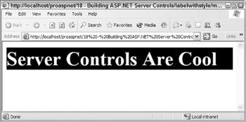
Figure 18-7:
Using the WebControl Class for Server Controls That Use Style
For controls, such as the label, that need style management, derive from the WebControl class in the System.Web.UI.WebControls namespace. This class adds the following functionality to a server control:
-
Exposes properties that allow style colors to be set using properties like ForeColor , BackColor , and Font .
-
Allows expando attributes (attributes that are not pre-defined properties of the control) to be specified in a server-control declaration. Expando attributes are not interpreted and are written directly to the output HTML stream. By default, the Control class throws an exception if an attribute is not a property of the server control.
-
Provides consistency with the standard ASP.NET Web controls since they derive from the WebControl class.
-
Persists the style object and any settings or state during postbacks, using view state. In the control example earlier, when the style object was used, any style changes made in event handlers or in other code would not have been remembered after a postback, since the state of the style object was not being round tripped using viewstate. For the control to remember any style changes (because it is derived from Control ), you'd need to implement custom statement management, by overriding the LoadViewState and SaveViewState methods. Viewstate is discussed later in the chapter.
The WebControl class is designed to either assist with the rendering of a control, or take complete control of the rendering. For a simple control such as the label, the WebControl class can replace most of the code written.
To use the WebControl class, make the following changes to the code:
-
Derive from the WebControl class rather than Control class.
-
Declare a public constructor that calls the base constructor, specifying which HTML element to render.
-
Override the RenderContents method to emit the content you want within your <h1> element The WebControl class takes responsibility for rendering the attributes as well as the begin and end-tags, so the Render method is removed.
-
Remove all of the style properties implemented earlier, since the WebControl will automatically have implemented them.
After making these changes, the C# control code looks like this:
using System; using System.Web; using System.Web.UI; using System.Web.UI.WebControls; namespace WroxControls { public class MyLabel : WebControl { string _text; public MyLabel() : base ("H1") { } public string Text { get{ return _text; } set{ _text = value; } } protected override void OnInit(EventArgs e) { base.OnInit(e); if ( _text == null) _text = "Here is some default text"; } protected override void RenderContents(HtmlTextWriter writer) { writer.Write( _text); } } }
The same control in VB.NET:
Imports System Imports System.Web Imports System.Web.UI Imports System.Web.UI.WebControls Namespace WroxControls Public Class MyLabel Inherits WebControl Private _text As String Public Sub New() MyBase.New("H1") End Sub 'New Public Property Text As String Get Return _text End Get Set _text = value End Set End Property Protected Overrides Sub OnInit(e As EventArgs) MyBase.OnInit(e) If _text Is Nothing Then _text = "Here is some default text" End If End Sub Protected Overrides Sub RenderContents(writer As HtmlTextWriter) writer.Write(_text) End Sub End Class End Namespace
With these changes, you need to change the ASP.NET page, since the available properties names for the control have changed. Use the WebControl class documentation to get a list of all the available properties.
Here is the updated page, which now uses properties consistent with all the server controls provided as part of ASP.NET, which were discussed in Chapter 5:
<%@ Register TagPrefix="Wrox" Namespace="WroxControls" Assembly="MyLabel" %> <html> <body> <Wrox:MyLabel runat="server" ForeColor="Yellow" BackColor="Black" Font-Size="36" Text="Web Controls" /> </body> </html>
For controls that require only one HTML root element to be rendered, the updated control code provides a good model to follow when building server controls. Your server controls should always derive from the WebControl class unless they do not render any UI, in which case the services provided by WebControl do not provide any benefit.
You can use all the other techniques to render HTML so far with server controls derived from WebControl , the only difference is that your code is moved to the RenderContents method.
In this revised code demonstrating the use of WebControl , I have removed support for the RepeatCount property, since that would require one or more HTML elements to be rendered at the root level (you can have any number of controls within the root element). This is something a basic Web control can do. To do this, you have to override the Render method.
To implement the RepeatCount property in the implementation, the overridden Render method calls the base implementation of Render a number of times. Let's see the necessary calling code in C# and VB.NET.
The following C# code just calls the base Render method thrice to demonstrate the technique:
protected override void Render(HtmlTextWriter writer) { for(int i=0; i < 3; i++ ) { base.Render( writer ); } }
In VB.NET:
Protected Overrides Sub Render(writer As HtmlTextWriter) Dim i As Integer For i = 0 To 2 MyBase.Render(writer) Next i End Sub 'Render
As expected, the control renders the label three times, as shown in Figure 18-8:
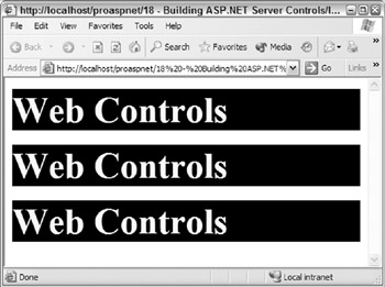
Figure 18-8:
The server control can also be programmatically manipulated, just like any other ASP.NET server control provided out of the box. The following ASP.NET page sets all the properties of the server-control properties within the Page_Init event:
<%@ Register TagPrefix="Wrox" Namespace="WroxControls" Assembly="MyLabel" %> <%@ Import Namespace="System.Drawing" %> <script runat="server" language="C#"> void Page_Init( object sender, EventArgs e ) { ourLabel.Text = "Web Controls"; ourLabel.ForeColor = Color.Yellow; ourLabel.BackColor = Color.Black; ourLabel.Font.Size = 36; } </script> <html> <body> <Wrox:MyLabel runat="server" id="ourLabel" /> </body> </html>
Now that we've created a couple of server controls that generate their UI by emitting HTML, let's take a look at composite controls. These controls render their UI by reusing other server controls. An ASP.NET page is a good example of a composite control. So let's take a look at how they work in detail.
Composite Controls
All ASP.NET dynamic pages are created by the ASP.NET runtime using ASP.NET controls. You may not have realized it, but we have already built several ASP.NET controls in the earlier chapters just by creating ASP.NET pages and user controls. The ASP.NET page framework automatically converts and compiles pages into server controls contained within a dynamically created assembly the first time a page is requested , as shown in Figure 18-9:
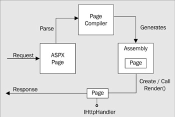
Figure 18-9:
This server control is then used to render the page. Subsequently, when a page is requested, the precompiled server control can be instantiated and called, resulting in great performance, as Figure 18-10 suggests:
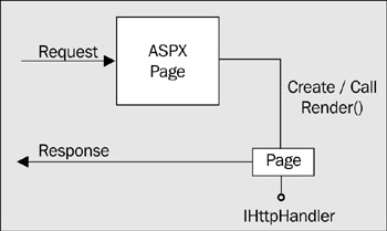
Figure 18-10:
The assemblies created for ASP.NET pages are automatically managed for you. If you search around your Windows system directory, you'll find a Temporary ASP.NET Files directory. Within this you'll find subdirectories for the various web sites on your machine, which in turn contain the assemblies for ASP.NET pages.
Open up one of these generated assemblies using the ILDASM tool (Figure 18-11). You'll see that they typically contain a single class with the same name as the ASP.NET page. This class extends (derives from) the System.Web.UI.Page class (see the sixth item from the root in the tree control):
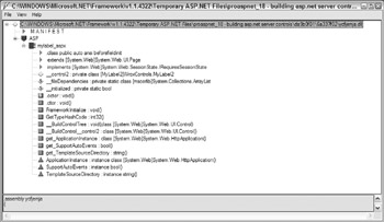
Figure 18-11:
The Page object (located in the System.Web.dll assembly) derives from the TemplateControl class, which in turn derives from the Control class. Figure 18-12 shows the main ASP.NET control classes and their inheritance hierarchy:
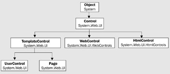
Figure 18-12:
Here is a brief description of each of these classes:
-
Control : Provides a common base class for all other control types.
-
WebControl : Provides methods and properties for dealing with the style. This class is the base class for all ASP web controls. These are always declared in an ASP.NET page using an ASP prefix.
-
HtmlControl : The base class for standard HTML elements, such as input . Typically, you will never derive from this control.
-
TemplateControl : Contains functionality that is shared between user controls and pages, such as support for loading user controls ( .ascx ) or templates.
-
UserControl : The base class from which all user controls derive.
-
Page : The base class from which all dynamically compiled ASP.NET pages derive.
The actual code generated by ASP.NET for these dynamically generated classes is not that different from the code we have just written for the label control. One key difference is that it uses control composition to actually generate the page. This means that a page is a server control that uses other server controls to render its UI.
Building a Composite Control
A server control can be a container for other controls. The Control class has a Controls property of the ControlsCollection type. This collection class can hold zero or more child controls. When a control is rendered, each of its child controls is called upon to render itself. If these child controls contain child controls, this process repeats until all controls have been rendered.
By default, if you derive a server control from the Control class, nested elements declared within an ASP.NET page will be added to the Controls collection, assuming you haven't used the ParseChildren attribute discussed earlier to change the default behavior.
Suppose you had a server control with a class definition that basically did nothing:
using System; using System.Web; using System.Web.UI; namespace WroxControls { public class CompositeControl : Control { } }
And then declared that control with nested sub-controls (a button and some literal text) on a page:
<%@ Register TagPrefix="Wrox" Namespace="WroxControls" Assembly="MyFirstControl" %> <html> <body> <form runat="server"> <Wrox:CompositeControl runat="server"> <asp:button Text="A Button" runat="server" /> Some Text </Wrox:CompositeControl> </form> </body> </html>
The ASP.NET page parser automatically creates a LiteralControl for each block of text or significant whitespace.
The control would actually render the button and the literal text, since the default Render implementation invokes the Render method of each control in the Controls collection, as shown in Figure 18-13:
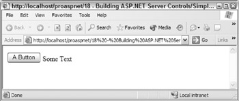
Figure 18-13:
When writing a composite control, the control itself typically decides on what child controls to create, rather than the user. If the user is going to create all the UI, you should use a User control rather than a custom server control.
Server controls override the CreateChildControls method and populate the Controls collection. The ASP.NET Framework calls this method to signal to a control that it should create its child controls. Which controls you populate the control's collection with will depend on the UI your control renders. Any class can be used as long as it derives from the Control class.
The code required to implement our first server control using control composition is shown here:
using System; using System.Web; using System.Web.UI; namespace WroxControls { public class CompositeControl : Control, INamingContainer { protected override void CreateChildControls() { LiteralControl text; text = new LiteralControl( "<h1>ASP.NET Control Development in C#</h1>" ); Controls.Add(text); } } }
In this code, we have removed the Render method and replaced it with the CreateChildControls method. When called, this code creates a single LiteralControl and adds it to the child control collection. The class has also been modified to derive from the INamingContainer interface to indicate that it is a naming container . We'll discuss naming containers in more detail later in this chapter, but as a general rule, all composite controls should implement this.
By removing the Render method from the class, the default implementation of the Render method defined in the Control class is called during the render phase of a page. The default Render method enumerates the Controls collection and invokes the RenderControl method of each child control in turn. This effectively causes a control's UI to be drawn, by allowing each child control to output their own HTML, by either using the HtmlTextWriter object, or by using child controls.
When deriving from the WebControl class and overriding the RenderContents methods, always call the base implementation of RenderContents if your WebControl uses control composition, as this method calls its base classes' (the Control class) Render method. The same is true if you derive from Control and override Control.Render (assuming you want child controls declared in a page to be rendered).
CreateChildControls
The CreateChildControls method can be called at different stages in the life cycle of a composite control, but it will only be called once per instantiation of the control, unless you explicitly reset the state of a control using the ChildControlsCreated property. In this respect, it is a non-deterministic event that occurs during the lifetime of a control, unlike the Init and Render events already discussed, which occur at fixed times in the life cycle of a page, and thus are deterministic.
If not called before, the CreateChildControls method will always be called in the pre-render stage of a page. The method will be called prior to this if either the public FindControl method of the control is called, or if the Control itself calls the protected EnsureChildControls method. The FindControl method is used when pushing postback data into a control, so CreateChildControls will also be called during the postback stage of a page, if there is postback data associated with a given control.
As a control author, always use the EnsureChildControls method if you need to populate your controls collection prematurely. This method calls CreateChildControls only if the ChildControlsCreated public property is false . If the property is false , it is set to true once CreateChildControls is called. This method ensures child controls are only created once.
If the ChildControlsCreated property is set to false , all child controls are released automatically. Subsequently, CreateChildControls may be called again.
ASP.NET Pages and Composite Controls
An ASP.NET page is essentially compiled into a composite control. Consider this simple page:
<html> <body> <form method="post" runat="server"> Name: <asp:textbox runat="server"/> </form> </body> </html>
When compiled, the page is rendered using the server controls (shown in Figure 18-14), which effectively form a hierarchical tree of server controls:
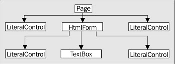
Figure 18-14:
The Page object's Controls collection contains the LiteralControl , HtmlForm , and LiteralControl child controls. The HtmlForm control contains the LiteralControl , TextBox , and LiteralControl child controls. When the page is rendered, each of these controls is rendered in turn, starting at the top, recursively rendering each child control before moving on to the next sibling. So, for this page the rendering sequence would be Page , LiteralControl , HtmlForm , LiteralControl , TextBox , LiteralControl , LiteralControl .
Control Tree Navigation
A server control tree can be navigated using different methods of the Control class. To navigate down one level, you use the Control.Controls collection. To navigate up the tree one level, from a control to its parent, you use the Parent property. To navigate from a Control to the container Page , you use the Control object's Page property. To recursively search down the tree for a control, you use the Control object's FindControl method.
The Advantages of Control Composition
Using control composition for simple controls really doesn't have much advantage over rendering the HTML directly using HtmlTextWriter . To see when there is a much greater benefit, let's create a more complex control. This control will create an HTML table below an <h1> element. The table will contain ten rows, each with five cells . You can render this using the HtmlTextWriter or by creating lots of LiteralContent objects, but it makes a lot more sense to use the high-level ASP.NET web controls seen in earlier chapters. Although we have typically only made references to these controls in ASP.NET pages before, creating these controls dynamically within a control is straightforward:
using System; using System.Web; using System.Web.UI; using System.Web.UI.WebControls; namespace WroxControls { public class CompositeTableControl : Control, INamingContainer { Table _table; // Make table a member so we can access it at any point protected override void CreateChildControls() { LiteralControl text; text = new LiteralControl( "<h1>ASP.NET Control Development in C#</h1>"); Controls.Add(text); TableRow row; TableCell cell; // Create a table and set a 2-pixel border _table = new Table(); _table.BorderWidth = 2; Controls.Add(_table); // Add 10 rows each with 5 cells for(int x = 0; x < 10; x++) { // Create a row and add it to the table row = new TableRow(); _table.Rows.Add(row); // Create a cell that contains the text for(int y = 0; y < 5; y++) { text = new LiteralControl("Row: " + x + " Cell: " + y); cell = new TableCell(); cell.Controls.Add(text); row.Cells.Add(cell); } } } } }
This code may look at bit complex a first, but what it's doing is very simple. Firstly, it adds the LiteralControl containing the <h1> element as a child control. Next, it creates a Table object ( System.Web.UI.WebControls.Table ), sets the border width to two pixels, and adds that as a child control:
_table = new Table(); _table.BorderWidth = 2; Controls.Add(_table);
The table is then populated with rows by running a for loop for ten iterations, creating, and adding a TableRow object using the Rows collection property:
row = new TableRow(); _table.Rows.Add(row);
Finally, for each row added, an inner loop is executed for five iterations adding a TableCell object that has a LiteralControl as its child. The Text of the LiteralControl is set to indicate the current row and cell. Compiling and executing this code produces the results shown in Figure 18-15:
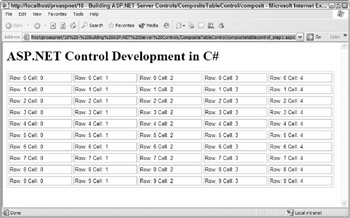
Figure 18-15:
All of the controls used (such as Table , TableRow , and TableCell, ) derive from the Control class somewhere in their inheritance hierarchy. Each of these controls also uses control composition to render its UI. The control tree for the page actually looks like Figure 18-16:
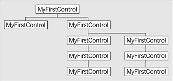
Figure 18-16:
If you view the source for this generated page, you'll see around 130 lines of HTML, none of which have been manually created. There are a number of key advantages of using control composition over direct rendering:
-
You save yourselves a great deal of error-prone HTML creation via code, and therefore save time and increase productivity.
-
You programmatically create objects, call methods, and set properties. The code written is therefore simple to read and easily extendable at a later date.
-
You have not been exposed to the underlying HTML generated by the various controls used.
-
The fact that they actually render table , tr , and td HTML elements to the page is an implementation detail that you don't have to worry about. In theory, the output can just as easily be WML or any other markup language “the control will still work fine.
The argument for using composite controls becomes more apparent as the child controls you use “such as the Table control “provide more and more functionality and hence save more time and effort. As an example, let's modify the table so the user can edit each cell within it, by using a TextBox control (rather than a LiteralControl ) within the TableCell control:
for( int y=0; y < 5; y++ ) { TextBox textbox; textbox = new TextBox(); textbox.Text = "Row: " + x + " Cell: " + y; cell = new TableCell(); cell.Controls.Add(textbox); ...
By changing four lines of code, we now have an editable table as shown in Figure 18-17:
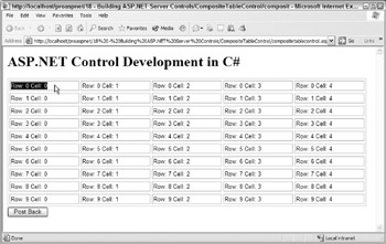
Figure 18-17:
The underlying HTML generated by our control is now even more complex, with the child controls creating all the input elements needed within the td elements:
<html> <body> <form name="ctrl0" method="post" action="compositetablecontrol.aspx" id="ctrl0"> <input type="hidden" name="__VIEWSTATE" value="dDwtNTMxODUzMzMxOzs+" /> <h1>ASP.NET Control Development in C#</h1> <table border="0" style="border-width:2px;border-style:solid;"> <tr> <td> <input name="grid:ctrl2" type="text" value="Row: 0 Cell: 0" /> </td><td> <input name="grid:ctrl3" type="text" value="Row: 0 Cell: 1" /> </td><td> <input name="grid:ctrl4" type="text" value="Row: 0 Cell: 2" /> </td><td> <input name="grid:ctrl5" type="text" value="Row: 0 Cell: 3" /> </td><td> <input name="grid:ctrl6" type="text" value="Row: 0 Cell: 4" /> </td> </tr><tr>...
You'll notice within this HTML that each of the input elements has a name attribute. By default, these id s are assigned sequentially by ASP.NET as the child controls are created and added to the control.
When a postback occurs, ASP.NET uses these id s to automatically push postback data into server controls that are created with the same id . This automatic management of postback data is part of the magic that gives the impression to page developers that controls are intelligent “developers don't have to write lots of code to manually make controls (like a textbox) remember their state. Of course, under the hood, a control author has to implement some code that maps the postback data to properties, but once that is done, page developers and custom control writers can simply reuse an intelligent self-maintaining control.
EAN: 2147483647
Pages: 243