Zones and WebParts
| Once you have a menu, you need to decide upon the zones the page will have. A zone is a templated control that references all the WebParts for the current zone and synchronizes the layout, appearance, and colors of these WebParts. An ASP.NET page can contain more than one WebPartZone, as seen in Figure 13.3. Figure 13.3. Multiple WebPartZones on a page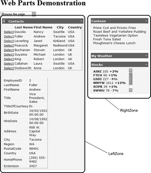 You cannot see the zones when browsing a page, but with any of the other page states, the zones are shown. For example, Figure 13.4, shows a page being designed, and the WebPart Framework shows the zones so that you can easily see where the drag and drop points are. Figure 13.4. Zones shown when designing a page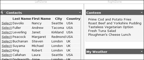 A WebPartZone declaration follows the same principles as most other familiar templated controls. It accepts attributes that define the behavior of the zone and all of the WebParts within the zone, elements that define the style of specific sections of the output, and a ZoneTemplate that contains the declaration of the WebParts that will appear in this zone by default (see Listing 13.6). Listing 13.6. Outline of a Simple WebPartZone Control Declaration
Bear in mind that the layout of the WebParts in the page may be different when the page is actually displayed. If this is a postback, and editing of the page layout is enabled, the user may have moved WebParts from one zone to another. Likewise, if personalization is enabled for the page, WebParts may appear in a different zone from the original location. WebPartsAs mentioned earlier, you can only have two kinds of controls within a WebPartZone:
The controls are placed within the zones just like they would be on any other page. For example, consider Listing 13.7, which shows two zones with a variety of controls. The Contacts, Canteen, and Stocks are User Controls, while the MSNWeatherWebPart is a custom server control, from code in the App_Code folder. The design time experience of WebParts is excellent, as seen in Figure 13.5, where the zones appear as containers and can be placed anywhere on the page (those in the figure have CSS styling applied for their layout). Within the zones, the WebParts can be placed using tables, CSS, or just in straight flow mode. Figure 13.5. Designing with WebParts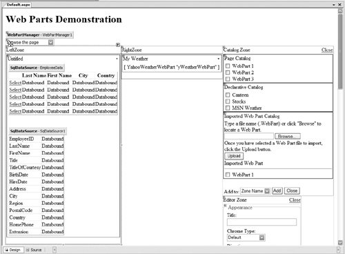 By just placing these controls within the zone, they automatically become WebParts. This means that they automatically inherit the functionality of WebParts, such as having a title bar, the minimize, close, and editing buttons (depending upon the page mode). Each WebPart within a zone can be moved around either within the zone or to other zones, or minimized or closed (assuming the WebPart allows it). One thing you may notice is that in Source view of the page, the User Controls for the Canteen and Stocks show a validation warning on their Title attribute. This is because a User Control doesn't have a Title attribute, but at runtime any control placed within a WebPartZone automatically inherits properties of a WebPart, one of which is Title. So at design time you get a warning, but at runtime the Title property is part of the User Control. Listing 13.7. Placing Controls within a WebPartZone
Another feature that WebParts automatically get is the user experience when users design a page. Any WebPart can be moved around the page, as seen in Figure 13.1. When the page is in design mode, you simply drag the title bar of a WebPart and drop it into its new location. In design mode, the zones are shown and an insert mark is dynamically placed, showing you where the WebPart would be placed when you drop it. You don't have to provide any code or functionality for this to work because it's provided by the WebParts framework. Implementing WebPartsUser Controls make excellent WebParts, but you may find you need more control over how the control is displayed in a zone. Or perhaps you wish to deploy a WebPart to multiple applications, or even to third parties, in which case you will probably consider writing a custom server control. Or perhaps you simply want to avoid the validation warning, or would like control over the default properties of a WebPart. If so, then you can implement the IWebPart interface and set the properties yourself, either within User Controls or custom server controls. User Controls as WebPartsFor a User Control, you can implement IWebPart by modifying the code-behind class, like this: public partial class Contacts : System.Web.UI.UserControl, IWebPart You then need to implement the properties defined by the interface. You can do this manually or have Visual Studio implement defaults for you. When you have typed IWebPart, a small SmallTask appears just underneath the I, allowing you to select from one of two implementation methods (see Figure 13.6); selecting one will add the stub properties and methods that the interface requires. For the IWebPart interface, there are only properties, which are:
Figure 13.6. Automatically implementing interfaces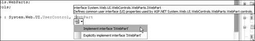 Listing 13.8 shows the implemented properties for the Contacts user control. These simply define the default values for this WebPart, and users can change them if they personalize the page. Implementing the IWebPart interface isn't required for user controls but does give you a greater degree of control over the default values for properties. Custom Controls as WebPartsThe other way of implementing WebParts is to write a custom server control, and in this case you inherit from WebPart, which provides the base implementation for WebParts. The MSN Weather WebPart is extremely simple, because it simply writes out some controls and client script that fetches the weather from MSN. The code is shown in Listing 13.9. This code shows a standard server control, which renders out some content that just happens to consist of HTML and JavaScript. The ZipCode property identifies the region to show the weather for; later in the chapter you'll see how this property can be replaced by a connection to other WebParts so that the ZipCode is automatically supplied. Listing 13.8. The Contacts User Control WebPart Properties
WebPart Chrome and StyleThe non-content areas of a WebPart (the border, title bar, open/close/minimize buttons, and so on) are together referred to as the chrome of the window. The individual buttons and command links on the title bar of a WebPart, and the links available in a drop-down list from the title bar of each WebPart, execute actions that are implemented by the WebParts technology. These buttons or links, their appearance, and the actions they execute are defined as a series of individual verbs, as shown in Figure 13.7. Figure 13.7. WebPart chrome and style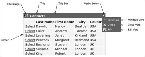 Listing 13.9. The MSN Weather WebPart
The chrome for a WebPart can be changed, either within the WebPart itself, or in the zone, in which case all WebParts inherit the same chrome. For example, consider Listing 13.10, which shows the definition for a zone. There are elements allowing definitions for the various verbsthe actions that can take place on the WebParts in the zone. In this example, each verb defines an image to show alongside the title, and to set a description for the verb, which shows as a tooltip. Each verb also has an associated style, allowing the look to be altered. Listing 13.10. Changing the Chrome of WebParts
The chrome can be set in each page, on each zone, or by way of themes (see Chapter 12 for more on themes), allowing you to remove the presentation of the WebParts from the page that includes them. This allows the pages to remain clear and easy to read, so that you don't get bogged down by lots of styling. Styling can be performed either in code or using the AutoFormat option in Design view. There are many styles, covering the WebPart as a whole, the chrome, the verb menu, the individual items on a verb menu, and so on. WebPart VerbsAs seen, there are verbs that identify the actions allowable for a WebPart. Not all verbs are available all of the time, because availability depends upon the state of the page. For example, minimize isn't visible when the WebPart is already minimized. The allowable verbs are:
Each of these verbs can have their properties set individually, such as the title or an image, and they may cause zones to appear, depending upon the verb selected. Since the verbs are added to WebParts automatically, you don't have to code anything, although if building WebParts as custom server controls, you can interact directly with the verbs and even create your own verbs. |
EAN: 2147483647
Pages: 147