The GridView Control
| One of the most useful controls introduced with ASP.NET 1.0 is the DataGrid . This control makes it easy to display rowsets of data, provides plenty of opportunities for formatting the output, and even supports in-line editing of the data. However, to use a DataGrid you still have to write code that generates the rowset and then bind it to the DataGrid control at runtime. As you saw in Chapter 3, the new data source controls in ASP.NET 2.0 remove the need to write data access code and can also expose various kinds of data as rowsets suitable for data binding to any of the ASP.NET server controls. However, to take maximum advantage of these data source controls, Microsoft added a new grid control in version 2.0. The GridView control enables data to be displayed, sorted, and edited without having to write any code at all. It can even provide a paging facility andwhen combined with the DetailsView control that you'll read more about later in this chapterenables you to create pages that allow new data rows to be inserted. An Overview of the GridView ControlIn basic terms, the GridView is similar to the version 1.0 DataGrid (which is, of course, still provided within the Framework). It exposes many of the same features for formatting the data content using style attributes and templates. However, it also adds a few extra features, such as support for multiple primary keys, extra opportunities for customizing the appearance, and new column types and templating options. There is also a new model for handling or canceling events. The aims of the GridView and DetailsView control combination are the following:
While the GridView control does have an object model similar to that of the DataGrid , it is not 100% backward compatible. You can't just switch from a DataGrid to a GridView in your pages without some reworking of the attributes and code. In general, you may find that it's better to use the GridView when you build new pages that take advantage of its capabilities, rather than trying to retrofit it into existing pages. Also note that the GridView does not support automatic insert operations for new rows. The associated DetailsView control is used to provide this feature, andin some casesyou have to write at least a few lines of code to achieve this. Declaring a GridView ControlThe GridView is obviously quite a complex control and has a correspondingly large number of properties and events. Listing 4.1 shows the general declaration of a GridView control and the types of values used for the attributes. The tables in the following subsections list and describe all of the properties, except for the generic styling properties (which are familiar from the DataGrid control). Listing 4.1 The General Declaration of a GridView Control<asp:GridView id=" String " runat="server" DataSourceID=" String " DataKeyNames="[ column-name [, column-name ]]" AutoGenerateColumns="[TrueFalse]" RowStyle-[ PropertyName ]="[ value ]" AlternatingRowStyle-[ PropertyName ]="[ value ]" AllowSorting="[TrueFalse]" AllowPaging="[TrueFalse]" PageSize=" Integer " PageIndex=" Integer " PagerStyle-[ PropertyName ]="[ value ]" AutoGenerateSelectButton="[TrueFalse]" SelectedIndex=" Integer " SelectedRowStyle-[ PropertyName ]="[ value ]" AutoGenerateDeleteButton="[TrueFalse]" AutoGenerateEditButton="[TrueFalse]" EditIndex=" Integer " EditRowStyle-[ PropertyName ]="[ value ]" ShowHeader="[TrueFalse]" HeaderStyle-[ PropertyName ]="[ value ]" ShowFooter="[TrueFalse]" FooterStyle-[ PropertyName ]="[ value ]" SummaryViewColumn=" String " SummaryTitleStyle-[ PropertyName ]="[ value ]" DetailNextRowText=" String " DetailPreviousRowText=" String " DetailSummaryText=" String " DetailLinkStyle-[ PropertyName ]="[ value ]" DetailTitleStyle-[ PropertyName ]="[ value ]" NullText=" String " BackImageUrl=" String " CellPadding=" Integer " CellSpacing=" Integer " Enabled="[TrueFalse]" GridLines="[BothHorizontalVerticalNone]" HorizontalAlign="[CenterJustifyLeftRightNotSet]" OnRowDeleting=" GridViewDeleteEventHandler " OnRowDeleted=" GridViewStatusEventHandler " OnRowUpdating=" GridViewUpdateEventHandler " OnRowUpdated=" GridViewStatusEventHandler " OnRowEditing=" GridViewEditEventHandler " OnRowCancellingEdit=" GridViewCancelEditEventHandler " OnPageIndexChanging=" GridViewPageEventHandler " OnPageIndexChanged=" EventHandler " OnSelectedIndexChanging=" GridViewSelectEventHandler " OnSelectedIndexChanged=" EventHandler " OnSort=" GridViewSortEventHandler " OnRowCommand=" GridViewCommandEventHandler " OnRowCreated =" GridViewRowEventHandler " OnRowDataBound=" GridViewRowEventHandler " > <[... TableItemStyle ...] /> <[... Style ...] /> <PagerStyle /> <PagerSettings /> <ColumnFields> <...[ column - definition ]... /> </ColumnFields> </asp:GridView> As with the DataGrid control, the GridView contains nested elements that further define the appearance and behavior of the control. We'll examine these later. The Properties and Attributes of the GridView ControlThe attributes shown in Listing 4.1 are documented in Tables 4.1, 4.2, and 4.3. These attributes set the corresponding properties of the control, though (as with other server controls) you can read and set these properties at runtime as well. Table 4.1 lists the properties that correspond to attributes in the same order as in the control declaration shown in Listing 4.1. (Note that style- related properties and attributes are not included in this table.) The attributes shown in Listing 4.1 that do not appear in Table 4.1, such as RowStyle-[ PropertyName ] and PagerStyle-[ PropertyName ] , are used to specify the style of various sections of the output generated by the GridView . As with other Web Forms controls, the attribute sets a property of the object that generates that specific section of the output. For example, the following code sets the foreground color of the rows in the output to red: RowStyle-ForeColor="Red" Table 4.1. The Properties and Attributes of the GridView Control
The GridView also supports theming, so it accepts attributes and exposes properties such as SkinID and EnableTheming that you can use to specify the theme for the control. See Chapter 7 for more details of the themes feature in ASP.NET 2.0. Declarative and Dynamic Version 1.xStyle Data Source AssignmentTwo properties of the GridView control can be used to specify data binding to a rowset that you generate in code, in the same way that you had to do with the DataGrid and other list controls in ASP.NET 1.x (see Table 4.2). You won't use these properties if you take advantage of the no-code approach to displaying datayou'll just use the DataSourceID instead. Read-Only PropertiesThe GridView exposes a series of properties that are read-only at runtime and can be used to get information about the control or to get a reference to the various objects that together generate the control output (see Table 4.3). Again, if you use the no-code approach you won't need to access these properties. Table 4.2. Data Binding Properties and Attributes of the GridView Control
Table 4.3. The Read-Only Properties of the GridView Control
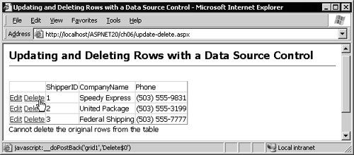
The DataBind Method of the GridView ControlWhen a data source control and a GridView are combined (as shown in Chapter 3), there is no need to write code to initiate data binding, as you would with other data-bound controls such as the DataGrid . The DataBind method of the GridView is called automatically. However, this method is also declared as Public and so is exposed for use in your own code if required. If you bind a GridView to a source of data other than a data source control, using the DataSource and DataMember properties, you must call the DataBind method yourself. The Events of the GridView ControlThe GridView control raises a series of events as it binds to a data source, generates the output, and in response to user interaction (see Table 4.4). You can handle these events to provide custom output, interact with the output process, and execute code in response to user actions. Handling a GridView EventThe example of editing rows shown at the start of Chapter 3 (Listing 3.4) contains a Delete link for each row displayed in the GridView control. However, in the sample Northwind database that the page uses, rows cannot be deleted from the Shippers table because there are related child rows in other tables. As an example of handling the events raised by the GridView control, the page prevents these existing rows from being deleted by checking the value of the primary key. The declaration of the GridView includes the OnRowDeleting attribute, which specifies that an event handler named CheckDelete will be executed when the RowDeleting event is raised (see Listing 4.2). This occurs just before the GridView control instructs the data source control to delete the row. There is also a Label control on that page where the event handler will display any error message. Table 4.4. The Data Binding Events of the GridView Control
Listing 4.2 Using the RowDeleting Event <asp:GridView id="grid1" DataSourceID="ds1" runat="server" DataKeyNames="ShipperID" AutoGenerateEditButton="True" AutoGenerateDeleteButton="True" OnRowDeleting="CheckDelete" /> <asp:Label id="lblError" EnableviewState="False" runat="server" /> The event handler is shown in Listing 4.3. It simply extracts the value of the primary key from the Keys array passed to the event handler within the GridViewDeleteEventArgs instancethere is only one column in the primary key, so the code just accesses Keys(0) . Then, if this key value is less than 4 (in other words, this is one of the existing rows in the table), it sets the Cancel property to True to prevent the GridView from continuing with the delete operation, and it displays a message in the Label control. Listing 4.3 The Event Handler for the RowDeleting Event<script runat="server"> Sub CheckDelete(oSender As Object, oArgs As GridViewDeleteEventArgs) Dim iKey As Integer = oArgs.Keys(0) If iKey < 4 Then oArgs.Cancel = True lblError.Text = "Cannot delete the original rows from the table" End If End Sub </script> Figure 4.1 shows the result. An attempt to delete the first row causes the event handler to display the error message below the grid. If you want to try deleting a row, use Enterprise Manager or type a SQL statement into Query Analyzer to insert a new row into the Shippers table, then run the page to delete the new row. Figure 4.1. Handling the RowDeleting event for a GridView control The Nested TableItemStyle ElementsYou can optionally include, within the declaration of a GridView control, nested elements that define the style for various sections of the output generated as HTML table rows. The general declaration of these elements is shown in Listing 4.4. Listing 4.4 The Nested TableItemStyle Elements<[ TableItemStyle ] BackColor=" Color " BorderColor=" Color " BorderStyle="[SolidDashedDottedDoubleGroove RidgeInsetOutsetNoneNotSet]" BorderWidth=" Unit " CssClass=" String " Font-[BoldItalicNameNamesOverlineSize StrikeoutUnderline]="[ value ]" ForeColor=" Color " Height=" Unit " Width=" Unit " HorizontalAlign="[CenterJustifyLeftRightNotSet]" VerticalAlign="[BottomMiddleTopNotSet]" Wrap="[TrueFalse]" /> The seven types of elements you can use (replacing [ TableItemStyle ] in the preceding declaration are shown in Table 4.5. The Nested Style ElementsAnother type of nested element that you can optionally include within the declaration of a GridView control is one that defines the style for the text and links that appear only when the grid is rendered on a small-screen or mobile device, where the output is displayed as separate summary and details views. The general declaration of these elements is shown in Listing 4.5. Table 4.5. The TableItemStyle Element Types
Listing 4.5 The Nested Style Elements<[TextStyle] BackColor=" Color " BorderColor=" Color " BorderStyle="[SolidDashedDottedDoubleGroove RidgeInsetOutsetNoneNotSet]" BorderWidth=" Unit " CssClass=" String " Font-[BoldItalicNameNamesOverlineSize StrikeoutUnderline]="[ value ]" ForeColor=" Color " Height=" Unit " Width=" Unit " /> Table 4.6. The Style Element Types
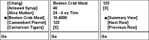
The three types of elements you can use (replacing [ TextStyle ] in the declaration above) are shown in Table 4.6. How the GridView Appears on Small-Screen and Mobile DevicesAs you will surmise from the previous subsections, the GridView control automatically changes the way it renders the data when viewed on a small-screen or mobile device. When the page first loads, only the column specified by name as the SummaryViewColumn property is displayed. Each value in this single column is a link that changes the display to show all the column values for just that row (see Figure 4.2). These are the summary view and details view mentioned in the property descriptions in this chapter and demonstrated at the start of Chapter 3. Figure 4.2. The GridView control on small-screen devices The Nested PagerStyle and PagerSettings ElementsIf you specify that the GridView will support paging by including the AllowPaging="True" attribute in the declaration, you can optionally specify in more detail how the section of the output that includes the page navigation controls will appear. You include a nested PagerStyle element, and/or a nested PagerSettings element, within the declaration of the GridView control. The PagerStyle element is identical to the TableItemStyle elements shown earlier, with one extra attribute supported that indicates where row(s) containing the pager controls will appear: Position="[BottomTopTopAndBottom]" The PagerSettings element defines the appearance of the paging controls in more detail. It allows you to use images, text links, or page numbers for the navigation controls. The general declaration of this element is shown in Listing 4.6. Listing 4.6 The PagerSettings Element<PagerSettings Mode="[NextPreviousNextPrevFirstLastNumericNumericFirstLast]" FirstPageText=" String " PrevPageText=" String " NextPageText=" String " LastPageText=" String " FirstPageImageUrl=" url " PrevPageImageUrl=" url " NextPageImageUrl=" url " LastPageImageUrl=" url " PageButtonCount=" Integer " /> Defining the Columns in a GridView ControlThe GridView control can automatically generate the columns required to display the contents of the source data rows, just as the ASP.NET 1.0 DataGrid control does. The default for the AutoGenerateColumns property is True , indicating that an AutoGeneratedField bound column will be generated for each column in the data rows. However, as with the DataGrid , you can set this property to False and specify the columns you want instead. This is useful if you want to use any of the special column types, other than the default type that displays the value as a text string (or in a TextBox control when the row is in edit mode) or as a CheckBox control (if the data is a Boolean or bit field). Compared with the DataGrid control, there are some interesting new column types available for the GridView control. The GridView Column TypesThe GridView control supports a range of column types, allowing you to display the data within each column in a range of ways. Note that the controls are named as xxx Field , in order to differentiate them from the xxx Column controls used in a DataGrid control.
Other types of columns are scheduled for development with the final release version of ASP.NET 2.0. These include the ImageField and DropDownListField , whose names are self-explanatory. Declaring a BoundField ColumnIn a BoundField column, the value in the column is displayed as text, except when the row is in edit mode, in which case it is displayed in a standard ASP.NET TextBox control. The DataFormatString property takes a String value that includes the placeholder {0} where the value should be inserted. And you can add one of the standard formatting characters , for example, using {0:C} to display the value as currency. The outline declaration of a BoundField is shown in Listing 4.7. Listing 4.7 Declaring a BoundField Column<asp:BoundField DataField=" String " DataFormatString=" String " TreatEmptyStringAsNull="[TrueFalse]" NullDisplayText=" String " ReadOnly="[TrueFalse]" InsertVisible="[TrueFalse]" Visible="[TrueFalse]" SortExpression=" String " ShowHeader="[TrueFalse]" HeaderText=" String " HeaderStyle-[ PropertyName ]="[ value ]" HeaderImageUrl=" String " ItemStyle-[ PropertyName ]="[ value ]" FooterText=" String " FooterStyle-[ PropertyName ]="[ value ]" /> The attributes shown in Listing 4.7 correspond to the properties in Table 4.7. Table 4.7. The Properties and Attributes of the BoundField Control
Declaring a ButtonField ColumnA ButtonField is used when you want each row in the output to include a button or a clickable link that causes a postback, perhaps to display more details of the row or to open an image or other resource. It can display the link as a standard HTML button control (an <input type="submit"> element), a clickable image (an <input type="image"> element), or a text link (an <a> element with some client-side script to submit the page). The outline declaration of a ButtonField is shown in Listing 4.8. Listing 4.8 Declaring a ButtonField Column<asp:ButtonField ButtonType="[ButtonImageLink]" CommandName=" String " DataTextField=" String " DataTextFormatString=" String " CausesValidation="[TrueFalse]" ValidationGroup=" String " Text=" String " ImageUrl=" String " Visible="[TrueFalse]" SortExpression=" String " ShowHeader="[TrueFalse]" HeaderText=" String " HeaderStyle-[ PropertyName ]="[ value ]" HeaderImageUrl=" String " ItemStyle-[ PropertyName ]="[ value ]" FooterText=" String " FooterStyle-[ PropertyName ]="[ value ]" /> Table 4.8. The Properties and Attributes of the ButtonField Control
The attributes shown highlighted in Listing 4.8 correspond to the properties in Table 4.8. The rest are the same as those listed for the BoundField control in Table 4.7. Declaring a CheckBoxField ColumnA CheckBoxField is used when you want every row to display a checkbox in this column, with the checkbox setting reflecting the value in the row. Because an HTML checkbox can be only on or off, this column type really only works with columns in the source data rows that contain Boolean or bit values. The outline declaration of a CheckBoxField is shown in Listing 4.9. Listing 4.9 Declaring a CheckBoxField Column<asp:CheckBoxField DataField=" String " ReadOnly="[TrueFalse]" Text=" String " InsertVisible="[TrueFalse]" Visible="[TrueFalse]" SortExpression=" String " ShowHeader="[TrueFalse]" HeaderText=" String " HeaderStyle-[ PropertyName ]="[ value ]" HeaderImageUrl=" String " ItemStyle-[ PropertyName ]="[ value ]" FooterText=" String " FooterStyle-[ PropertyName ]="[ value ]" /> The attributes shown highlighted in Listing 4.9 correspond to the properties in Table 4.9. The rest are the same as those listed for the BoundField control in Table 4.7. Declaring a HyperLinkField ColumnA HyperLinkField is used to display a clickable link in each row by inserting a standard <a> element into the output. The control allows you to set the text content of the <a> element and the href attribute as either static values or as values from the source data row. You can also specify a value for the target window name, though this can be only static text and not a bound value. The outline declaration of a HyperLinkField is shown in Listing 4.10. Table 4.9. The Properties and Attributes of the CheckBoxField Control
Listing 4.10 Declaring a HyperLinkField Column<asp:HyperLinkField DataTextField=" String " DataTextFormatString=" String " Text=" String " DataNavigateUrlField=" String " DataNavigateUrlFormatString=" String " NavigateUrl=" String " Target=" String " Visible="[TrueFalse]" SortExpression=" String " ShowHeader="[TrueFalse]" HeaderText=" String " HeaderStyle-[ PropertyName ]="[ value ]" HeaderImageUrl=" String " ItemStyle-[ PropertyName ]="[ value ]" FooterText=" String " FooterStyle-[ PropertyName ]="[ value ]" /> The attributes shown highlighted in Listing 4.10 correspond to the properties in Table 4.10. The rest are the same as those listed for the BoundField control in Table 4.7. Table 4.10. The Properties and Attributes of the HyperLinkField Control
Declaring a TemplateField ColumnWhen you need to provide output that is not supported by any of the standard column types, you can use a TemplateField . This works just as in the DataGrid from version 1.0 of ASP.NET and is the same approach to generating list output as used by other controls such as the Repeater and DataList . You specify all the content that you want to be output for the column within one or more templates nested within the TemplateField declaration (or added at runtime in code). The control selects the appropriate template depending on which mode the row is currently in. The outline declaration of a TemplateField is shown in Listing 4.11. Listing 4.11 Declaring a TemplateField Column<asp:TemplateField Visible="[TrueFalse]" SortExpression=" String " ShowHeader="[TrueFalse]" HeaderText=" String " HeaderStyle-[ PropertyName ]="[ value ]" HeaderImageUrl=" String " ItemStyle-[ PropertyName ]="[ value ]" FooterText=" String " FooterStyle-[ PropertyName ]="[ value ]" > <HeaderTemplate>...</HeaderTemplate> <ItemTemplate>...</ItemTemplate> <AlternatingItemTemplate>...</ AlternatingItemTemplate> <SelectedItemTemplate>...</SelectedItemTemplate> <EditItemTemplate>...</EditItemTemplate> <FooterTemplate>...</FooterTemplate> </asp:TemplateField> All the attributes of the control are the same as those listed for the BoundField control in Table 4.7. The six kinds of templates that you can specify, highlighted in Listing 4.11, are documented in Table 4.11. Declaring a CommandField ColumnThe final column type for the GridView control is the CommandField column. This is used to switch the row between modes and to confirm updates to the values. When the row is not in edit mode, the column displays one or more of the Select, Insert, Edit, and Delete buttons, depending on the values you've specified for the Show xxx Button properties of the GridView control. When the row is in edit mode, it displays Update and Cancel buttons, again depending on the property settings you make for the GridView control. Table 4.11. The Templates of the TemplateField Control
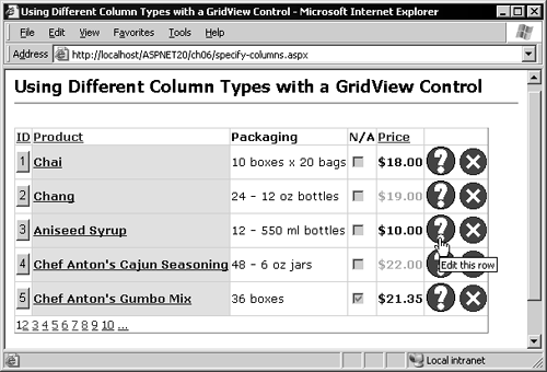
Clicking on the buttons raises an event that is automatically handled by the data source control to which the GridView is connected, though you can also respond to the events in code yourself by handling the RowCommand event. The outline declaration of a CommandField is shown in Listing 4.12. Listing 4.12 Declaring a CommandField Column<asp:CommandField ButtonType="[ButtonImageLink]" UpdateText=" String " UpdateImageUrl=" String " ShowCancelButton="[TrueFalse]" CancelText=" String " CancelImageUrl=" String " ShowSelectButton="[TrueFalse]" SelectText=" String " SelectImageUrl=" String " ShowInsertButton="[TrueFalse]" InsertText=" String " InsertImageUrl=" String " ShowEditButton="[TrueFalse]" EditText=" String " EditImageUrl=" String " ShowDeleteButton="[TrueFalse]" DeleteText=" String " DeleteImageUrl=" String " CausesValidation="[TrueFalse]" ValidationGroup=" String " Visible="[TrueFalse]" SortExpression=" String " ShowHeader="[TrueFalse]" HeaderText=" String " HeaderStyle-[ PropertyName ]="[ value ]" HeaderImageUrl=" String " ItemStyle-[ PropertyName ]="[ value ]" FooterText=" String " FooterStyle-[ PropertyName ]="[ value ]" /> The attributes shown highlighted in Listing 4.12 correspond to the properties in Table 4.12. The rest are the same as those listed for the BoundField control in Table 4.7. Using a Mixture of Column TypesTo demonstrate some of the column types available for the DataGrid control, Listing 4.13 shows a GridView control that extracts some rows from the Northwind database Products table and displays them with sorting and paging enabled. The data source control declaration contains the commands required to allow updating of the data in the table and caches the data for five minutes to improve performance when just reading the rows. Table 4.12. The Properties and Attributes of the CommandField Control
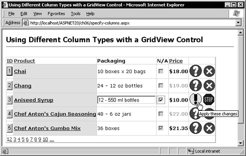
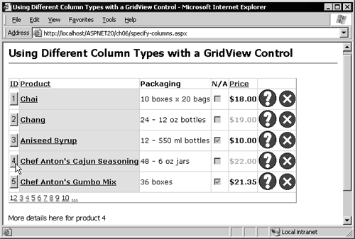
Listing 4.13 Using a Mixture of Column Types<asp:SqlDataSource id="ds1" runat="server" ConnectionString="server=localhost;database=Northwind;uid=x;pwd=x;" SelectCommand="SELECT ProductID, ProductName, QuantityPerUnit, Discontinued, UnitPrice FROM Products" UpdateCommand="UPDATE Products SET QuantityPerUnit=@QuantityPerUnit, Discontinued=@Discontinued WHERE ProductID=@ProductID" DeleteCommand="DELETE FROM Products WHERE ProductID=@ProductID" EnableCaching="True" CacheDuration="300" /> <asp:GridView id="grid1" runat="server" DataSourceID="ds1" AllowSorting="True" AllowPaging="True" PageSize="5" DataKeyNames="ProductID" AutoGenerateColumns="False" OnRowCommand="ShowDetails"> <ColumnFields> ... column definitions shown later ... </ColumnFields> </asp:GridView> <asp:Label id="lblInfo" EnableViewState="False" runat="server" /> The RowCommand event is raised when any control other than a standard Edit, Delete, Update, or Cancel link in the grid causes a postback. Code in the page will handle this event and display details about a row in a Label control (declared at the end of Listing 4.13) when a button in that row is clicked. The screenshot in Figure 4.3 shows the result; the custom column declarations the GridView uses are discussed afterward. Figure 4.3. Using a mixture of column types The GridView control shown in Listing 4.13 and Figure 4.3 contains the attribute AutoGenerateColumns="False" , so it will not automatically generate the columns based on the structure of the data rows. The columns are declared individually within the <ColumnFields> element. The next sections describe each of the columns we've used. The ButtonField ColumnThe first column is a ButtonField column that displays a button with the row ID as the caption. The DataTextField attribute causes the values from the ProductID column to be used for the Text property of the button in each row, and the SortExpression attribute allows the rows to be sorted using the values in this column (see Listing 4.14). A header row is displayed for this column, containing the text "ID", and it is styled as bold Verdana font. Finally, the CommandName attribute causes the CommandName property of each button to be set to MyRoutine . This is required to be able to identify which control caused the postback when we handle the RowCommand event. Listing 4.14 Declaring the ButtonField Column<asp:ButtonField ButtonType="Button" DataTextField="ProductID" SortExpression="ProductID" ShowHeader="True" HeaderText="ID" CommandName="MyRoutine" HeaderStyle-Font-Name="Verdana" HeaderStyle-Font-Bold="True" /> The HyperLinkField ColumnThe next column is a HyperLinkField , bound to the ProductName column. The Text property of each hyperlink is set to the value in each row of the ProductName column by the DataTextField attribute (see Listing 4.15). The NavigateUrl ( href ) of each hyperlink is set to a string value such as http://www.mysite.com/products?product=3 by the combination of the DataNavigateUrlField attribute (which specifies the ProductID column) and the DataNavigateUrlFormatString attribute (which supplies the format string with the placeholder {0} for the value from each row). Listing 4.15 Declaring the HyperLinkField Column <asp:HyperLinkField DataTextField="ProductName" ShowHeader="True" HeaderText="Product" DataNavigateUrlField="ProductID" DataNavigateUrlFormatString= "http://www.mysite.com/products?product={0}" SortExpression="ProductName" HeaderStyle-Font-Name="Verdana" HeaderStyle-Font-Bold="True" ItemStyle-Font-Name="Verdana" ItemStyle-Font-Bold="True" ItemStyle-BackColor="Yellow" /> The BoundField ColumnNext comes a BoundField column, bound to the QuantityPerUnit column. It too has a header, and both this and the "item" rows are styled using attributes in the column declaration (see Listing 4.16). Listing 4.16 Declaring the BoundField Column<asp:BoundField DataField="QuantityPerUnit" ShowHeader="True" HeaderText="Packaging" HeaderStyle-Font-Name="Verdana" HeaderStyle-Font-Bold="True" ItemStyle-Font-Name="Verdana" /> The CheckBoxField ColumnThe Discontinued column in the data rowset is a Boolean type, so the ideal representation is a checkbox. This is the default for this type of data column anyway. The CheckBoxField column is bound to the Discontinued column in the data rows and the header "N/A" (not available) declared for it (see Listing 4.17). Listing 4.17 Declaring the CheckBoxField Column<asp:CheckBoxField DataField="Discontinued" ShowHeader="True" HeaderText="N/A" HeaderStyle-Font-Name="Verdana" HeaderStyle-Font-Bold="True" /> The TemplateField ColumnThe most complex column type is the TemplateField , and this cannot be bound directly to a column in the source data rowset. Instead, it contains individual templates that define the output to be displayed depending on the row location and which mode the row is in. You can see that the eample contains an ItemTemplate and an AlternatingItemTemplate , each containing a Label control that displays the value from the UnitPrice column in each rowand with alternating foreground colors (see Listing 4.18). Listing 4.18 Declaring the TemplateField Column <asp:TemplateField ShowHeader="True" HeaderText="Price" SortExpression="UnitPrice" HeaderStyle-Font-Name="Verdana" HeaderStyle-Font-Bold="True" ItemStyle-Font-Name="Verdana" ItemStyle-Font-Bold="True"> <ItemTemplate> <asp:Label runat="server" Text='<%# Eval("UnitPrice", "${0:F2}") %>' /> </ItemTemplate> <AlternatingItemTemplate> <asp:Label runat="server" ForeColor="DarkGray" Text='<%# Eval("UnitPrice", "${0:F2}") %>' /> </AlternatingItemTemplate> </asp:TemplateField> It's possible to include an EditItem template that defines the appearance of the row when it is in edit mode, but because this column type cannot be bound to a column in the source data it is not possible to achieve the "no-code" updates we've seen earlier when using a TemplateField . Instead you have to write code that is executed in response to the RowUpdating event and add the value(s) of the fields in the TemplateField to the NewValues dictionary of the GridViewUpdateEventArgs using the value in the column in this case. The CommandField ColumnThe final column displays the images for switching to edit mode, updating a row, canceling the changes, and deleting the row. The CommandField column declaration specifies that the links should be images and also declares the relative URL of the images and the text to use as the alt attribute of these images (see Listing 4.19). Listing 4.19 Declaring the CommandField Column<asp:CommandField ButtonType="Image" UpdateImageUrl="i.gif" UpdateText="Apply these changes" ShowCancelButton="True" CancelImageUrl="s.gif" CancelText="Cancel this update" ShowEditButton="True" EditImageUrl="q.gif" EditText="Edit this row" ShowDeleteButton="True" DeleteImageUrl="x.gif" DeleteText="Delete this row" /> As we've seen earlier, the GridView control manages all the mode switching and updates automatically, without requiring any code to be written. The screenshot in Figure 4.4 shows the grid with the third row in edit mode. Notice that the HyperLinkField column does not allow the value to be edited, while the BoundField column does. The CheckBoxField column automatically enables the checkbox in this row to allow the value to be changed. Meanwhile the CommandField column displays the Update and Cancel images. All this happens automatically with the column declarations we used, without any code required. Figure 4.4. Editing a row with custom column types Handling the RowCommand EventThe first column (a ButtonField column) contains buttons that raise the RowCommand event when clicked. The declaration of the GridView control includes the attribute OnRowCommand="ShowDetails" , which will execute the only code in the pagean event handler named ShowDetails (see Listing 4.20)when any one of the buttons is clicked. However, the RowCommand event is also raised for some other actions that cause a postback, including the pager links at the bottom of the grid. So, before processing the row values, the event handler has to check whether it was in fact a button in the first column that caused the postback. The ButtonField column declaration contains the attribute CommandName="MyRoutine" , so the event handler can check the CommandName property of the GridViewCommandEventArgs instance passed to it. If this is a button from the first column, a reference to it is obtained from the CommandSource property of the GridViewCommandEventArgs instance, and the Text property contains the value from the current row. Listing 4.20 The Event Handler for the RowCommand EventSub ShowDetails(oSender As Object, oArgs As GridViewCommandEventArgs) If oArgs.CommandName = "MyRoutine" Then lblInfo.Text = "More details here for product " _ & oArgs.CommandSource.Text End If End Sub The code in Listing 4.20 simply displays the text "More details here for product x" but could easily go off and query the database or fetch an image of the product to display more information as required. The result of clicking one of the buttons in the first column is shown in Figure 4.5. Figure 4.5. Handling the RowCommand event |