New Features
| This chapter isn't an in-depth look at any specific featureinstead we are going to give you a taste of what's to come so you can see how much easier Web development is going to be. For this outlook we've broken down the new features into rough end-to-end scenarios. Templates for a Consistent Look and FeelASP.NET 1.x provides an easy way to develop Web sites, but one thing that has become apparent is the lack of an architecture for applying a consistent look and feel. Several workaround techniques emerged:
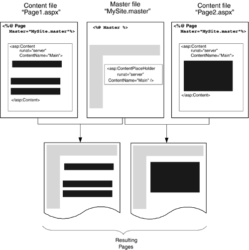
Of these, the first two require knowledge of creating server controls, and while this is a topic most ASP.NET developers could master, it may not be one they've had experience with. Therefore a solution using custom server controls tends to be avoided. The last option, though, is a simple solution, easy to create and implement. User Controls were created to provide reusable functionality, and this is a great use for them. However, to apply a consistent look and feel you need to first place the User Controls on each page, then ensure that they are placed in the same place on each page. In other words, you really need a page template, and in reality this manifests itself as an ASP.NET file that you simply copy for each new page. The danger of this approach is that it's too easy to modify a page and change the layout for that single page. To provide a templating solution, ASP.NET 2.0 has the concept of master pages, which provide a template for the look and implementation of a page. A master page is an ASP.NET page that provides a template for other pages, giving shared page-level layout and functionality. The master page defines placeholders for the content, which can be overridden by child pages. The resultant page is a combination of the master page and the child page, as shown in Figure 1.1. Figure 1.1. Combining a master page and a child page
Styles for ControlsThe second major feature of ASP.NET 2.0 that deals with the look and feel of a site is that of themes. Theming, or skinning, has become very popular, allowing users to create a customized look for applications. On the Windows desktop two of the most popular themed applications are audio players (WinAmp and Windows Media Player), and with some additional software, even Windows XP can be themed. The popularity of theming is due to the nature of humanswe like to choose the way things look, and we like to express our individuality . This is easy on the desktop, where users generally have a single machine each. With Web sites, however, theming becomes a harder issue because of the number of users. Tracking which users have which themes and managing those themes becomes an overhead that site administrators don't want to get involved with. Some Web sites provide forms of theming, but these are relatively limited in terms of customization, perhaps allowing only a choice of color scheme. Other sites provide a selection of stylesheets for users to pick from, assuming their browsers support this feature, or alternatively change the stylesheet on the server. This allows not only color schemes to be selected but also complete style choices, such as fonts, style of borders, and so on. In ASP.NET 2.0 the goals for theming are quite simple.
The implementation of this in ASP.NET 2.0 is built around two areas: skins and themes. A skin is a set of properties and templates that can be applied to controls. A theme is a set of skins and any other associated files (such as images or stylesheets). Skins are control specific, so for a given theme there could be a separate skin for each control within that theme. Any controls without a skin inherit the default look. The implementation is simple because a skin uses the same definition as the server control it is skinning, and themes are just a set of files in a directory under the application root. For example, consider the sample directory structure shown below: default.aspx \Themes \MyTheme MySkin.skin \YourTheme YourSkin.skin Each theme consists of a directory under the Themes directory. Within each theme there is a file with a .skin suffix, which contains the skin details for that theme. For example, MySkin.skin might contain: <asp:Label SkinID="Normal" runat="server" Font-Bold="True" BackColor="#FFC080" /> <asp:Label SkinID="Comic" runat="server" Font-Italic="True" Font-Names="Comic Sans MS" /> This defines two skins for the Label control, each with different visual properties. The theme can be chosen by setting a page-level property, and the skin is chosen by setting a control-level property, as demonstrated below. <%@ Page Theme="MyTheme" %> <form runat="server"> <asp:Label SkinID="Comic" Text="A Label" /> </form> Both of these can be set at runtime as well as design time, so this provides an extremely powerful solution, especially when connected with the new Personalization features.
Securing Your SiteWith the large amount of business being done on the Web, security is vitally important for protecting not only confidential information such as credit card numbers but also users' personal details and preferences. Thus you have to build into your site features to authenticate users. This was easy to do in ASP.NET 1.x, although you still had to write code. Security was created by picking your preferred security mechanism (most often Forms Authentication) and then adding controls to your page to provide the login detailsuser name , password, "remember me" checkbox, and so on. There was no built-in mechanism for storing personal details, so this was a roll-it-yourself affair. With ASP.NET 2.0, the pain has been taken out of both areas. For login functionality, there is now:
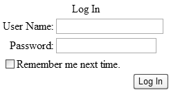
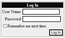
For example, to add login features to your page all you need to do is add the following code: <form runat="server"> <asp:Login runat="server" /> </form> This gives us the simple interface shown in Figure 1.2. Figure 1.2. The Login control This could be achieved easily in previous versions of ASP.NET, but not with such simplicity. You needed labels, text entry boxes, buttons , and validation, whereas it's now all rolled into one control. Sure it looks raw, but this is the basic unformatted version. Using the design tool Visual Studio .NET (more on that in Chapter 2), you can auto-format this for a better look. You can also skin the interface, as shown in Figure 1.3, or even template it to provide your own customized look. Along with the other login controls you get a complete solution for handling user logins. Figure 1.3. A skinned Login control The user interface isn't the only part of logging into a site; there's also the code needed to validate the user against a data store. With ASP.NET 1.x this required not only code to be written but also knowledge of what that data store was and how it stored data. ASP.NET 2.0 introduces a new Membership API, whose aim is to abstract the required membership functionality from the storage of the member information. For example, all of the data handling we'd have done in previous versions to validate a user can now be replaced with the code shown in Listing 1.1. Listing 1.1 Validating User CredentialsSub Login_Click(Sender As Object, E As EventArgs) If Membership.ValidateUser(Email.Text, Password.Text) Then FormsAuthentication.RedirectFromLoginPage(Email.Text, False) Else LoginMessage.Text = "Invalid credentials. Please try again." End If End Sub What's even better is that when using the Login control you don't even have to do thisthe control handles it for you. The great strength of the Membership API is that it is built on the idea of Membership Providers, with support for Microsoft SQL Server and Access supplied by default. To integrate custom membership stores you simply need to provide a component that inherits from the Membership interface and add the new provider details to the configuration file. The Membership API has some simple goals.
Personalizing Your SiteOne of the areas driving changes on the Internet is that of communities. People like to belong, and the Internet is a big, lonely place. Community sites give you a home, a sense of belonging . Part of that comes from being in contact with like-minded people, and part comes from the features some of these sites offer. Our houses are decorated to our style, and many of us customize our Windows desktop, so why shouldn't our favorite Web sites offer the same opportunity? Hand in hand with the Membership API lie the Personalization features. These provide a simple programming model for storing user details (including those of anonymous users), with easy customization. Like Membership, Personalization can be configured to work with multiple data providers and provides an easy way to define custom properties for each user. This leads to a user profile with strong types, allowing easy access within ASP.NET pages. For example, you can create a profile with Name , Address , and Theme as properties and a page that allows the user to update them, as shown in Listing 1.2. Listing 1.2 Using the Profile Custom Properties<script runat="server"> Sub Page_Load(Sender As Object, E As EventArgs) Name.Text = Profile.Name Address.Text = Profile.Address Theme.Text = Profile.Theme End Sub Sub Update_Click(Sender As Object, E As EventArgs) Profile.Name = Name.Text Profile.Address = Address.Text Profile.Theme = Theme.Text End Sub </script> <form runat="server"> Name: <asp:TextBox id="Name" runat="server" /> <br /> Address: <asp:TextBox id="Address" runat="server" /> <br /> Theme: <asp:TextBox id="Theme" runat="server" /> <br /> <asp:Button Text="Update" onClick="Update_Click" runat="server" /> </form> The simplicity of this method means we only have to deal with the user profile. We don't need to know how it stores the datawe just deal with the properties each profile has. This personalization also allows us to easily use the theming capabilities, changing the theme when the page is created, as demonstrated below. Sub Page_PreInit(Sender As Object, E As EventArgs) Me.Theme = Profile.Theme End Sub To ensure that the theme customization is applied before the controls are created we use the new PreInit event.
Creating PortalsAs if customization of a site's look weren't enough, ASP.NET 2.0 also brings a way to alter the structure with its new portal framework. The success of the ASP.NET IBuySpy portal application and its offshoots shows that customized sites are popular. The trouble has always been how to provide a consistent look while still allowing user customization not only of the style but also of the content and placement of content. Microsoft has already implemented solutions to provide this functionality, including SharePoint Server and Outlook Web Parts. In ASP.NET 2.0, Web Parts become the underlying technology for all Microsoft portal applications, allowing a single easy-to-use, extensible framework. The concept revolves around two key controlsthe WebPartZone and the WebPart . The WebPartZone identifies areas on the page in which content can be changed, and the WebPart identifies the part (or module) within the zone. There are different types of WebPart controls for different purposes, for example:
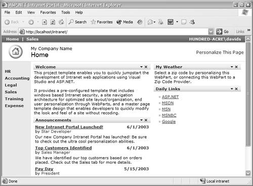
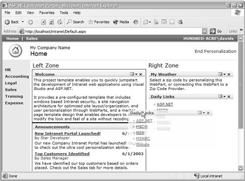
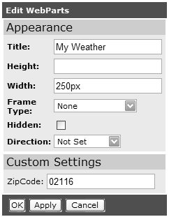
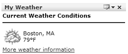
For example, consider an intranet site that needs a selection of areas of contentlinks, announcements, and so on. Figure 1.4 shows a sample site. Figure 1.4. Sample intranet site using the portal framework This site has two main areas of contentthe left area with the welcome message and the announcements, and the right area showing weather and links. Each of these main areas is a WebPartZone and the content with them a ContentWebPart . The code for this page appears in Listing 1.3. Listing 1.3 Sample Intranet Site Using Web Parts<table> <tbody> <tr> <td valign="top" align="left"> <asp:WebPartZone id="LeftZone" runat="server" Title="Left Zone" partFrameType="TitleOnly" lockLayout="False" borderColor="White"> <ZoneTemplate> <asp:ContentWebPart id="ContentWebPart1" title="Welcome" runat="server"> <ContentTemplate> This project 85 </ContentTemplate> </asp:ContentWebPart> <uc1:Announcements id="Announcements1" runat="server" /> </ZoneTemplate> </asp:WebPartZone> </td> <td valign="top" align="left"> <asp:WebPartZone id="RightZone" runat="server" title="Right Zone" width="100%" partFrameType="TitleOnly" lockLayout="False" borderColor="White"> <ZoneTemplate> <sample:WeatherWebPart runat="server" id="WeatherWebPart" Title="My Weather" width="250px" /> <uc1:dailylinkswebpart id="DailyLinksWebPart1" runat="server" title="Daily Links" /> </ZoneTemplate> </asp:WebPartZone> </td> <td valign="top" align="left"> </td> </tr> </tbody> </table> Here you can see two WebPartZone controls separating the left and right content. Within each there is a mixture of content, including static text, user controls, and custom server controls. At first glance this doesn't look like much improvement over existing layout methods such as user controlsin fact, it looks more complex. However, the framework on which Web Parts is built is great for developers and users alike. Developers only have to drop user controls or server controls into a ZoneTemplate to automatically receive Web Parts functionality. To enhance this functionality you can add verbs to the WebPartZone to indicate which features the framework should add to each part within the template. Listing 1.4 shows an example. Listing 1.4 Web Part Verbs<WebPartCloseVerb checked="False" imageUrl="images/CloseVerb.gif" enabled="True" text="Close" description="Closes the WebPart" visible="True" /> <WebPartRestoreVerb checked="False" imageUrl="images/RestoreVerb.gif" enabled="True" text="Restore" description="Restores the WebPart" visible="True" /> <WebPartMinimizeVerb checked="False" imageUrl="images/MinimizeVerb.gif" enabled="True" text="Minimize" description="Minimizes the WebPart" visible="True" /> <WebPartHelpVerb checked="False" enabled="True" text="Help" description="Shows help for the WebPart" visible="True" /> <WebPartEditVerb checked="False" imageUrl="images/EditVerb.gif" enabled="True" text="Edit" description="Edits the WebPart" visible="True" /> Here there are verbs that allow minimizing and maximizing the WebPart controls, editing, help, and so on. For the user, the Personalization features allow each WebPart to be moved to other WebPartZone controls or edited. For example, moving a WebPart is simply a matter of drag and drop, as shown in Figure 1.5, where the Daily Links section is being moved to the Left Zone. Figure 1.5. Dragging a WEBPART to another location Editing of WebPart controls is also part of the portal framework, where by default the user can alter the title, height, width, and frame style. Each WebPart can also provide custom properties that can be edited. For example, the WebPart for the My Weather section allows the zip code to be set, upon which the weather for that zip code is displayed. Editing of WebPart controls is provided by the inclusion of an EditorZone , which details what can be edited. For example, for our sample intranet site, the EditorZone might include the code shown in Listing 1.5. Listing 1.5 Adding Editor Parts to an EditorZone<asp:EditorZone id="EditorZone1" title="Edit WebParts" runat="server" partFrameType="TitleOnly" cssClass="EditorZoneBody"> <ZoneTemplate> <asp:AppearanceEditorPart id="AppearanceEditorPart1" runat="server" font-size="8pt" font-bold="true" /> <asp:PropertyGridEditorPart id="PropertyGridEditorPart1" title="Custom Settings" font-size="8pt" runat="server" /> </ZoneTemplate> </asp:EditorZone> This indicates that there are two editor partsone for the appearance, and one for the property gridfor properties of the WebPart that are marked as personalizable . Selecting the edit button invokes the editing features and the EditorZone is made visible, as shown in Figure 1.6. Once edited for zip code 02116, the WebPart shows the weather for Boston (Figure 1.7). Figure 1.6. Editing the My Weather WEBPART Figure 1.7. The My Weather WEBPART
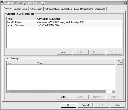
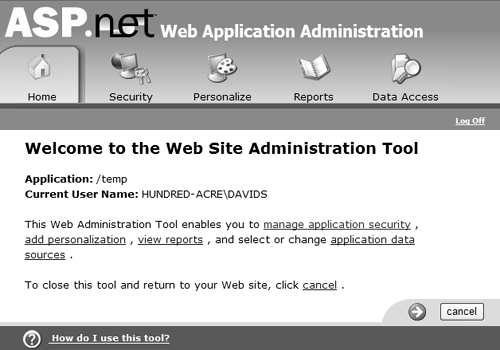
Setting Up and Managing Your SiteASP.NET 1.x made deployment of Web sites easy with its xcopy deployment model. This removed the need for some administrative tasks, such as registering COM components , but still left other tasks , such as site administration, as more manual affairs. The XML-based configuration file obeyed the xcopy rule, but there are three major problems with it. First, there is no easy-to-use administration tool, meaning you must have knowledge of the XML schema before you can modify it. Second, you need some way to actually fetch the file, edit it, and then upload it. This is a problem particularly for hosted scenarios, where users are always remote, and administration of many sites can become a management nightmare. Finally, you cannot create a Web Application, which is required for sites that require security. Three features in ASP.NET 2.0 help solve these issues. The first is the Microsoft Management Console (MMC) Snap-in for configuration, as shown in Figure 1.8. Figure 1.8. ASP.NET Configuration MMC Snap-in The second feature is a Management API, providing a programmable interface to manage a site. For example, Listing 1.6 sets the authorization mode using the API. Listing 1.6 Setting the Authorization Mode Dim cfg As Configuration Dim ms As AuthenticationSection cfg = Configuration.GetConfigurationForUrl(Request.ApplicationPath) ms = CType(cfg.GetConfigurationSection("system.web/authentication"), AuthenticationSection) ms.Mode = HttpAuthenticationMode.Windows cfg.Update() The Management API provides access to all areas of the configuration, both at the machine level ( machine.config ) and the application level ( web.config ). This allows utilities to be written not only to manage a single site but also to manage all sites. The third aspect of site management is the creation of a Web-based tool, wrapping much of the Management API. This provides a simple way to remotely administer a site, as shown in Figure 1.9. Figure 1.9. The Web management tool Here you have a simple Web interface that allows configuration of all aspects of a site. The interface is designed to be customized, so corporations and hosts can give it a company look.
Using Images on Your SiteUsing images isn't a particularly difficult area of site design, but their use has been eased with two new server controls. First, the ImageMap control provides easy support for image maps, as demonstrated on the next page. <asp:ImageMap runat="server" onClick="Map_Click" ImageUrl="images/states.jpg"> <asp:CircleHotSpot X="100" Y="100" Radius="25" Value="Other State" /> <asp:RectangleHotSpot Top="200" Left="150" Right="200" Bottom="150" Value="More State"/> <asp:PolygonHotSpot Coordinates="3,4, 15,18, 45,18, 15,70, 3,4" Value="State 1" /> </asp:PolygonHotSpot> The detection of the hot spot is handled in the postback event: Sub Map_Click(Sender As Object, E As ImageMapEventArgs) Select Case e.Value Case "State 1" ' ... Case "Other State" ' ... Case "More States" ' ... End Select End Sub The second new image-handling feature is that of dynamic images, designed specifically to render images appropriate to the calling browser. This is necessary because images displayed in Web browsers generally aren't suitable for smaller devices, such as PDAs or phones. The new DynamicImage control uses an HttpHandler to sniff the browser type and render the appropriate image. For example, consider the following code: <form runat="server"> <asp:DynamicImage DynamicImageType="ImageFile" ImageFile="car.gif" runat="server" /> </form> For a standard Web browser the image is rendered as expected, but for a Wireless Access Protocol (WAP) phone, the image is rendered as a Wireless Bitmap (WBMP). This removes any need for the developer to specifically target images to browser types.
Using Data on Your SiteIt's probably no exaggeration to say that most, if not all, Web sites use some form of data to drive them. Whether XML files, a database, or another dynamic form of storage, the data allows a site to respond to the user and to be up to date. ASP.NET 1.x provided some great data binding capabilities, but they always involved code, often the same code used over and over. One of the key goals of ASP.NET 2.0 is to reduce code and to ease the use of databases, especially for beginner programmers. To achieve this a new set of data controls has been introduced, removing the need for in-depth knowledge of ADO.NET. Data source controls provide a consistent and extensible method for declaratively accessing data from Web pages. There are several data source controls, including AccessDataSource , SqlDataSource , XmlDataSource , and ObjectDataSource , and it's likely that others (perhaps for Excel and Exchange Server) will appear as ASP.NET 2.0 nears release, along with third-party data sources. The use of data controls is simple, as shown below. <asp:SqlDataSource id="ds1" runat="server" ConnectionString="localhost;database=pubs;Trusted_Connection=True" SelectCommand="SELECT * FROM authors"/> <asp:DataGrid DataSourceId="ds1" runat="server" /> This just encapsulates the code everyone used to put in the Page_Load eventit connects to the database, fetches the data, and binds the grid. The contents of the SelectCommand can be a stored procedure as well as a SQL command, thus preserving the separation of data access from the page itself. There are commands for updating, inserting, and deleting. This model is extended by use of a parameter collection, allowing parameters to be passed into the command from a variety of sources. For example, the code in Listing 1.7 automatically takes the value from the TextBox control txtState and feeds this into the parameter @state . Listing 1.7 Using a ControlParameter<asp:SqlDataSource id="ds1" runat="server" ConnectionString="localhost;database=pubs;Trusted_Connection=True" SelectCommand="SELECT * FROM authors WHERE state=@state"> <SelectParameters> <ControlParameter name="@state" ControlID="txtState" /> </SelectParameters> </asp:SqlDataSource> <asp:TextBox id="txtState" runat="server" /> <asp:DataGrid DataSourceId="ds1" runat="server" /> There are also other parameter types, allowing parameter information to be taken directly from Session variables , Cookies, the Request (QueryString), and the HTML Form. Data BindingData binding in ASP.NET 1.x was simple, but it did cause confusion in some areas. For example, should you use early binding, for which you have to know the underlying data structure? Or should you take the development shortcut and use late binding, like this: <%# DataBinder.Eval(Container.DataItem, "au_lname") %> With ASP.NET 2.0 this syntax has been simplified: <%# Eval("au_lname") %> There is also an equivalent XPath syntax for XPath expressions when binding to XML documents: <%# XPath("@au_lname") %> Binding to ObjectsOne of the most requested features has been the ability to bind data directly to objects. Good design dictates that you separate your data access layer from your presentation layer, and this is often done as a set of classes. The new ObjectDataSource allows you to simply bind directly to existing objects, such as classes, thus allowing you to have a strongly typed data layer but still participate in the easy data binding that ASP.NET 2.0 brings.
Adding Mobility SupportMobile devices are becoming more pervasive. It seems everyone has a mobile phone, many people have PDAs, and some great devices now combine the functionality of both. From the development perspective the problem with these devices is their screen size and rendering capabilities. Not only do many of them not accept HTML, but with their tiny screens some also can't display images, tables, and so on. In ASP.NET 1.x, the Microsoft Mobile Internet Toolkit (MMIT in version 1.0 and ASP.NET Mobile Controls in version 1.1) provided this support, including separate controls for building Web pages suitable for small-screen browsers. In ASP.NET 2.0, the MMIT is no longer required because mobile support is built into all controls. This reduces not only the amount of code required but also the need for specialist knowledge about mobile platforms. This might seem relatively unimportant while the number of sites that target mobile browsers is small, but this is bound to increase as the features of small devices improve and prices drop. The really important part of the changes is to the infrastructure of the ASP.NET server controls. All controls are now built on a control adapter architecture, where there is an adapter for each specific device. The adapters have knowledge of each device and perform the rendering appropriate for its markup language and screen size. Since the controls are derived from adapters, they don't need to perform any special action to choose what to renderthe adapter intelligently renders the appropriate content based on the calling device. New devices are easily supported because they require only the addition of an adapter, which the controls can then take advantage of. Device FiltersThis architecture is taken further by allowing adapter-specific attributes for controls, enabling the page designer to provide different content for specific devices. For example, the following code shows how different text and cascading style sheet (CSS) styling can be defined for a mobile device. <asp:Label id="MyLabel" runat="server" Text="Welcome to our site" Nokia:Text="Time to upgrade your Nokia phone!" cssClass="StandardStyleClass" Nokia:cssClass="SpecialNokiaStyleClass" /> Device TemplatesAlong with modified attributes, we also have the ability to provide templates for specific devices. We know that mobile devices have a small screen size, so repeated controls such as grids and lists either aren't appropriate or need different output. By using specific templates for devices we can now provide different content to different devices, as shown in Listing 1.8. Listing 1.8 Filtered Templates for Mobile Devices<asp:Repeater runat="server" ..> <HtmlBrowsers:HeaderTemplate> <table> <tr><td>UserName</td><td>Address</td><td>Phone</td></tr> </HtmlBrowsers:HeaderTemplate> <HtmlBrowsers:ItemTemplate> <tr> <td><%# Container.DataItem("UserName") %></td> <td><%# Container.DataItem("Address") %></td> <td><%# Container.DataItem("Phone") %></td> </tr> </HtmlBrowsers:ItemTemplate> <WmlBrowsers:ItemTemplate> <asp:Panel runat="server"> <%# Container.DataItem("UserName") %> <%# Container.DataItem("Phone") %> </asp:Panel> </WmlBrowsers:ItemTemplate> <HtmlBrowsers:FooterTemplate> </table> </HtmlBrowsers:FooterTemplate> </asp:Repeater> These mechanisms provide a way for developers to override the built-in rendering for mobile devices. Along with automatic mobile support with the standard controls, there are controls specifically designed for mobile devices, such as PhoneLink (to launch a phone call) and Pager (to provide paging support). Standard controls also support the SoftKeyLabel attribute to allow specific text to be targeted to soft keys on phones.
 |