Alive with Color
CSS and Visual Design
The WOW Learning Center design makes the most of content and doesn't emphasize graphic presentation The colors are important to navigation and section identity, and the organization is overall quite clear. However, the design lacks a certain panache that a less information-oriented site, one that is geared to impress or promote, requires.
Real graphic design with CSS is still in its infancy. Typically, CSS-based designs appear clean and simple (Figure 8.6) even if the site designers make use of graphics.
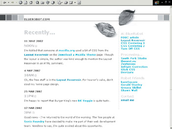
Figure 8.6: The BlueRobot home page is a simple but attractive CSS design.
Simplicity is a wonderful thing, but it's only one of many design options. There is no question that visual designers who take hold of CSS can do some impressive and sometimes surprising work when it comes to presenting more graphical or market-oriented sites. In this section, I showcase two visual designers who have used structured markup and CSS layout to make their sites work visually for their needs.
Douglas Bowman: stop|design
Artist and graphic designer Douglas Bowman shows off his interest in philosophy, design, and web standards on his site, stop|design, http://www.stopdesign.com/. What's impressive about Bowman's work is that he integrates not just the basic concepts of structured markup and CSS, but also more complex design that includes a variety of graphic images and type.
Figure 8.7 shows Bowman's home page. Note the use of a graphic background (8.7A) and the graphic images to emphasize navigation and separate it from the main content sections (8.7B). Bowman uses graphic type for headers (8.7C and 8.7D) but leaves links text-based (8.7E and 8.7F), which is a nice approach when you consider the diverse ways you can create link effects with CSS.

Figure 8.7: Bowman uses graphics effectively to produce a slick page appropriate for a visual designer
As with the color identifiers within sections in the WOW Learning Center site, Bowman uses color for each of his internal pages. He's a bit more experimental though, relying on the strength of his graphic headers and layout to carry the design as it goes from subtle to more dramatic colors.
Figures 8.8-8.10 show off Bowman's design.
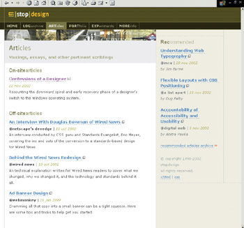
Figure 8.8: Bowman uses lighter colors for the article page
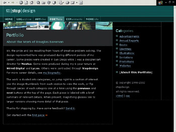
Figure 8.9: For the portfolio section, an artsy black is used

Figure 8.10: A combination of subtle grays and blues enhance the informatioin page
Raymond Pirouz: Your Guide to Modern Living
Many times, a promotions-oriented site requires a sophisticated look. Designer Raymond Pirouz set out to make a site that promoted him, his design group, and his interests effectively. As with many progressive web designers, he was motivated to accomplish his design using web standards in the form of structured markup and CSS, and so he did.
As with all of the sites you've enjoyed in this chapter, consistency is a critical element of interface design and usability. Pirouz accomplishes this admirably yet proves himself flexible in terms of layout.
Figure 8.11 shows Pirouz's home page, which sets the look for the entire site.
In this case, the upper section (8.11A) of the Pirouz site maintains consistency across the entire site. The top navigation also remains consistent (8.11B). The lower navigation (8.11C) changes depending upon which section of the site you are in, as does the lower content area (8.11D).
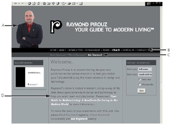
Figure 8.11: Pirouz opts for a sophisticated and consistent look.
Sometimes there are layouts, such as in Figure 8.11, making visible use of three columns, sometimes there are two columns (Figure 8.12), and sometimes only one (Figure 8.13).
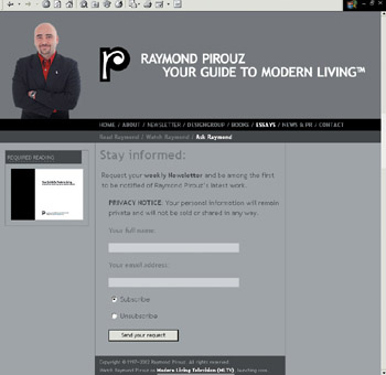
Figure 8.12: Here, only two columns within the content area are used.
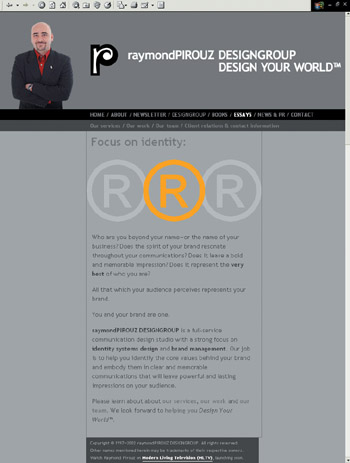
Figure 8.13: Only one central column in use
Yet the constancy of Pirouz's figure and logo at the top left of the page keep you grounded, and there is never any question of where you are or how to get back from where you came.
| Tip | Offering a newsletter on a promotions-oriented site can be extremely helpful in getting your site out there. As Pirouz has, you can easily set one up using any number of free or low-cost newsletter management options. |
It's interesting to note that both Bowman's and Pirouz's sites look similar to sites that were developed using tables and graphics. Only an experienced web designer or developer could tell at first glance that they are not. This is the epitome of the possibilities of CSS design and suggests strongly how it can even be more effective in the future. By combining what you know of visual design with sensible use of technology, you can begin to approach a new and innovative means of achieving your website goals.
EAN: 2147483647
Pages: 86