Standard Windows Forms User Interface Controls
|
| As does just about any other language that is capable of creating application for Windows, the .NET Framework provides a few standard controls for use in your applications. These controls enable you to perform actions, store values, maintain lists of information, and contain other controls. For most programmers, these controls are expected and often taken for granted. In the next few sections, you will learn the basics of some of the standard controls provided in the .NET Framework. Performing Actions with ControlsThe first set of controls are ones whose main function is to provide a means of signaling that an event or some sort of action should occur. These controls include the Button and Toolbar. The Button ControlThe Button control is a familiar one that looks just like what its name implies. Its sole purpose is to signal that an event or action should occur. The Button control, as shown in Figure 16.1, is useful when you want to place the burden of starting an event on the user of the application. Figure 16.1. A Button control on a Windows Form. The action of the Button can generally be triggered by clicking the Button with your mouse, by pressing the Enter button on your keyboard, or by pressing the spacebar while the focus is on the Button. If you set the CancelButton or AcceptButton property on the form to a particular Button, you can cause that Button to respond to the pressing of the Escape and Enter keys even when the Button does not have focus. In addition, when a window is used as a dialog by using the ShowDialog method, you can use the DialogResult property to set the return value of the ShowDialog method. The following code snippet shows how to create a Button control on a form: private void CreateButton() { // create the button Button myButton = new Button(); // Set the button's caption myButton.Text = "Click Me!"; // add the button to the control container Controls.Add(MyButton); } The Toolbar ControlThe ToolBar control is used to contain and display ToolBarButton private void CreateToolBar() { // create the button myToolBar = new ToolBar(); // create the two ToolBarButtons The ToolBar, as shown in Figure 16.2, receives the click event from the ToolBarButtons it contains. Figure 16.2. A ToolBar control on a Windows Form.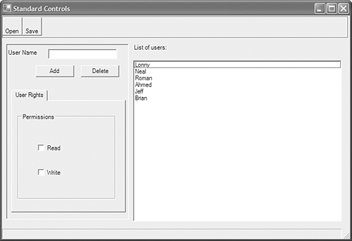 It's the responsibility of the ToolBar to figure out which button was responsible for the click. To receive the click notification, the ToolBar must have an event handler. The following code snippet demonstrates how to add an event handler to the ToolBar: private void AddEventHandler() { myToolBar.ButtonClick += new ToolBarButtonClickEventHandler(myToolbarButtonClick); } The next code fragment demonstrates how to determine which ToolBarButton was pressed. private void myToolbarButtonClick(Object sender, ToolBarButtonClickEventArgs e) { // Evaluate the Button property to determine which button was clicked. switch(myToolBar.Buttons.IndexOf(e.Button)) { case 0: openFileDialog1.ShowDialog(); // Insert code to open the file. break; case 1: saveFileDialog1.ShowDialog(); // Insert code to save the file. break; } } TIP As you build and design your application, you will often change the location of different user interface elements. To insulate yourself from breaking your code due to the position and layout of elements, you can use a stronger method of identifying the source of an event. In the case of a button click on a toolbar, you can query the name of the button that was pushed. You can also use the Tag property to add arbitrary data to virtually any control. Numerical or name-based identification of controls is far more reliable than relying on indexes or relative positions. In addition to hosting the ToolBarButton controls, the ToolBar also has a few methods and events that enable you to control the way that it is drawn. If you set the Appearance property to Flat, the ToolBar will appear with a flat style and when the mouse passes over any of its contained buttons, the ToolBarButton will raise up to show that it is the target of any mouse input at that point. If you set the Style property to ToolBarButtonStyle.Separator, a spacer will appear between buttons. Storing and Changing Values with ControlsThe next set of controls is used to store and or change values. These controls include the Label, TextBox, and StatusBar. Although there are other controls in this category, the three just named will give you a general understanding of what this set of controls is used for and how to utilize them. The Label ControlThe Label control, as shown in Figure 16.3, is one of the easiest controls to understand. It simply displays a label on a form. Figure 16.3. A Label control on a Windows Form. Although the Label control participates in the tab order of a form or control, it does not receive focus. TIP To make a Label transparent, set Label.BackColor to transparent. However, to ensure that the control is drawn properly, make sure to use only the coordinate system of the current device. The following code snippet shows how to create a Label, set its text to User Name, and place it on a form: private void CreateLabel() { myLabel = new Label(); myLabel.Text = "User Name"; Controls.Add(myLabel); } The TextBox ControlAnother useful control is the TextBox, shown in Figure 16.4. A TextBox provides the basis for most text input on Windows Forms and is by far the most common input control. Figure 16.4. A TextBox control on a Windows Form. When a TextBox control is used, the user can set focus to the control and type in some textual information. Although the user can type essentially anything he chooses, you can add an event handler to process the information as the user types it and to validate it against your business rules. Unlike the standard Windows TextBox, the control provided in the .NET Framework enables you to use multiline editing, as well as password masking, simply by setting a property on the TextBox. The following code snippet demonstrates how to create a multiline TextBox that accepts the Return (or Enter) key as just another character: private void CreateTextBox() { // Create the TextBox control. TextBox myTextBox = new TextBox(); // Allow for multiline capability. myTextBox.Multiline = true; // Allow the use of the Return key. myTextBox.AcceptsReturn = true; // Set WordWrap to True. myTextBox.WordWrap = true; // Add the TextBox to the forms Controls container. Controls.Add(myTextBox); } The StatusBar ControlAnother common control is the StatusBar, shown in Figure 16.5. Just about every Windows application contains at least one of these controls. Figure 16.5. A StatusBar control on a Windows Form. This control can contain one or many StatusBar panels. These panels are typically used to display information about the current object on a form or the application itself. As with all controls, you can customize the panels to display anything you prefer, such as a clock, progress bars, or images. The following code snippet demonstrates how to create a status bar and display the default panel that is created along with the StatusBar: private void CreateStatusBar() { // Create the StatusBar control. myStatusBar = new StatusBar(); // Display the Panels that are created in the StatusBar. myStatusBar.ShowPanels = true; // Add the StatusBar to the forms Controls container. Controls.Add(myStatusBar); } Maintaining Lists with ControlsThe next set of controls is used to display lists of information. These controls are useful when multiple objects need to be displayed. Among these controls are the ListBox, ListView, and treeView. The next few sections will give you a basic understanding of each control and an idea of how and when to use them. The ListBox ControlThe ListBox control, shown in Figure 16.6, is a relatively simple list control that enables you to display multiple items in list form. To reduce the amount of scrolling that a user must perform, the ListBox control enables you to display these items in a multicolumn format. Figure 16.6. A ListBox control on a Windows Form. The ListBox control also allows the user to select any item, or multiple items, by clicking them with the mouse. The following code snippet demonstrates how to create a ListBox control and add some items to the control to be displayed: private void CreateListBox() { // Create the ListBox control. myListBox = new ListBox(); string displayText; for(int i=0; i<5; i++) { displayText = "This is the first item " + i.ToString(); myListBox.Items.Add(displayText); } // Add the ListBox to the forms Controls container. Controls.Add(displayText); } The ListView ControlThe ListView control, shown in Figure 16.7, enables you to display items in its list in multiple ways. Figure 16.7. A ListView control on a Windows Form.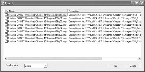 By setting the ListView.View property to one of the values in Table 16.1, you can change the appearance of the list. The following list of property values is taken from the MSDN Library documentation for the ListView.View property.
Listing 16.1 contains the source code for the ListView example. It demonstrates how to add and delete items from the ListView control Listing 16.1. The ListView Example using System; using System.Drawing; using System.Collections; using System.ComponentModel; using System.Windows.Forms; using System.Data; namespace ListViewExample { /// <summary> /// Summary description for Form1. /// </summary> public class Form1 : System.Windows.Forms.Form { private System.Windows.Forms.ListView listView1; private System.Windows.Forms.Button addButton; private System.Windows.Forms.Button deleteButton; private System.Windows.Forms.ImageList imageList1; private System.Windows.Forms.OpenFileDialog openFileDialog1; private System.Windows.Forms.ComboBox viewCombo; private System.Windows.Forms.Label label1; private System.ComponentModel.IContainer components; public Form1() { // // Required for Windows Form Designer support // InitializeComponent(); The treeView ControlThe treeView control, shown in Figure 16.8, is a popular control for displaying hierarchical representations of data. Figure 16.8. A TReeView control on a Windows Form.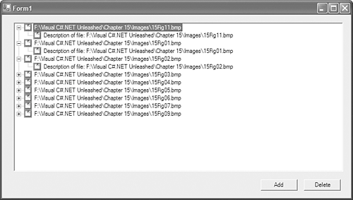 The treeView control is capable of displaying items, called tree nodes, in a fashion that resembles a tree of data. Each tree node added to the tree can contain its own collection of nodes, called child nodes, and so on. For example, if you were to add a root tree node called Galaxies, it could contain child nodes that were specific galaxies. Each galaxy could contain solar systems, each solar system could contain planets, each planet could contain moons, bodies of water, and so forth. You can see how you could get lost at any point of a tree. Although items displayed in a treeView are fairly easy to visualize conceptually, it is another thing to try to programmatically load and parse the data contained in this view. For this reason, the treeView.FullPath property enables you to view the entire hierarchy from the root node to the current tree node.The code in Listing 16.2 is an example of using a TReeView control. Listing 16.2. The treeView Sample Program using System; using System.Drawing; using System.Collections; using System.ComponentModel; using System.Windows.Forms; using System.Data; namespace TreeViewExample { /// <summary> /// Summary description for Form1. /// </summary> public class Form1 : System.Windows.Forms.Form { private System.Windows.Forms.Button deleteButton; private System.Windows.Forms.Button addButton; private System.Windows.Forms.TreeView treeView1; private System.Windows.Forms.ImageList imageList1; private System.Windows.Forms.OpenFileDialog openFileDialog1; private System.ComponentModel.IContainer components; public Form1() { // // Required for Windows Form Designer support // InitializeComponent(); // // TODO: Add any constructor code after InitializeComponent call // } /// <summary> /// Clean up any resources being used. /// </summary> protected override void Dispose( bool disposing ) { if( disposing ) { if (components != null) { components.Dispose(); } } base.Dispose( disposing ); } #region Windows Form Designer generated code //Windows Forms designer code intentionally left out for clarity. #endregion /// <summary> /// The main entry point for the application. /// </summary> [STAThread] static void Main() { Application.Run(new Form1()); } private void AddItem(string fileName, string description) { TreeNode item = new TreeNode(fileName, 0, 0); TreeNode subItem = new TreeNode(description, -1, -1); item.Nodes.Add(subItem); treeView1.Nodes.Add(item); } private void addButton_Click(object sender, System.EventArgs e) { if(openFileDialog1.ShowDialog() == DialogResult.OK) { for(int i=0; i<openFileDialog1.FileNames.GetUpperBound(0); i++) { AddItem(openFileDialog1.FileNames[i], "Description of file: " + openFileDialog1.FileNames[i]); } } } private void deleteButton_Click(object sender, System.EventArgs e) { if(MessageBox.Show("The selected items will be deleted", "Warning", MessageBoxButtons.OKCancel) == DialogResult.OK) { treeView1.Nodes.Remove(treeView1.SelectedNode); } } } } Nesting Child Controls Within ControlsSimilar to the list controls, controls that can contain other controls are often used to group items. The GroupBox, Panel, and TabControl are some of this type of control. In the next few sections, you will gain a basic understanding of these controls and how they are used. The GroupBox ControlThe GroupBox control, shown in Figure 16.9, is used to logically group other controls. Figure 16.9. A GroupBox control on a Windows Form. This control is often used to display a set of radio buttons or check boxes in a group. The GroupBox control can display a border around the items along with or without a caption. The Panel ControlSimilar to the GroupBox control, the Panel control in Figure 16.10 is used to group a collection of other controls. Figure 16.10. A Panel control on a Windows Form. By default, the Panel control is displayed without a border. You can modify the Panel.BorderStyle property to add a Fixed3D, FixedSingle, or no style to the border. As with all other container type controls, setting the Enabled property to true or false will in turn set the Enabled property of all the contained controls to the same value. The TabControl ControlThe TabControl control, shown in Figure 16.11, is a control that can have one or more TabPages. Figure 16.11. A TabControl control on a Windows Form. Unlike the other grouping controls, the TabControl control is used to separate groups of data onto separate sheets (TabPages). By displaying only the data that the user needs to view or modify, the TabControl eases the confusion that a user might experience by seeing too much information at the same time. |
 controls. It can display any ToolBarButton that can be shown as a toggle-style button, a drop-down style button, or a standard button. The following code snippet shows how to create a ToolBar control along with two ToolBarButtons:
 as well as how to change the way these items are displayed.
|