Creating Server Controls
| A server control trades off the ease of use of having separate UI and code elements by giving the developer tighter control of the rendering process. This control comes at a price, however: It is often more time-consuming to produce server controls than user controls. Despite the relative difficulty, many developers prefer using server controls because they are easy to share among multiple projects and the developer has precise control over the control's output and its behavior. Server controls also have the advantage of being easily bundled and can be sold to other developers by component and control vendors. Within the narrow scope of this single chapter, you will not get a thorough and comprehensive coverage of all aspects of creating server controls within ASP.NET. However, this next section will get you started creating those controls and possibly whet your appetite for a book like Stephen Walther's ASP.NET 2.0 Unleashed (ISBN: 0672328232). Before getting into the specifics of creating a custom server control, you should familiarize yourself with the capabilities of the WebControl class. You create custom server controls by creating classes that inherit from WebControl. Tables 30.1 and 30.2 contain a list of commonly used properties and methods of the WebControl class.
As you saw in the preceding example, you can define properties on a control class that can be set declaratively at design time or programmatically at runtime. With a custom server control, it is more difficult to determine the context of those properties because you don't have editable access to the control tree at design time as you do with a web user control. To help the user figure out what each property means and how it should be used, there are several attributes that you can use to decorate a server control property. Some of the more common ones are
To follow along, add a new Class Library project to the solution in which the control website was created. Add a reference to System.Web from within this class library and you're ready to start creating server controls in this library. Add a new class to the class library called TextBoxButton. This class is going to be a server control that will contain a text box and a button to illustrate the principle of a custom server control with child controls. In addition, you will also see how to "bubble" events from within a server control up to the page in which the control resides. Make sure the code for the TextBoxButton class looks like the code in Listing 30.1. Listing 30.1. The TextBoxButton Class
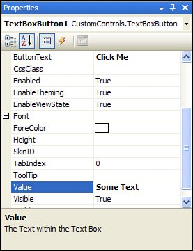
However tempting it may be, you should never instantiate new child controls from within a control's constructor. It is often difficult to remember that the instantiation and configuration of controls is done in an entirely separate stage of the control life cycle than the rendering. Because of this, use the CreateChildControls method to establish the control tree and use the RenderContents method to make any specific changes to the child controls. In Listing 30.1 the property definitions should be fairly self-explanatory. The property values are derived from property values on child controls, and thus require the use of the EnsureChildControls() method to make sure that the child controls exist before retrieving or setting their properties. To let the page hosting the control respond to the event when a user clicks the nested button within TextBoxButton, you need to support a process called "bubbling." When an event is fired and handled within one class and that class then publishes an event representing the same occurrence to another class, the event is considered to be "bubbled." The phrase comes from an analogy related to bubbles rising to the surface of a liquid. For this control to support event bubbling, it needs to publish an event using the following line of code: public event EventHandler buttonClick; When this control handles the Click event from the child Button control, it allows any container control to respond to the same event by bubbling it up one level: void btn_Click(object sender, EventArgs e) { if (buttonClick != null) buttonClick(sender, e); } Build the class library and then add a reference to the CustomControls project from the web application project. After building the solution this way, create a new Web Form. An extremely useful feature is that the Toolbox has detected the presence of a web control within an assembly in the solution and has added it in a category called "ControlsDemo Components" (assuming your web project is called ControlsDemo). When you drag the control from the special category on the control Toolbox, you will see a preview of the control's rendered output using default values. The Properties Editor panel will contain all of the custom properties that you defined on your control and will reflect the settings of the custom attributes applied to those properties, as shown in Figure 30.2. Figure 30.2. Properties Editor panel for a custom server control. Using your knowledge of C#, object-oriented programming, the ASP.NET page life cycle, and the functionality and features of the WebControl class, you can create some very powerful controls. |
EAN: 2147483647
Pages: 298
- An Emerging Strategy for E-Business IT Governance
- Assessing Business-IT Alignment Maturity
- A View on Knowledge Management: Utilizing a Balanced Scorecard Methodology for Analyzing Knowledge Metrics
- Technical Issues Related to IT Governance Tactics: Product Metrics, Measurements and Process Control
- Managing IT Functions