9.3 Creating a graph
Creating a graph
Polymorphism is hard at work here: use the Add method to add a chart. This time, there is a bit of a twist you must decide which collection s Add method to use.
If you want to add an embedded chart, use the Add method of the ChartObjects collection. It takes four parameters, which are the left, top, height, and width (in points) of the chart. Issuing the following inserts a chart object below the sample data:
oChart = oExcel.Sheets[1].ChartObjects.Add(45.7, 173.2, 319.5, 190.5)
Figure 2
shows the placement of the empty ChartObject container. Don t worry it s really a chart. The ChartWizard method can easily set the most common properties in one method call, or you can manually set them yourself. We suppose you can consider this blank graph a "feature," as it made no decisions for you about the kind of graph so there s nothing to undo.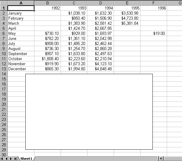
Figure 2
. Adding an embedded chart from the ChartObjects.Add method. The new chart is blank; Excel made no assumptions about it. Use the ChartWizard method to fill it in easily, or set all of the properties manually.How did we settle on the values to pass? With a bit of brute force in the Command Window. We created a public variable, oExcel, then ran the XLGDataSetup program. Next, we activated Excel (using Alt-Tab) and added a chart using the Chart Wizard button, and then positioned the resulting graph where we wanted it. Then we went back to VFP and queried the Left, Top, Height, and Width properties of the ChartObject object. The following commands give you the numbers you need.
? oExcel.Sheets[1].ChartObjects[1].Left
? oExcel.Sheets[1].ChartObjects[1].Top
? oExcel.Sheets[1].ChartObjects[1].Height
? oExcel.Sheets[1].ChartObjects[1].Width
If you want to add a chart sheet, use the Add method of the Charts collection. This one needs no parameters. It places the new chart sheet before the currently active worksheet. The chart sheet is named Chartn, where n is the next available chart number.
oChart = oBook.Charts.Add()
Add can also take parameters to specifically place the new chart sheet. Pass a Worksheet object as the first parameter to place the chart before the worksheet, or pass a Worksheet object as the second parameter to place it after the specified worksheet. A note of caution: passing worksheet names as the first or second parameter nets this error: "OLE IDispatch exception code 0 from Microsoft Excel: Unable to get the Add property of the Sheets class." Be sure to pass the Worksheet object.
The ActiveChart property
When the Add method is used to add an embedded chart, the resulting chart is not selected. To make it available through the Workbook s ActiveChart property, you need to use the chart s Activate method:
oChart.Activate()
Now the chart is active and available from the Workbook s ActiveChart property.
We ve sometimes found that Chart object methods, particularly those for embedded charts, fail with an "Unknown name" error if called by the full ChartObject name (for example, Excel.Workbooks[1].Sheets["Sheet1"].ChartObjects[1], or any variable set to the full reference), but they appear to work just fine when called from the ActiveChart property when the same chart is definitely active (for instance, oExcel.ActiveWorkbook.ActiveChart). We re not quite sure why this is, but we re glad to find a workaround when some methods just don t want to work.
Off to see the wizard
There is a single method called ChartWizard that allows you to quickly format a chart. If you re familiar with Excel s interactive method of building a chart, the parameters will be familiar, too, because they closely parallel the tabs on the Chart Wizard s dialog box.
oChart.ChartWizard( [oSourceRange], [nChartType], [nChartFormat],
[nPlotBy], [nCategoryLabels], [nSeriesLabels],
[lHasLegend], [cTitle], [cCategoryTitle],
[cValueTitle], [cExtraTitle] )
| oSourceRange | Object | The Range object that contains the source data for the chart. |
| nChartType | Numeric | The chart type. Use one of the following constants: xlArea 1 xl3DArea -4098 xlBar 2 xl3DBar -4099 xlColumn 3 xl3DColumn -4100 xlLine 4 xl3DLine -4101 xlPie 5 xl3DPie -4102 xlRadar -4151 xl3DSurface -4103 xlXYScatter -4169 xlDoughnut -4120 xlCombination -4111
See the text for more information. |
| nChartFormat | Numeric | The variation of the chart type to use (for example, if nChartType is xlBar, then you could choose stacked bar vs. clustered bar). Use a number from 1 to however many formats are available. See the text for more information. |
| nPlotBy | Numeric | Indicates whether data series are stored in rows or columns. Use one of these two constants: xlRows 1 xlColumns 2 The default is based on the shape of the range. If there are more rows than columns, the default is xlRows. If there are more columns than rows, the default is xlColumns. If there are an equal number of rows and columns, xlRows is used. |
| nCategoryLabels | Numeric | Indicates how many rows (if plotting by rows) or columns (if plotting by columns) to use as the labels on the category (X) axis. |
| nSeriesLabels | Numeric | Indicates how many columns (if plotting by rows) or rows (if plotting by columns) to use to label the series. Generally, the labels appear in the legend. |
| lHasLegend | Logical | Indicates whether the chart has a legend (.T.) or not (.F.). |
| cTitle | Character | A character string used to title the chart. By default, it is centered just above the plot area. |
| cCategoryTitle | Character | A character string used to title the category (X) axis. |
| cValueTitle | Character | A character string used to title the value (Y) axis. |
| cExtraTitle | Character | A character string used for a second value axis title in 2D charts (if two separate value axes are used), or as the series (Z) axis title in 3D charts. |
All this power in a single method comes with a price it takes quite a few pages to explain all the parameters. As we explain each of the parameters, we ll also tell you which Chart object properties are set by the ChartWizard method, and whether any alternative methods are available to set these parameters. These properties and methods are discussed in the remaining sections of this chapter, so we ll note the section to reference for a complete discussion of those properties.
The source range
This is the Range object where the data resides. For embedded charts, it can be but doesn t have to be on the same worksheet. For chart sheets, the data is obviously not on the same worksheet. To pass the range used to populate the embedded chart shown in Figure 2, pass the following object as the oSourceRange parameter:
oBook.Sheets["Sheet1"].Range("A1:F13")
Notice that in this range, we ve included the cells that contain the category and value labels. If no other parameters are passed to the ChartWizard, it assumes that no rows or columns are used as labels, so 13 categories are graphed, instead of 12 months, and six series are plotted instead of five years. If you choose to include the category and value labels, be sure to include the nCategoryLabels and nSeriesLabels parameters.
Non-contiguous ranges
It would be nice if all graphs could be graphed from contiguous ranges of data. However, you ll find that there are times when you d like to use one worksheet to develop multiple graphs, or put data from multiple worksheets into a single graph. Either way, the series data is not contiguous.
Fortunately, Excel provides a way to use non-contiguous data. All that s necessary is to list the ranges separated by commas. Be sure to include the category label row first. For our example, let s build a graph with the months as category names, and show the years 1993 and 1994 as data series. There are two ways to do this. Using cell addresses, the code looks like this:
oBook.Sheets["Sheet1"].Range("A1:A13, C1:C13, D1:D13")
Using range names (see the section "Range names are your friend" earlier in this chapter), you get this more readable code:
oBook.Sheets["Sheet1"].Range("CategoryNames, Year1993, Year1994")
 Be sure to name the ranges using the Range object s Name property, instead of using the Names collection s Add method. We re not sure why, but a range that s added with Names.Add doesn t seem to be recognized by the ChartWizard method. You get an OLE error: 0x800a03ec, Unknown COM status code. To be fair, this isn t the only way to get that error. You can trigger this error by passing a misspelled or non-existent range name, too.
Note that for each of the ranges (including the CategoryNames range), the range includes a row for the series labels. When passing a range that includes headings, be sure that the nCategoryLabels and nSeriesLabels parameters (the fifth and sixth parameters) have a value of 1 (or more, if more rows/columns are used).
Other source properties and methods
Data series are stored in the SeriesCollection collection object, which stores a Series object for each data series. The SeriesCollection s Add method takes five parameters. They are the source range (just like the ChartWizard), a PlotBy numeric value (just like the ChartWizard s nPlotBy parameter), a logical value that s true if the first row or column contains series labels, another logical value that s true if the first column or row contains category labels, and finally, a logical value that determines whether the category labels are replaced or not. Issuing the following is similar to adding the source range through the ChartWizard (using the oSourceRange, nPlotBy, nSeriesLabels, and nCategoryLabels parameters):
#DEFINE xlColumns 2
oExcel.ActiveChart.SeriesCollection.Add("Sheet1!A1:F13", xlColumns, .T., .T.)
The Series objects store a lot of formatting information. This is covered in more detail in the "Formatting the components" section later in this chapter.
Another alternative that s new to Excel 2000 is the Chart object s SetDataSource method. This method takes two parameters: the source range and the numeric PlotBy value. The following is equivalent to the SeriesCollection.Add method and the ChartWizard method:
#DEFINE xlColumns 2
oExcel.ActiveChart.SetSourceData(oExcel.Sheets[1].Range("Sheet1!A1:F13"),;
xlColumns)
Chart Types and Formats
The ChartWizard s second and third parameters work together. The first of these is nChartType, a numeric value that corresponds to the type of chart, such as area chart, pie chart, line chart, or bar chart. The second of these parameters, nChartFormat, is a sub-type, or a fine-tuning on the basic chart type. For example, a bar chart can be a clustered bar or a stacked bar chart. Figure 3 shows how these two parameters work in the interactive Chart Wizard. The list to the left shows the chart type (with a thumbnail to help you out), and the chart sub-type is shown on the right, with larger icons to help you select precisely which chart to use.
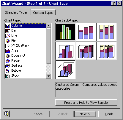
Figure 3
. Chart types and sub-types, as seen from Excel s Chart Wizard. This illustrates how the nChartType (corresponds to the chart type list) and nChartFormat (corresponds to the sub-type buttons on the right) parameters work together.There s only one problem with using Figure 3 as a reference: this is one of the few dialog boxes that does not put the options in as they re used in the corresponding method! We ve shown Figure 3 to illustrate the concept of Chart Type and Chart Format, but don t rely on the dialog box to give you hints about the values to use.
The nChartType parameter uses a series of values, each with its own VBA constant name. Unfortunately, there are no constants available for the nChartFormat parameter. In fact, they don t even really correspond to the chart sub-types shown in Figure 3, because the ChartWizard method separates 3D from 2D graphs, and it mixes and matches types. Appendix B shows a complete list of the available values; Table 1 shows the most common values.
Table 1
. Sample nChartType parameters.The Chart Format value is the column to use in the ChartWizard; the Chart Type value is the resulting value in the Chart object s ChartType property. Appendix B has the complete listing.| Chart Format description | Chart Format value | Chart Type value |
| For Chart Type: xlArea | 1 | |
| Stacked Area | 1 | 76 |
| Stacked Area with black grid lines | 4 | 76 |
| For Chart Type: xlBar | 2 | |
| Clustered Bar | 1 | 57 |
| Stacked Bar | 3 | 58 |
| Clustered Bar with 0 overlap and 0 gap width | 8 | 57 |
| For Chart Type: xlColumn | 3 | |
| Clustered Column with gap width set to 150 | 1 | 51 |
| Clustered Column, 0 overlap and 0 gap width | 8 | 51 |
| 100% Stacked Column with series lines | 10 | 53 |
| For Chart Type: xlLine | 4 | |
| Line with markers | 1 | 65 |
| Line with no data markers | 2 | 4 |
| Data markers only (no connecting lines) | 3 | 65 |
| Smoothed line with no markers | 10 | 4 |
| For Chart Type: xlPie | 5 | |
| Pie with no labels | 1 | 5 |
| Pie with labels, highlighting first wedge | 2 | 5 |
| Exploded pie | 4 | 69 |
| For Chart Type: xl3DArea | -4098 | |
| Stacked 3D area | 1 | 78 |
| Stacked 3D area with series labels | 2 | 78 |
| Area 3D elevated, vertical grid lines | 7 | -4098 |
| For Chart Type: xl3DBar | -4099 | |
| Clustered 3D | 1 | 60 |
| Stacked 3D | 2 | 61 |
| For Chart Type: xl3DColumn | -4100 | |
| Clustered 3D | 1 | 54 |
| Stacked 3D | 2 | 55 |
| 100% Stacked 3D | 3 | 56 |
| For Chart Type: xl3DPie | -4102 | |
| 3D Pie with no labels | 1 | -4102 |
| 3D Exploded pie | 4 | 70 |
Other chart type properties
The nChartType and nChartFormat parameters set the Chart object s ChartType property. Just to be sure that life isn t too simple, Excel has 73 numeric values that don t relate well (mathematically, anyway) to the combinations of nChartType and nChartFormat parameters. You can see the resulting values enumerated in the Chart Format Value column of Table 1. We ll discuss them some more in the "Chart types" section later in this chapter.
Not only do these two parameters set the ChartType property, they also set many properties of the various Axis objects, including ScaleType, HasMajorGridlines, and HasRadarAxisLabels (if a Radar chart). Series properties are set, too, including AxisGroup, ChartType, Explosion, HasDataLabels, HasErrorBars, and various Marker properties.
For more information on these and other related properties, see the appropriate sections under "Formatting the components" later in this chapter.
PlotBy selecting rows or columns
The nPlotBy parameter determines whether rows or columns are used as data series. Two values are available: xlRows (1) and xlColumns (2). The default depends upon the shape of the range: if there are more columns than rows, columns are the default; otherwise, the default is rows. Because of this "moving target" nature of the default value, we choose to always provide this parameter, rather than assume anything.
Other PlotBy properties
This is a well-behaved parameter, as it sets only one property without any guesswork, and it even has the same name! The Chart object s PlotBy property uses the same two values, xlRows (1) and xlColumns (2).
The category and series labels
The nCategoryLabels and nSeriesLabels parameters control how many rows or columns are used within the source range to label the categories and series. The nPlotBy parameter determines whether the category labels are rows or columns. If nPlotBy is xlRows, then the category labels are in the first n rows, and the series labels are in the first n columns. Conversely, if nPlotBy is xlColumns, then the category labels are in the first n columns, and the series labels are in the first n rows.
Generally, the value of nCategoryLabels and nSeriesLabels is 0 or 1. You can, however, use two or more columns/rows. You should experiment with the visual results; having two lines for each category may be too busy if many categories are used. Depending on space, Excel may omit the second line, anyway.
Other label properties
Category labels are stored as a range in the Series object s XValues property. Series labels are stored in the Series object s Name property. More on those in the "Data series" topic later in this chapter.
Does it have a legend?
The lHasLegend parameter determines whether the resulting chart has a legend (also known as a "key"). All it does is make the legend visible (or not). Pass a logical value indicating whether the chart should have a legend.
Other legend properties and objects
This parameter sets the Chart object s HasLegend property, which is a logical value. You can query this one and get a Boolean value (unlike many seemingly Boolean values). If the value is true, legend values are set through the Chart object s Legend object, which is discussed in detail in the "Legends" topic later in this chapter.
Title parameters
The final four parameters cTitle, cCategoryTitle, cValueTitle, and cExtraTitle are simply character strings that are placed in the chart as titles. The cTitle parameter is used as a chart title and is centered at the top of the chart. The cCategoryTitle and cValueTitle parameters are axis titles and are centered on the respective axis. The cExtraTitle is used only in two cases: if there is a second axis on a 2D chart, or if the chart is a 3D chart, and a third axis needs a title. See the ChartWizard example in the next section for an example showing where the titles are placed.
Other title properties
The cTitle parameter sets the Chart s HasTitle property to true and makes the ChartTitle object available (through the ChartTitle property). The remaining title parameters are axis titles, which set the corresponding Axis object s HasTitle property to True, and makes the AxisTitle object available (through the AxisTitle property). These are discussed in detail in the "Titles" topic later in this chapter.
Finally, an example of wizardry
After all the explanation of the various parameters, it s now time to see how this thing really works. For the example, we ll build a clustered column chart from the whole range of example data, plotting series by columns and using one column and row for labels. The legend is calculated, and we ll use example titles to show where the various titles go. Ready? Here goes:
#DEFINE xlColumn 3
#DEFINE xlColumns 2
#DEFINE autoColumnFormat 4
#DEFINE autoOneSeriesLabel 1
#DEFINE autoOneCategoryLabel 1
#DEFINE autoHasLegend .T.
oSourceRange = oExcel.Sheets[1].Range("A1:F13")
oExcel.ActiveChart.ChartWizard(oSourceRange, xlColumn, autoColumnFormat, ;
xlColumns, autoOneCategoryLabel, autoOneSeriesLabel, autoHasLegend, ;
"Chart Title", "Category Title", "Value Title", "Extra Title")
Figure 4
shows the results of the ChartWizard method. As you can see, there s a lot of power packed into this method. As you examine the resulting graph, you see a lot of the features of the ChartWizard method. There are titles, axis labels, and a legend on a nicely formatted chart. If there s something you want to enhance, you can certainly do so. There are many properties and methods to help you refine the format see the section "Formatting the components" later in this chapter.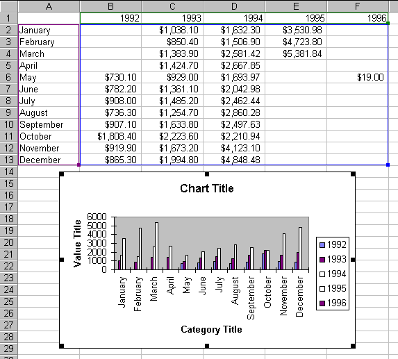
Figure 4
. The results of the ChartWizard method. Although its parameter list is long, the ChartWizard method has a lot of power to format a chart.There is an alternative to using the ChartWizard. You can control each of the objects separately. It takes more code, but you gain more control. We ve found that a hybrid approach works best: use the ChartWizard to get you close to what you want, and then refine the formatting from there. In the following sections, we ll discuss the various objects contained in a chart, and how to refine them. Then we ll look at the code to manually create that chart without the ChartWizard.
The anatomy of a chart
Now that we have a chart to look at, we can talk about the pieces of the chart. So many objects make up a chart that the terminology quickly gets confusing.
The chart area is the whole area of the chart. For embedded charts, it s the area enclosed by the border. When selected, it has eight resize handles, as shown in Figure 4. For chart sheets, the chart area is the whole sheet. The major difference between chart sheets and embedded charts is that the chart area on an embedded chart can be moved and resized (via the Top, Left, Height, and Width properties), while the size and position of a chart sheet is fixed to the bounds of a sheet. The chart area is the only object affected by whether the chart is a chart sheet or an embedded chart. The Chart object stores the ChartArea object in the ChartArea property.
The plot area is the area bounded by the axes. It s the gray area shown in Figure 4. The PlotArea object is accessed from the Chart object s PlotArea property.
There are several kinds of axes available in the charts. Figure 4 shows the two most common: the category axis, also known as the X or horizontal axis, and the primary value axis, known as the Y or vertical axis. Excel provides for two value axes; if the secondary value axis were used, it would be shown on the right side of the graph. For some 3D charts, there is a series axis, also known as a Z-axis. The Axes collection is accessed through the Chart object s Axes method.
The legend is the box to the right of the plot area. It shows a sample of the formatting for each series along with the series labels. The Legend object is accessed via the Chart object s Legend property.
Data series are data points plotted with the same format. Each series is stored in an object in the SeriesCollection object. The Series object stores the data ranges for the data to graph, the category labels, and the series labels. It also stores all the formatting options, such as color options and formatting specific to the chart type (high-low bars, data markers, bar types, and so on). Each series can have its own chart type; for example, you can have one series as a line, the next as an area chart, and the third as a column chart. As long as all series use the same kind of axes, you can mix and match chart types. (In other words, a single chart can contain several different graph types, but don t plan on putting pie charts in the same chart as lines and columns.)
Within each series is a collection of data points. Each point can be labeled and/or formatted separately. Formatting a point calls attention to that data item for example, it could be used to identify the high (or low) for a series. Warning: highlighting too many data points causes charts to become very confusing to the viewer. If you re highlighting more than a couple of points in a chart, be sure the points really need to be highlighted. Access the Points collection from the Series object s Points method.
Copyright 2000 by Tamar E. Granor and Della Martin All Rights Reserved
EAN: 2147483647
Pages: 128
- Linking the IT Balanced Scorecard to the Business Objectives at a Major Canadian Financial Group
- A View on Knowledge Management: Utilizing a Balanced Scorecard Methodology for Analyzing Knowledge Metrics
- Measuring ROI in E-Commerce Applications: Analysis to Action
- Technical Issues Related to IT Governance Tactics: Product Metrics, Measurements and Process Control
- Governing Information Technology Through COBIT