Chapter 15: Components
|
A component is a GUI device that presents user input to programs and displays program information to users. Standard GUI components include buttons, text fields, scrollbars, and menus. Java's awt package provides a rich suite of components, all of which are reasonably easy to use. A program's GUI can combine custom drawing, which you learned about in the previous chapter, with standard components, which you will learn about here and in the next chapter.
You have probably heard the expression "look and feel." For example, several years ago there was a major lawsuit between Apple and Microsoft; one company alleged that the other had plagiarized their look and feel. A program's look and feel consists of its appearance (look) plus its responses to user input (feel). This chapter will focus on look; feel will be covered in Chapter 16, "Events."
A Survey of Components
In this section, you will learn about some of the most useful components of the awt package:
-
Buttons
-
Checkboxes
-
Choices
-
Labels
-
Menus
-
Text fields
-
Text areas
-
Scrollbars
You have probably encountered all of these component types in the course of using your computer. As a reminder, Figure 15.1 shows one of each component type listed.
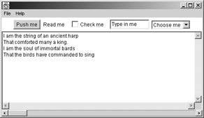
Figure 15.1: A component sampler
Now let's jump in and learn about each of these components.
Buttons
Buttons are perhaps the most familiar of all component types. We are so accustomed to them that we take for granted statements like, "Click on the OK button on your screen to confirm your purchase." Of course, there isn't really a button on the screen; it's just a picture of a button. "Press the OK button" really means, "Move your mouse until the arrow on the screen is over the picture of the button. Then press and release the button on your mouse."
Figure 15.2 shows a button in a frame.
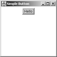
Figure 15.2: A button in a frame
In Java, buttons are represented by the java.awt.Button class. Here is the code that created Figure 15.2:
1. import java.awt.*; 2. 3. class ShowButton 4. { 5. public static void main(String[] args) 6. { 7. Frame f = new Frame("Simple Button"); 8. LayoutManager lom = new FlowLayout(); 9. f.setLayout(lom); 10. Button btn = new Button("Hello"); 11. f.add(btn); 12. f.setSize(200, 200); 13. f.setVisible(true); 14. } 15. } Line 10 illustrates the most common Button constructor, which takes a string argument. The string appears as the button's text label.
Something in this code is conspicuously absent, and something else in conspicuously mysterious. Look at Figure 15.2. The button is a reasonable size. It's big enough to encompass its text, and not much bigger. It's near the top of the frame, and it's horizontally centered. Conspicuously absent is the code that sets the button's size and location.
The mysterious code is lines 8 and 9, which construct and use an instance of FlowLayout. The FlowLayout class is a kind of layout manager. Layout managers are responsible for setting the location and size of components. We will visit them in detail in the second half of this chapter; you will find them much easier to understand after you know about components. For now, be aware that the button's reasonable size and location were set by the layout manager. The call to add() on line 11 puts the button in the frame. The method uses the layout manager to work out the details.
The example code is not very object-oriented. Here is a version that extends Frame:
1. import java.awt.*; 2. 3. class BtnInAFrame extends Frame 4. { 5. public BtnInAFrame() 6. { 7. setLayout(new FlowLayout()); 8. Button btn = new Button("Hello"); 9. add(btn); 10. setSize(200, 200); 11. } 12. 13. public static void main(String[] args) 14. { 15. (new BtnInAFrame()).setVisible(true); 16. } 17. } The GUI that this code produces is identical to the previous example. Notice that construction and use of the layout manager have now been combined into a single line (line 7) so as to be less obtrusive.
In the previous chapter, you learned about fonts and colors. The Button class has three methods that let you control the font and color of a button:
-
setFont(Font f)
-
setForeground(Color c)
-
setBackground(Color c)
Actually, Button inherits these methods from its superclass, java.awt.Component. All the component classes you will learn about in this chapter extend java.awt.Component, so they all implement these three methods.
setFont() sets the font of any text that the component displays. setForeground() sets the color of the component's text, and setBackground() sets the component's background color. The following code displays a button with a large yellow serif font on a blue background:
import java.awt.*; class FancyButtonInFrame extends Frame { public FancyButtonInFrame() { LayoutManager lom = new FlowLayout(); setLayout(lom); Button btn = new Button("Hello"); Font font = new Font("Serif", Font.ITALIC, 36); btn.setFont(font); btn.setForeground(Color.yellow); btn.setBackground(Color.blue); add(btn); setSize(200, 200); } public static void main(String[] args) { FancyButtonInFrame b = new FancyButtonInFrame(); b.setVisible(true); } } Figure 15.3 shows the button in the frame. The black-and-white screen shot does not do justice to the colors, but you can clearly see the enlarged italic font.
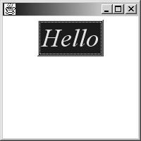
Figure 15.3: A fancy button
Notice that the button is still large enough to encompass its text, even though the text is now considerably larger. We have the mysterious layout manager to thank for that.
Buttons are for clicking. If you run any of the code in this section, you will find that the buttons do the right thing when you click on them: They look like they're indented into the screen until you release the main mouse button. However, nothing happens within the program. This should be expected, since there is no code in any of the programs that appears to deal with listening for button input. Listening for input is a function of feel, not look, so it will be presented in the next chapter.
Checkboxes
A checkbox is a little box that can be either checked or not checked. The checked/not checked state changes whenever the user clicks on the component. The two most useful constructors are
-
Checkbox(String s)
-
Checkbox(String s, boolean state)
The string is the checkbox's text. The boolean in the second form is the checkbox's initial state. The following code builds and displays a simple unchecked checkbox:
import java.awt.*; class CboxInnaFrame extends Frame { public CboxInnaFrame () { setLayout(new FlowLayout()); Checkbox cbox = new Checkbox("Check Me"); add(cbox); setSize(200, 200); } public static void main(String[] args) { (new CboxInnaFrame ()).setVisible(true); } } The result is shown in Figure 15.4.

Figure 15.4: A simple checkbox
The figure just shows the initial state of the GUI. If someone clicks on the box, it will be checked.
The following code displays a checkbox that is checked if the application was invoked with "yes" as its first command-line argument.
import java.awt.*; class CheckedCbox extends Frame { public CheckedCbox(boolean b) { setLayout(new FlowLayout()); Checkbox cbox = new Checkbox("Check Me", b); add(cbox); setSize(200, 200); } public static void main(String[] args) { boolean state = false; if (args.length > 0 && args[0].equals("yes")) state = true; (new CheckedCbox(state)).setVisible(true); } } Figure 15.5 shows the result when the application is invoked by typing java CheckedCbox yes.
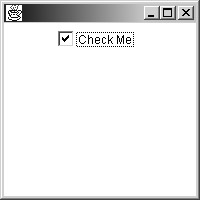
Figure 15.5: A checked checkbox
Now it's time to display several components together. The following code creates three checkboxes and a button:
1. import java.awt.*; 2. 3. class Boats extends Frame 4. { 5. Checkbox[] cboxes; 6. Button btn; 7. String[] sizes = { "small", "medum", "large" }; 8. 9. Boats() 10. { 11. setLayout(new FlowLayout()); 12. 13. cboxes = new Checkbox[sizes.length]; 14. for (int i=0; i<sizes.length; i++) 15. { 16. String s = "a " + sizes[i] + " boat"; 17. cboxes[i] = new Checkbox(s); 18. add(cboxes[i]); 19. } 20. btn = new Button("Add to shopping cart"); 21. add(btn); 22. 23. setSize(600, 200); 24. } 25. 26. public static void main(String[] args) 27. { 28. new Boats().setVisible(true); 29. } 30. } This application is slightly longer than any of our previous GUI code examples. It is long enough to warrant some structure. Note that the three checkboxes, which could have been constructed one by one, are constructed in a loop. Line 16 generates the text for each checkbox, based on the appropriate string from the sizes array on line 7. A nice benefit of this structure is the visual isolation of the literal strings. They are easy to find, up near the top of the code listing.
Did you notice that "medium" was misspelled? Would you have noticed so easily if the literal strings were in the middle of the code? Imagine the difficulty in correcting a spelling error if the strings were scattered over a 300-line constructor. When you misspell a keyword (like "for" or "new"), the compiler tells you the line number where the error occurs. But when you misspell a literal string, the compiler can't help you. You have to go hunting for the string.
Another benefit of this program's structure is the ease with which it can be modified. If you want to add or delete some sizes, changing the array on line 7 is the only change you need to make. Exercises 2 and 3 show this in action.
Figure 15.6 shows the example program's GUI. (The spelling error has been fixed.)

Figure 15.6: Three checkboxes and a button
In the figure, the user has checked both "a small boat" and "a large boat". This is suspicious. A GUI should capture the user's precise intention. Moreover, a well-designed GUI should make it impossible for a user to enter invalid data. Figure 15.6 gives the impression that the user is supposed to check only one of the three checkboxes. If the checkboxes represent mutually exclusive alternatives, the GUI should be changed to discourage (or, better yet, prevent) selection of more than one boat size.
There are two ways to change the GUI:
-
Insert text that tells the user to check only one box.
-
Insert code that automatically unchecks a box whenever the user makes a new selection.
The first option puts all the responsibility on the user. The GUI still permits invalid input, and the user gets all the blame when something goes wrong. This approach is unforgivable. It's also distressingly common: Every Web user has experienced an extreme version of it. Think of the last time you typed your credit card number or phone number into a Web page, only to be told that you should have (or should not have) used spaces or hyphens. Then you have to wait for the page to reload, you have to reenter your credit card or phone number, and if the page designer was especially inept, you have to reenter your name and address as well.
The second option makes it impossible for any user to select more than one option. The result is a GUI that is free from blame. This is the approach we will take.
Java's checkboxes can act as radio buttons. A radio button is a member of a group, only one of which can be selected at any time. The term comes from the station-selection buttons on a car radio. To give radio-button behavior to a group of checkboxes, you first create an instance of the class java.awt.CheckboxGroup:
CheckboxGroup cbg = new CheckboxGroup();
When you construct your checkboxes, use one of the following constructors:
Checkbox(String s, boolean state, CheckboxGroup cbg)
or
Checkbox(String s, CheckboxGroup cbg, boolean state)
Here is the previous example, rewritten to use a checkbox group:
1. import java.awt.*; 2. 3. class RadioBoats extends Frame 4. { 5. Checkbox[] cboxes; 6. Button btn; 7. String[] sizes = { "small", "medium", "large" }; 8. 9. RadioBoats() 10. { 11. setLayout(new FlowLayout()); 12. 13. cboxes = new Checkbox[sizes.length]; 14. CheckboxGroup cbg = new CheckboxGroup(); 15. for (int i=0; i<sizes.length; i++) 16. { 17. String s = "a " + sizes[i] + " boat"; 18. boolean state = (i == 0); 19. cboxes[i] = new Checkbox(s, state, cbg); 20. add(cboxes[i]); 21. } 22. btn = new Button("Add to shopping cart"); 23. add(btn); 24. 25. setSize(600, 200); 26. } 27. 28. public static void main(String[] args) 29. { 30. new RadioBoats().setVisible(true); 31. } 32. } Line 18 creates a boolean whose value is true in the first pass through the loop. Thus, the first checkbox is checked and the rest are not. Figure 15.7 shows the GUI after the "a large boat" box has been selected.
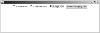
Figure 15.7: Checkboxes as radio buttons
Notice the appearance of the checkboxes. There are no check marks, and there are no boxes. The circular buttons are a standard visual cue that the components have radio behavior. This cue is standard not just in Java, but in all current windowing toolkits.
When you create a GUI that has multiple checkboxes, ask yourself if the checkboxes can be selected independently, or if only one should be selected at any moment. If they are independent, use plain checkboxes. If they are exclusive, give them radio behavior by creating a checkbox group for them.
Choices
Suppose you want to create a GUI for specifying a font. Suppose also that you want your users to choose one of the three standard font families, and also to choose a size from among a small set of options. You might use the following code:
import java.awt.*; class ChooseFontByRadios extends Frame { String[] families = {"Monospaced", "Serif", "SansSerif"}; int[] sizes = {16, 24, 32, 64}; public ChooseFontByRadios() { setLayout(new FlowLayout()); CheckboxGroup familyCBG = new CheckboxGroup(); for (int i=0; i<families.length; i++) add (new Checkbox(families[i], (i==0), familyCBG)); CheckboxGroup sizeCBG = new CheckboxGroup(); for (int i=0; i<sizes.length; i++) add (new Checkbox(""+sizes[i], (i==0), sizeCBG)); setSize(500, 200); } public static void main(String[] args) { (new ChooseFontByRadios ()).setVisible(true); } } This code creates two checkbox groups. The result, as you can see in Figure 15.8, is less than brilliant.
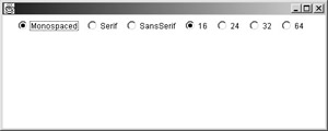
Figure 15.8: Multiple checkbox groups
The problem with the GUI is that there are no visual cues to tell you that there are two independent groups of checkboxes. This brings us to an important principle of GUI design: Components that are functionally related should also be visually related. To create a sensation of visual relationship among a group of components, you need to do two things:
-
Place the components near one another.
-
Isolate them from other nearby components.
In Figure 5.8, the components that control the font family are certainly near one another, but they are not isolated from the components that control size.
The java.awt.Choice component class offers an alternative to groups of checkboxes. A choice is a single component that lets the user make a one-of-many selection. Figure 15.9 shows a simple choice.
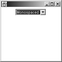
Figure 15.9: A choice
Choices are like pull-down menus. When you click on the component, the entire set of options is displayed, as shown in Figure 15.10.
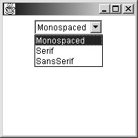
Figure 15.10: An expanded choice
Here is the code that created the GUIs in Figures 15.9 and 15.10:
1. import java.awt.*; 2. 3. class SimpleChoice extends Frame 4. { 5. String[] families = {"Monospaced", "Serif", 6. "SansSerif"}; 7. 8. public SimpleChoice() 9. { 10. setLayout(new FlowLayout()); 11. Choice c = new Choice(); 12. for (int i=0; i<families.length; i++) 13. c.add(families[i]); 14. add(c); 15. setSize(200, 200); 16. } 17. 18. public static void main(String[] args) 19. { 20. (new SimpleChoice()).setVisible(true); 21. } 22. } The choice is created in line 11. Notice that there are no constructor arguments. Line 13 calls the choice's add() method to add more options; the method's argument is a string. After the choice is constructed and populated, it is added to the GUI at line 14. Notice that line 14 uses the add() method of the frame to add the choice component to the frame. This is a different method from the add() in line 13, which adds options to the choice.
The following application uses choices to support selection of a font family and size:
1. import java.awt.*; 2. 3. class FontChoice extends Frame 4. { 5. 6. String[] families = {"Monospaced", "Serif", 7. "SansSerif"}; 8. int[] sizes = {16, 24, 32, 64}; 9. 10. public FontChoice() 11. { 12. setLayout(new FlowLayout()); 13. Choice c = new Choice(); 14. for (int i=0; i<families.length; i++) 15. c.add(families[i]); 16. add(c); 17. c = new Choice(); 18. for (int i=0; i<sizes.length; i++) 19. c.add(""+sizes[i]); 20. add(c); 21. setSize(200, 200); 22. } 23. 24. public static void main(String[] args) 25. { 26. (new FontChoice()).setVisible(true); 27. } 28. } The resulting GUI is shown in Figure 15.11.

Figure 15.11: Two choices
You can see that the choice component does an excellent job of isolating its parts visually.
Labels
Labels are by far the simplest Java components. They are the only components that cannot be used to gather user input. They just sit there. Often labels appear next to scrollbars, text fields, choices, or other components that do not have their own labels.
A label looks like text on a screen, exactly as if it had been painted there by the drawString() method of the Graphics class, which you saw in the previous chapter. The following code adds labels to the GUI of the last example in the previous section:
1. import java.awt.*; 2. 3. class FontChoiceWithLabels extends Frame 4. { 5. String[] families = {"Monospaced", "Serif", 6. "SansSerif"}; 7. int[] sizes = { 16, 24, 32, 64 }; 8. 9. public FontChoiceWithLabels() 10. { 11. setLayout(new FlowLayout()); 12. Label familyLabel = new Label("Font family:"); 13. add(familyLabel); 14. Choice c = new Choice(); 15. for (int i=0; i<families.length; i++) 16. c.add(families[i]); 17. add(c); 18. Label sizeLabel = new Label("Font size:"); 19. add(sizeLabel); 20. c = new Choice(); 21. for (int i=0; i<sizes.length; i++) 22. c.add(""+sizes[i]); 23. add(c); 24. setSize(350, 200); 25. } 26. 27. public static void main(String[] args) 28. { 29. (new FontChoiceWithLabels()).setVisible(true); 30. } 31. } Lines 12 and 18 construct labels. The constructor takes a single argument, which is the label's text. Figure 15.12 shows this code's GUI.
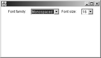
Figure 15.12: Choices with labels
The figure shows a typical use of labels. They rarely appear in isolation. Most often, they are used to give information or instructions about adjacent components.
Menus
Menus have a lot in common with choices:
-
They drop down to reveal options.
-
The options are arranged vertically.
-
They roll back up after a selection is made.
There are also some important differences:
-
Menus are attached to a frame's boundary, whereas choices occupy the interior.
-
Menus are hierarchical. They can contain submenus, which can contain sub-submenus, and so on. Choices are linear.
-
Commercial-grade sites are expected to have menus, which are expected to follow certain conventions. There are no such expectations or conventions for choices.
To insert menus into a frame, follow these steps:
-
Create a menu bar.
-
Create the menus.
-
Attach the menus to the menu bar.
-
Attach the menu bar to the frame.
These steps are all straightforward. The following code creates a frame with a single menu, labeled File. The menu contains three options: Open..., Close, and Exit.
1. import java.awt.*; 2. 3. class FrameWithSimpleMenu extends Frame 4. { 5. String[] options = { "Open...", "Close", "Exit" }; 6. 7. public FrameWithSimpleMenu() 8. { 9. // Create the menu bar. 10. MenuBar mbar = new MenuBar(); 11. 12. // Create the file menu. 13. Menu fileMenu = new Menu("File"); 14. for (int i=0; i<options.length; i++) 15. fileMenu.add(options[i]); 16. 17. // Populate the menu bar. 18. mbar.add(fileMenu); 19. 20. // Attach the menu bar to the frame. 21. setMenuBar(mbar); 22. 23. setSize(200, 200); 24. } 25. 26. public static void main(String[] args) 27. { 28. (new FrameWithSimpleMenu()).setVisible(true); 29. } 30. } Line 10 creates a menu bar. In Java, a frame may have at most one menu bar, to which all menus must be attached. Line 13 creates a File menu. The string passed to the Menu constructor appears in the menu bar. Line 15 adds options to the menu. Line 18 attaches the menu to the menu bar. Menus appear on the bar in the order of attachment, from left to right. Finally, line 21 attaches the menu bar to the frame. The result is shown in Figure 15.13.
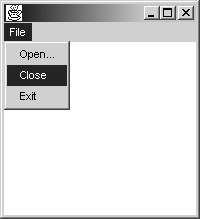
Figure 15.13: A menu in a menu bar
The Menu class has a method called addSeparator(), which inserts a horizontal separator bar. You can rewrite the loop at lines 14-15 in the previous example, adding a separator bar between the Close and Exit items:
for (int i=0; i<options.length; i++) { fileMenu.add(options[i]); if (i == 1) fileMenu.addSeparator(); } The result is shown in Figure 15.14.

Figure 15.14: A menu with a separator
In this example, you've created a menu and added items to it using the add() method, passing strings as method arguments. To create a hierarchical menu, add a menu instead of a string:
1. import java.awt.*; 2. 3. class FrameWithSubmenu extends Frame 4. { 5. public FrameWithSubmenu() 6. { 7. MenuBar mbar = new MenuBar(); 8. 9. Menu subSubMenu = new Menu("Subsub"); 10. subSubMenu.add("This"); 11. subSubMenu.add("That"); 12. Menu subMenu = new Menu("Sub"); 13. subMenu.add("Here"); 14. subMenu.add("There"); 15. subMenu.add(subSubMenu); 16. Menu fileMenu = new Menu("File"); 17. fileMenu.add("Open..."); 18. fileMenu.add("Close"); 19. fileMenu.add(subMenu); 20. 21. mbar.add(fileMenu); 22. setMenuBar(mbar); 23. 24. setSize(200, 200); 25. } 26. 27. public static void main(String[] args) 28. { 29. (new FrameWithSubmenu()).setVisible(true); 30. } 31. } The GUI appears in Figure 15.15.
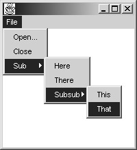
Figure 15.15: Hierarchical menus
You can nest menus within menus within menus as much as you want, but don't get carried away. The more complicated your menu structure is, the more difficult it will be for users to find important menu items.
There are many industry-standard conventions that govern the use of menus in GUIs. These are the result of extensive psychological research, as well as many years of practical usage. Here are a few guidelines that are easy to follow:
-
There should always be a File menu, and it should occupy the leftmost position in the menu bar. The items New, Open..., and Close should, if present, appear in that order. New should be the first item in the File menu. The Exit item should always be present and should be the last item in the File menu.
-
If the application has an Edit menu, it should immediately follow the File menu. The Edit menu should support functions such as Cut, Copy, and Paste.
-
If a Help menu is present, it should occupy the rightmost position menu bar.
-
Any menu item that causes a new frame or dialog box to be displayed should have three dots following its label. This explains why Open menu items, which typically display file selection dialogs, appear as Open... The three-dots notation is called an ellipsis.
These guidelines should be followed in appropriate situations. It isn't necessary to follow them when you're writing code to solve exercises, but keep them in mind whenever you are writing code that is at least moderately complicated and will be used by other people. This book's animated illustrations are all moderately complicated. They are much bigger than exercises and much smaller than commercial applications. They all follow these guidelines.
Text Fields
A text field is a component that displays a single line of text. Unlike labels, text fields respond to keyboard input. To create a text field, use one of the following constructors:
-
TextField(String contents)
-
TextField(int numColumns)
-
TextField(String contents, int numColumns)
The first version creates a text field that is just wide enough to accommodate its contents, which are specified by the string argument. The second version creates a blank text field that is wide enough to accommodate a string of numColumns characters. The width is only approximate, since most characters have varying widths when rendered in most fonts. The third version is like the second version, but the text field's contents are initialized to contents.
The following application creates two text fields for entering a first and last name. The Last Name text field uses a large non-default font:
import java.awt.*; class TFs extends Frame { public TFs() { setLayout(new FlowLayout()); add(new Label("First Name: ")); TextField tf = new TextField("Livia", 10); add(tf); add(new Label("Last Name: ")); tf = new TextField("Soprano", 12); Font font = new Font("Monospaced", Font.PLAIN, 24); tf.setFont(font); add(tf); setSize(550, 200); } public static void main(String[] args) { (new TFs()).setVisible(true); } } Figure 15.16 shows the GUI.
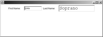
Figure 15.16: Two text fields
As you can see from the figure, there is something dissonant about having two related text fields with two unrelated fonts. The GUI would be much improved if both fields used the same font, but it illustrates an important point: Text fields can grow to accommodate their fonts. For the moment, we will simply attribute this behavior to the mysterious layout manager, with a promise of a full explanation in the second half of this chapter.
Text Areas
A text area is like a text field, but it can display multiple lines of text. If its contents exceed its height, it can automatically display scrollbars.
The most useful TextArea constructor is
TextArea(int numRows, int numColumns)
The constructor creates a text area with numRows rows and numColumns columns. Caution: The order of the constructor's arguments might seem backwards. Generally, we are used to specifying first a width and then a height (for example, in the various drawing methods of the Graphics class). But numRows is a specification of height, and numColumns is a specification of width. If you get confused about which comes first, you might try to create a tall, narrow text area and end up with a short, broad one. We say that the dimensions of the text area are specified in row major order, which just means that the number of rows comes first.
Here is a very simple program that creates a text area:
import java.awt.*; class TAInnaFrame extends Frame { public TAInnaFrame() { setLayout(new FlowLayout()); TextArea ta = new TextArea(10, 30); add(ta); setSize(550, 220); } public static void main(String[] args) { (new TAInnaFrame()).setVisible(true); } } The code is simple, but the text area is not. All we did was create a 10-by-30 text area, as shown in Figure 15.17.
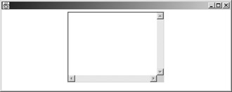
Figure 15.17: A text area
The text area's contents can be changed, either under program control or by user input. A little bit of typing results in Figure 15.18.
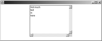
Figure 15.18: Multiple checkbox groups
As more text is entered, the contents become taller than the component. When this happens, the text area automatically installs scroll bars, as shown in Figure 15.19.
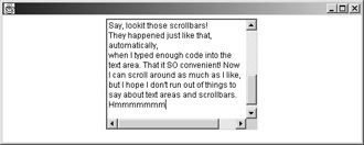
Figure 15.19: A text area with scroll bars
To add text to a text area programatically, use the append() method, which takes a string argument. The string is added to the end of the component's contents. Caution: Text areas do not automatically word-wrap. If you want to add text on a new line, your new text should start with a newline character (\n).
Scrollbars
A checkbox has two states, true and false. A choice has several states, one state for each item that might be selected. Both component types are good for situations where users have a limited range of choices. Scrollbars are input devices that come into play when the range of choices is broad. They are most commonly seen in word processors and Web browsers, where they are used to specify the vertical position of a document.
The java.awt.Scrollbar class has two main constructors:
-
Scrollbar()
-
Scrollbar(int orientation)
The first version creates a vertical scrollbar. The second version creates a scrollbar that is either horizontal or vertical, depending on the value of the orientation argument. The class defines two static ints, called Scrollbar.HORIZONTAL and Scrollbar.VERTICAL. So to construct a horizontal scrollbar, you would call new Scrollbar(Scrollbar.HORIZONTAL).
The following code creates two scrollbars, one in each orientation:
import java.awt.*; class TwoBars extends Frame { public TwoBars() { setLayout(new FlowLayout()); add(new Scrollbar()); // Vertical add(new Scrollbar(Scrollbar.HORIZONTAL)); setSize(200, 200); } public static void main(String[] args) { (new TwoBars()).setVisible(true); } } There is nothing very exciting about this code. Unfortunately, there is also nothing very exciting about the GUI it creates, as you can see from Figure 15.20.
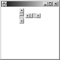
Figure 15.20: A pair of disappointing scrollbars
Neither of the scrollbars is long enough to be useful. A decent vertical scrollbar should be taller, and a decent horizontal scrollbar should be wider. You can't be effective at setting a component's height or width unless you know about layout managers. Fortunately, we have completed our survey of components, so let's move on.
|