Chapter 12. Cascading Style Sheets (CSS)
 | CONTENTS |  |
|
The names of most elements describe the semantic meaning of the content they contain. However, ultimately this content needs to be formatted and displayed to users. For this to occur, there must be a step where formatting information is applied to the XML document and the semantic markup is transformed into presentational markup. There are a variety of choices for the syntax of this presentation layer. However, two are particularly noteworthy:
-
Cascading Style Sheets (CSS)
-
XSL Formatting Objects (XSL-FO)
CSS is a non-XML syntax for describing the appearance of particular elements in a document. CSS is a very straight-forward language. No transformation is performed. The parsed character data of the document is presented more or less exactly as it appears in the XML document, though of course you can always transform the document with XSLT and then apply a CSS stylesheet to it if you need to rearrange the content of a document before showing it to the user. A CSS stylesheet does not change the markup of an XML document at all; it merely applies styles to the content that already exists.
By way of contrast, XSL-FO is a complete XML application for describing the layout of text on a page. It has elements that represent pages, blocks of text on the pages, graphics, horizontal rules, and more. You do not normally work with this application directly. Instead, you write an XSLT stylesheet that transforms your document's native markup into XSL-FO. The application rendering the document reads the XSL-FO and displays it to the user.
In this and the next chapter, we'll demonstrate the features of the two major stylesheet languages by applying them to the simple well-formed XML document shown in Example 12-1. This document does not have a document type declaration and is not valid, though a DTD or schema could be added easily enough. In general, DTDs and schemas don't have any impact on stylesheets, except insofar as they change the document content through entity declarations, default attribute values, and the like.
Example 12-1. Marjorie Anderson's recipe for Southern Corn Bread
<?xml version="1.0" encoding="UTF-8" standalone="yes"?> <?xml-stylesheet type="text/css" href="recipe.css"?> <recipe source="Marjorie Anderson"> <dish>Southern Corn Bread</dish> <ingredients> <ingredient> <quantity>1 cup</quantity> <component>flour</component> </ingredient> <ingredient> <quantity>4 tablespoons</quantity> <component>Royal Baking Powder</component> </ingredient> <ingredient> <quantity>1/2 teaspoon</quantity> <component>salt</component> </ingredient> <ingredient> <quantity>1 cup</quantity> <component>corn meal</component> </ingredient> <ingredient> <quantity>11/2 cups</quantity> <component>whole milk</component> </ingredient> <ingredient> <quantity>4 tablespoons</quantity> <component>melted butter</component> </ingredient> </ingredients> <directions> <step>Sift flour, baking powder, sugar & salt together.</step> <step>Add 1 cup corn meal.</step> <step> Beat egg in cup and add beaten egg and 11/2 cups whole milk to make a batter. Stir well. </step> <step> Add melted shortening and beat until light and thoroughly mixed. </step> <step> Pour into greased shallow pan or greased muffin rings. </step> <step> Bake in hot oven at <temperature>425 F</temperature> for <duration>25 minutes</duration>. </step> <step optional="yes"> Cut into squares if cooked in shallow pan. </step> </directions> <story> After my mother-in-law <person>Marjorie Anderson</person> died, Beth and I found this recipe written on the "extra recipes" page in a local cookbook in her cupboard. This was published by The Episcopal Churchwomen, Church of Ascension, <city>Mt. Sterling</city>, <state>Kentucky</state>. </story> </recipe>
12.1 The Three Levels of CSS
At the time of this writing, there are three versions of CSS. CSS Level 1 was an early W3C Recommendation from 1996 for HTML only, though the extension to XML was obvious. The CSS Level 1 specification was incomplete and led to inconsistent browser implementations.
CSS Level 2 is the current recommendation and the version of CSS on which this chapter focuses. CSS Level 2 places XML on an equal footing with HTML. Indeed, CSS Level 2 often works better with XML than with HTML because CSS styles don't have to interact with any predefined rendering semantics. For the most part, CSS Level 2 is a superset of CSS Level 1. That is, all CSS Level 1 stylesheets are also CSS Level 2 stylesheets that mean pretty much the same thing.
The W3C is now working on CSS Level 3. When complete, it will modularize the CSS specification so software can implement particular subsets of CSS functionality without having to implement everything. For instance, an audio browser could implement audio stylesheets but ignore the visual formatting model. Furthermore, CSS Level 3 adds a number of features to CSS, including multi-column layouts, better support for non-Western languages, such as Arabic and Chinese, XML namespace support, more powerful selectors, paged media, and more. However, CSS Level 3 is not yet implemented by any browsers.
12.2 CSS Syntax
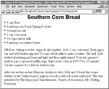
CSS syntax isn't XML syntax, but the syntax is so trivial this hardly matters. A CSS stylesheet is simply a list of the elements you want to apply the styles to, normally one to a line. If the element is in a namespace, then the qualified name like recipe:dish must be used. The prefix must be the same in the stylesheet as in the XML document. Each element name is followed by the list of styles you want to apply to that element. Comments can be inserted using the /*...*/ format of comments familiar to C programmers. Whitespace isn't particularly significant, so it can be used to format the stylesheet. Example 12-2 is a simple CSS stylesheet for the recipe document in Example 12-1. Figure 12-1 shows the recipe document as rendered and displayed by the Opera 4.01 browser with this stylesheet.
Example 12-2. A CSS stylesheet for recipes
/* Defaults for the entire document */ recipe {font-family: "New York", "Times New Roman", serif; font-size: 12pt } /* Make the dish look like a headline */ dish { display: block; font-family: Helvetica, Arial, sans-serif; font-size: 20pt; font-weight: bold; text-align: center } /* A bulleted list */ ingredient {display: list-item; list-style-position: inside } /* Format these two items as paragraphs */ directions, story { display: block; margin-top: 12pt; margin-left: 4pt } Figure 12-1. A semantically tagged XML document after application of a CSS stylesheet
This stylesheet has four style rules. Each rule names the element(s) it formats and follows that with a pair of curly braces containing the style properties to apply to those elements. Each property has a name such as font-family and a value such as "New York", "Times New Roman", serif. Properties are separated from each other by semicolons. Neither the names nor the values are case sensitive. That is, font-family is the same as FONT-FAMILY or Font-Family. CSS Level 2 defines over 100 different style properties. However, you don't need to know all of these. Reasonable default values are provided for all the properties you don't set.
For example, the first rule applies to the recipe element and says that it should be formatted using the New York font at a 12 point size. If New York isn't available, then Times New Roman will be chosen instead; if that isn't available, then any convenient serif font will suffice. These styles also apply to all descendants of the recipe element; that is, the styles cascade down the tree. Since recipe is the root element, this sets the default font for the entire document.
The second rule makes the dish element look like a heading, as you can see in Figure 12-1. It's set to a much larger sans serif font and made bold and centered besides. Furthermore, its display style is set to block. This means there'll be a line break between the dish and its next and previous sibling elements. The third rule formats the ingredients as a bulleted list, while the fourth rule formats both the directions and story elements as more-or-less straight-forward paragraphs with a little extra whitespace around their top and left-hand sides.
Not all the elements in the document have style rules and not all need them. For example, the step element is not specifically styled. Rather, it simply inherits a variety of styles from its ancestor elements directions and recipe, as well as using some defaults. A different stylesheet could add a rule for the step element that overrides the styles it inherits. For example, this rule would set its font to 10 point Palatino:
step {font-family: Palatino, serif; font-size: 10pt } 12.3 Associating Stylesheets with XML Documents
CSS stylesheets are primarily intended for use in web pages. Web browsers find the stylesheet for a document by looking for xml-stylesheet processing instructions in the prolog of the XML document. This processing instruction should have a type pseudoattribute with the value text/css and an href pseudoattribute whose value is an absolute or relative URL locating the stylesheet document. For example, this is the processing instruction that attaches the stylesheet in Listing 12-2 (recipe.css) to the file in Example 12-1 (cornbread.xml) if both are found in the same directory.
<?xml-stylesheet type="text/css" href="recipe.css"?>
Including the required type and href pseudoattributes, the xml-stylesheet processing instruction can have up to six pseudoattributes:
- type
-
This is the MIME media type of the stylesheet; text/css for CSS and application/xml (not text/xsl!) for XSLT.
- href
-
This is the absolute or relative URL where the stylesheet can be found.
- charset
-
This names the character set in which the stylesheet is written, such as UTF-8 or ISO-8859-7. There's no particular reason this has to be the same as the character set in which the document is written. The names used are the same ones used for the encoding pseudoattribute of the XML declaration.
- title
-
This pseudoattribute names the stylesheet. If more than one stylesheet is available for a document, the browser may (but is not required to) present readers with a list of the titles of the available stylesheets and ask them to choose one.
- media
-
Printed pages, television screens, and computer displays are all fundamentally different media that require different styles. For example, comfortable reading on screen requires much larger fonts than on a printed page. This pseudoattribute specifies the media types this stylesheet should apply to. There are nine predefined values:
-
screen
-
tty
-
tv
-
projection
-
handheld
-
print
-
braille
-
aural
-
all
By including several xml-stylesheet processing instructions, each pointing to a different stylesheet and each using a different media type, you can make a single document attractive in many different environments.
-
- alternate
-
This pseudoattribute must be assigned one of the two values yes or no. yes means this is an alternate stylesheet, not normally used. no means this is the stylesheet that will be chosen unless the user indicates that they want a different one. The default is no.
For example, this group of xml-stylesheet processing instructions could be placed in the prolog of the recipe document to make it more accessible on a broader range of devices:
<?xml-stylesheet type="text/css" href="recipe.css" media="screen" alternate="no" title="For Web Browsers" charset="US-ASCII"?> <?xml-stylesheet type="text/css" href="printable_recipe.css" media="print" alternate="no" title="For Printing" charset="ISO-8859-1"?> <?xml-stylesheet type="text/css" href="big_recipe.css" media="projection" alternate="no" title="For presentations" charset="UTF-8"?> <?xml-stylesheet type="text/css" href="tty_recipe.css" media="tty" alternate="no" title="For Lynx" charset="US-ASCII"?> <?xml-stylesheet type="text/css" href="small_recipe.css" media="handheld" alternate="no" title="For Palm Pilots" charset="US-ASCII"?>
12.4 Selectors
CSS provides limited abilities to select the elements to which a given rule applies. Many stylesheets only use element names and lists of element names separated by commas, as shown in Example 12-2. However, CSS provides some other basic selectors you can use, though they're by no means as powerful as the XPath syntax of XSLT.
12.4.1 The Universal Selector
The asterisk matches any element at all; that is, it applies the rule to everything in the document that does not have a more specific, conflicting rule. For example, this rule says that all elements in the document should use a large font:
* {font-size: large} 12.4.2 Matching Descendants, Children, and Siblings
An element name A followed by another element name B matches all B elements that are descendants of A elements. For example, this rule matches quantity elements that are descendants of ingredients elements, but not other ones that appear elsewhere in the document:
ingredients quantity {font-size: medium} If the two element names are separated by a greater than sign (>), then the second element must be an immediate child of the first for the rule to apply. For example, this rule gives quantity children of ingredient elements the same font-size as the ingredient element:
ingredient > quantity {font-size: inherit} If the two element names are separated by a plus sign (+), then the second element must be the next sibling element immediately after the first element. For example, this style rule sets the border-top-style property for only the first story element following a directions element:
directions + story {border-top-style: solid} 12.4.3 Attribute Selectors
Square brackets allow you to select elements with particular attributes or attribute values. For example, this rule hides all step elements that have an optional attribute:
step[optional] {display: none} This rule hides all elements that have an optional attribute regardless of their name:
*[optional] {display: none} An equals sign selects an element by a given attribute's value. For example, this rule hides all step elements that have an optional attribute with the value yes:
step[optional="yes"] {display: none} The ~= operator selects elements that contain a given word as part of the value of a specified attribute. The word must be complete and separated from other words in the attribute value by whitespace, as in a NMTOKENS or ENTITIES attribute. That is, this is not a substring match. For example, this rule makes bold all recipe elements whose source attribute contains the word "Anderson":
recipe[source~="Anderson"] {font-weight: bold} Finally, the |= operator matches against the first word in a hyphen-separated attribute value, such as Anderson-Harold or fr-CA.
CSS also provides a special syntax for selecting elements with a given ID value, even when you don't know exactly what the name of the ID type attribute is. Simply separate the ID from the element name with a sharp sign (#). For example, this rule applies to the single step element whose ID type attribute has the value P833:
step#P833 { font-weight: 800 } 12.4.4 Pseudoclass Selectors
Pseudoclass selectors match elements according to a condition not involving their name. There are seven of these. They are all separated from the element name by a colon. For example, the first-child pseudoclass matches the first child element of the named element. When applied to Example 12-1, this rule italicizes the first, and only the first, step element:
step:first-child {font-style: italic} The link pseudoclass matches the named element if and only if that element is the source of an as yet unvisited link. For example, this rule makes all links in the document blue and underlined:
*:link {color: blue; text-decoration: underline} The visited pseudoclass applies to all visited links of the specified type. For example, this rule marks all visited links as purple and underlined:
*:visited {color: purple; text-decoration: underline} The active pseudoclass applies to all elements that the user is currently activating (for example, by clicking the mouse on). Exactly what it means to activate an element depends on the context, and indeed not all applications can activate elements. For example, this rule marks all active elements as red:
*:active {color: red} The linking pseudoclasses are not yet well-supported for XML documents because most browsers don't recognize XLinks. So far, Mozilla and Netscape 6, the only browsers that recognize XLinks, are the only browsers that will apply these pseudoclasses to XML.
The hover pseudoclass applies to elements on which the cursor is currently positioned but which the user has not yet activated. For example, this rule marks all these elements as green and underlined:
*:hover {color: green; text-decoration: underline} The focus pseudoclass applies to the element that currently has the focus. For example, this rule draws a one-pixel red border around the element with the focus, assuming there is such an element:
*:focus {border: 1px solid red } Finally, the lang pseudoclass matches all elements in the specified language as determined by the xml:lang attribute. For example, this rule uses the David New Hebrew font for all elements written in Hebrew (more properly, all elements whose xml:lang attribute has the value he or any subtype thereof).
*:lang(he) {font-family: "David New Hebrew"} 12.4.5 Pseudoelement Selectors
Pseudoelement selectors match things that aren't actually elements. Like pseudoclass selectors they're attached to an element selector by a colon. There are four of these:
-
first-letter
-
first-line
-
before
-
after
The first-letter pseudoelement selects the first letter of an element. For example, this rule makes the first letter of the story element a drop cap:
story:first-letter { font-size: 200%; font-weight: bold; float: left; padding-right: 3pt } The first-line pseudoelement applies formatting to all characters in the first line of a block-level element. If the browser window is resized so that characters move into or out of the first line, then the formatting changes to match. For example, this rule formats the first line of the story element in small capitals instead of lowercase letters:
story:first-line {font-variant: small-caps} The before and after pseudoelements select the points immediately before and after the specified element. You can't really apply font or text styles to a zero-width point, but you can insert text at that point using the content property. For example, this rule inserts the string "Ingredients!" before the ingredients element:
ingredients:before {content: "Ingredients! "} This rule places the number of the step in front of each step element in the form 1., 2., 3., and so on:
step:before { content: counter(step) ". "; counter-increment: step; } 12.5 The Display Property
Display is one of the most important CSS properties. This property determines how the element will be positioned on the page. There are 18 legal values for this property. However, the two primary values are inline and block. The display property can also be used to create lists and tables, as well as to hide elements completely.
12.5.1 Inline Elements
Setting the display to inline, the default value, places the element in the next available position from left to right, much as each word in this paragraph is positioned. (The exact direction can change for right-to-left languages like Hebrew or top-to-bottom languages like traditional Chinese.) The text may be wrapped from one line to the next if necessary, but there won't be any hard line breaks between each inline element. In Example 12-1 and 12-2, the quantity, step, person, city, and state elements were all formatted as inline. This didn't need to be specified explicitly because it's the default.
12.5.2 Block Elements
In contrast to inline elements, an element set to display: block is separated from its siblings, generally by a line break. For example, in HTML, paragraphs and headings are block elements. In Example 12-1 and 12-2, the dish, directions, and story elements were all formatted with display: block.
12.5.3 List Elements
An element whose display property is set to list-item is also formatted as a block-level element. However, a bullet is inserted at the beginning of the block. The list-style-type, list-style-image, and list-style-position properties control which character or image is used for a bullet and exactly how the list is indented. For example, this rule would format the steps as a numbered list rather than rendering them as a single paragraph:
step { display: list-item; list-style-type: decimal; list-style-position: inside } 12.5.4 Hidden Elements
An element whose display property is set to none is not included in the rendered document the reader sees. It is invisible and does not occupy any space or affect the placement of other elements. For example, this style rule hides the story element completely:
story {display: none} 12.5.5 Table Elements
There are ten display values that identify elements as parts of a table. These are:
-
table
-
inline-table
-
table-row-group
-
table-header-group
-
table-footer-group
-
table-row
-
table-column-group
-
table-column
-
table-cell
-
table-caption
These display values have the obvious meanings by analogy with HTML 4.0 table tags. Their use should be consistent with each other and with other elements in the document. For instance, an element formatted as a table-row element should have a parent element formatted as a table and child elements formatted as table-cells. For example, these three rules format the ingredients as a simple table:
ingredients { display: table } ingredient { display: table-row } quantity, component { display: table-cell } 12.6 Pixels, Points, Picas, and Other Units of Length
Many CSS properties represent lengths. Some of the most important (though far from all) of these include:
-
border-width
-
font-size
-
line-height
-
margin-left, margin-top, margin-right, and margin-bottom
-
left
-
top
-
height
-
width
CSS provides many different units to specify length. They fall into two groups:
-
Absolute units of length such as inches, centimeters, millimeters, points, and picas.
-
Relative units such as ems, exes, pixels, and percentages.
Absolute units of length are appropriate for printed media (that is, paper), but should be avoided in other media. Relative units should be used for all other media, except for pixels, which probably shouldn't be used at all. For example, this style rule sets the dish element to be exactly one-half centimeter high:
dish { height: 0.5cm } However, documents intended for display on screen media like television sets and computer monitors should not be set to fixed sizes. For one thing, the size of an inch or other absolute unit can vary depending on the resolution of the monitor. For another, not all users like the same defaults, and what looks good on one monitor may be illegible on another. Instead, you should use units that are relative to something, such as an em, which is relative to the width of the uppercase letter M, in the current font, or ex, which is relative to the height of the lowercase letter x in the current font. For example, this rule sets the line-height property of the story element to one and half times the height of the letter x:
story { line-height: 1.5ex} Pixel is also a relative unit, though what it's relative to is the size of a pixel on the current display. This is generally somewhere in the vicinity of a point, but it can vary from system to system. In general, we don't recommend using pixels unless you need to line something up with a bitmapped graphic displayed at exactly a 1:1 ratio. Web pages formatted with pixel lengths invariably look too small or too large on a large fraction of users' monitors.
One very useful technique is to specify lengths as percentages of some other length. Exactly what this is a percentage of varies from property to property. For instance, if the line-height is given as a percentage, then it's calculated with respect to the font-height of the same element. These two rules set the font-height of the dish element to 0.5 centimeters and the line-height of the dish element to 0.75 centimeters:
dish { font-height: 0.5cm } dish { line-height: 150% } 12.7 Font Properties
Fonts are one of the most basic things designers want to set with CSS. Is the text italic? Is it bold? What typeface and size are used? CSS provides properties to set all these basic characteristics of text. In particular, you can set these properties:
- font-family
-
This is a list of font names, separated by commas, in order of preference. The last name in the list should always be one of the generic names serif, sans-serif, monospace, cursive, or fantasy. Multiword names like "Times New Roman" should be enclosed in quotes.
- font-style
-
The value italic indicates that an italic version of the font should be used if one is available. The value oblique suggests that the text should be algorithmically slanted, as opposed to using a specially designed italic font. The default is normal (no italicizing or slanting). An element can also be set to inherit the font-style of the parent element.
- font-size
-
This is the size of the font. This should be specified as one of the values xx-small, x-small, small, medium, large, x-large, xx-large. Alternately, it can be given as a percentage of the font-size of the parent element. It can also be specified as a length like 0.2cm or 12pt, but this should only be done for print media.
- font-variant
-
If this property is set to small-caps, then lowercase text is rendered in smaller capitals like this instead of normal lowercase letters.
- font-weight
-
This property determines how bold or light the text is. It's generally specified as one of the keywords normal (the default), bold, bolder, or lighter. It can also be set to any multiple of 100 from 100 (lightest) to 900 (darkest). However, not all browsers necessarily provide nine different levels of boldness.
- font-stretch
-
This property adjusts the space between letters to make the text more or less compact. Legal values include normal (the default), wider, narrower, ultra-condensed, extra-condensed, condensed, semi-condensed, semi-expanded, expanded, extra-expanded, and ultra-expanded.
For example, this style rule uses all of the previous properties to make the dish element a suitably impressive headline:
dish { font-family: Helvetica, Arial, sans-serif; font-size: x-large; font-style: italic; font-variant: small-caps; font-weight: 900; font-stretch: semi-expanded } 12.8 Text Properties
Text properties cover those aspects of text formatting other than what can be adjusted merely by changing the font. These include how far the text is indented, how the paragraph is aligned, and so forth. The most common of these properties include:
- text-indent
-
The text-indent property specifies how far in to indent the first line of the block. (Indents of all lines are generally applied via margin properties.) Hanging indents can be specified by making text-indent negative. This property only applies to block-level elements. For example, this style rule indents the first line of the story element by half an inch from the left side:
story { text-indent: 0.5in } - text-align
-
The text-align property can be set to left, right, center, or justify to align the text with the left edge of the block or the right edge of the block, to center the text in the block, or to spread the text out across the block. This property only applies to block-level elements.
- text-decoration
-
The text-decoration property can be set to underline, overline, line-through or blink to produce the obvious effects. Note, however, that the CSS2 specification specifically allows browsers to ignore the request to make elements blink. This is a good thing.
- text-transform
-
The text-transform property has three main values: capitalize, uppercase, and lowercase. Uppercase changes all the text to capital letters LIKE THIS. Lowercase changes all the text to lowercase letters like these. Capitalize simply uppercases the first letter of each word Like This, but leaves the other letters alone. The default value of this property is none, which performs no transformation. It can also be set to inherit to indicate that the same transform as used on the parent element should be used.

Changing the case in English is fairly straightforward, but this isn't true of all languages. In particular, software written by native English speakers tends to do a very poor job of algorithmically changing the case in ligature-heavy European languages like Maltese or context-sensitive languages like Arabic. Outside of English text, it's best to make the transformations directly in the source document rather than relying on the stylesheet engine to make the correct decisions about which letters to capitalize.
- white-space
-
The white-space property determines whether text is wrapped. It has only four legal values: normal, pre, nowrap, and inherit. Normal is of course the default and simply means to wrap the text wherever convenient, much as is done in this paragraph. Pre means to preserve all line breaks and whitespace in the document, as does the pre element in HTML. Nowrap means that runs of whitespace can be condensed, but that line breaks will not be inserted. Finally, inherit simply takes on the same behavior as the parent element.
12.9 Colors
CSS has several properties for changing the color of various items:
- color
-
The color of the text itself (black on this page)
- background-color
-
The color of the background behind the text (white on this page)
- border-color
-
The color of a visible box surrounding the text
CSS uses a 24-bit color space to specify colors, much as HTML does. Always keep in mind, however, that just because you can specify a color doesn't mean any given device can render it. A black-and-white printer isn't going to print red no matter how you identify it; it might give you some nice shades of gray though. Like many other properties, color depends on the medium in which the document is presented.
The simplest way to choose a color is through one of these 16 named constants: aqua, black, blue, fuchsia, gray, green, lime, maroon, navy, olive, purple, red, silver, teal, white, and yellow. There are also a number of colors that are defined to be the same as some part of the user interface. For instance, WindowText is the same color as text in windows on the local system.
Beyond this small list, you can specify the color of an item by specifying the three components red, green, and blue of each color, much as you do for background colors on HTML pages. Each component is given as a number between 0 and 255 with 255 being the maximum amount of the color. Numbers can be given in decimal or hexadecimal. For example, these rules use hexadecimal syntax to color the dish element pure red, the story element pure green, and the directions element pure blue:
dish { color: #FF0000 } story { color: #00FF00 } directions { color: #0000FF } If you prefer, you can specify the color as decimals separated by commas inside an rgb( ) function. For example, white is rgb(255,255,255); black is rgb(0,0,0). Colors in which each component is equal form various shades of gray. These rules use decimal syntax to color the ingredient element a light shade of gray but its quantity child element a darker shade of gray:
ingredient { color: rgb(43,43,43) } quantity { color: rgb(21,21,21) } You can also specify the color as percentages of each primary color from 0 to 100%. For example, the previous rules can be rewritten like this:
ingredient { color: rgb(16.9%,16.9%,16.9%) } quantity { color: rgb(8.2%,8.2%,8.2%) }
| CONTENTS | |
EAN: 2147483647
Pages: 28