Technical Solution
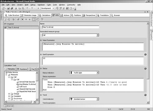
| We will assume that the data warehouse and Integration Services packages follow the standard approach and focus in this section on the particular Analysis Services features that we need to build the solution, as well as on the reporting techniques and Windows SharePoint Services development. Analysis Services DatabaseBecause we have six fact tables and about 17 dimension tables in the police service data warehouse, the first question we have to answer is how many cubes we need to build. In previous versions of Analysis Services as well as other OLAP technologies, a cube is usually related to a single business area or granularity, meaning that we might have four or five different cubes for this model. Analysis Services 2005 takes a much simpler approach to this. A cube can essentially contain all the facts and dimensions in a data warehouse, even though the different facts may have different granularities. This makes the concept of conformed dimensions even more important, to ensure that you can query measures from different measure groups across common dimensions. We start the solution by creating the data source view that will be used as the source for the cube. Remember that a cube requires a single data source view (DSV) to be used as the source, so we must include all the relevant facts and dimensions in the DSV before running the Cube Wizard. Tip: Identifying Missing Relationships Between Fact and Dimension Tables For large models like this, it is easy to occasionally miss defining a relationship between a fact table and a dimension table. When you run the Cube Wizard, you will see that the foreign key column on the fact table shows up as a suggested measure, which is probably not what you intended. At this stage, you can cancel the wizard and go back and define the additional relationships in the DSV. Creating a Parent-Child DimensionThe Employee dimension table contains a record for every employee in the police service, with a column that contains the employee key of the employee's direct superior. Analysis Services understands this type of relationship and lets you create a parent-child dimension, which will allow users to drill down through the levels defined by the employee key relationships. One way that you can set up a parent-child dimension is to use the Dimension Wizard, which will pick up the self-referencing relationship that you defined in the DSV and suggest that the dimension supports parent-child. Alternatively, you can edit an existing dimension and change the Usage property of the parent key attribute to Parent. After you have specified this setting, the attribute will show up in client tools as a hierarchy, as shown in Figure 9-6, so you should rename the attribute from Parent Employee Key to something more meaningful, such as Direct Reports. Figure 9-6. Employee dimension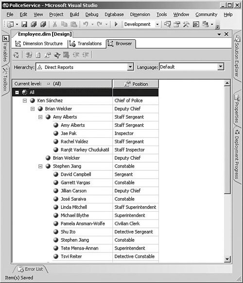 The name that will be used for each member of the Direct Reports hierarchy is taken from the dimension's key attribute. And, because there are separate First Name and Last Name columns in the Employee table, we have added a FullName column to the Employee view in the database that we can use to provide a meaningful name for the key attribute (using the Name Columns property of the Employee key attribute). Parent Members with Their Own DataUsually when you use a hierarchy in Analysis Services queries, the numbers for the child-level members are summed up to produce the totals for the group that they belong to. For example, a Product Category total will show the sum of the individual products in that category. Parent-child dimensions make things a little more interestingbecause all the members in the Employee dimension from the chief of police down all have an employee key, there can be fact records associated with parent records and their children. This means that in the dimension shown in Figure 9-6, if Amy Alberts received some complaints and so did the people who report to her, should a query show Amy's total as the number of complaints that she personally received, or the total number of complaints that all her direct reports received? Analysis Services handles this by adding a special child to Amy Alberts that also has the same name, as you can see in the figure. Any complaints that Amy personally received would be associated with this special child, and then these personal complaints would be added to those of her direct reports so that the parent-level Amy Alberts total will include the complaints made to everyone. For cases when you don't want to show the special child member, you can change the MembersWithData property of the parent attribute to be NonLeafDataHidden instead of the default setting, NonLeafDataVisible. In this case, the parent total will still be the same because it will still include the parent's own information, but the special child will not display. Changing the Sequence of Dimension MembersEach attribute in a dimension has an associated key column and optionally a name column that contains the text to display. When you use the attribute in a query, the sort order of the members is controlled by the OrderBy property of the attribute, and you can choose to order by either the key or the name. This works well for most cases, but what about when you want special control over the order so that, for example, the Position attribute shows the chief of police first in the list and then sorts the rest of the members by their rank? We can deal with this by adding a Position Sequence column to the Position dimension table, which will contain a number such as 1 for the Chief, 2 for the Deputy Chiefs, and so on. This sequence column can then be added to the Employee dimension as an attribute. To use the new Position Sequence attribute to change the order of the Position attribute, you can change the OrderByAttribute property of the Position attribute to Position Sequence, and then change the OrderBy property to AttributeKey. If you deploy the changes and browse the dimension, you will see that the positions now show up in the correct sequence. One side effect that we didn't intend though is that we now have an extra attribute, Position Sequence, which doesn't really mean anything to the users. You can hide the Position Sequence attribute by changing the AttributeHierarchyEnabled property to False for that attribute. This setting means that the attribute will not be available for users to select in a query, but can still be used in calculations or for purposes such as ordering other attributes and will still show up in client tools as a Member Property. Setting Up the Complaint Reasons Many-to-Many RelationshipAs you saw in the section "Data Model," each complaint may have many reasons so we have created an intermediary FactMappingComplaint Reason table to resolve the many-to-many relationship. When you use the Cube Wizard to create the cube, you must create at least one measure based on this mapping fact table (such as a count); otherwise, the cube will not create the relationship correctly. This means that the users will end up seeing an additional Mapping Complaint Reason measure group, with a Mapping Complaint Reason Count measure. If this count does not make sense to the users, we can hide the measure by setting its Visible property to False, which will also hide the corresponding measure group. On the other hand, users may be able to use this count to figure out useful information such as the average number of reasons within a single complaint. If you decide to leave this measure visible, you will probably want to change the measure's Display Folder property to be Complaint because users may not consider Mapping Complain Reason a sensible measure group. When you browse the cube, you will notice, as shown in Figure 9-7, that the number of complaints does not add up to the grand total when you use the Complaint Reason dimension. This makes sense because although we had 1,000 complaints in total, each may have had multiple reasons. Figure 9-7. Complaint counts with reasons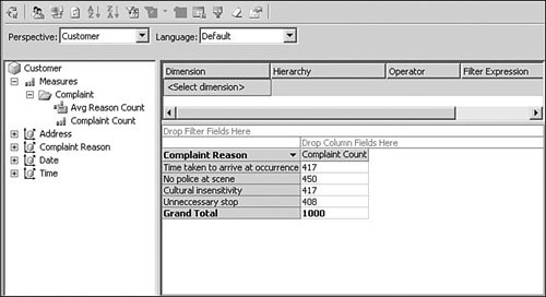 Another design decision that you need to make during the Cube Wizard is whether you want the Complaint fact to also be available as a dimension. If you want people to be able to drag a Complaint Business Key attribute onto the rows of a query and then look at what reasons each individual complaint consisted of, you must mark Complaint as both a Fact and a Dimension in the wizard. This will create a Complaint "fact dimension," which is similar to the Invoice Details dimension we created in Chapter 5, "Building an Analysis Services Database." If you don't want to add this complexity, make sure to just select Fact and not Dimension in the wizard. When the wizard has created the cube, you can see the results in the Dimension Usage tab, as shown in Figure 9-8. The Complaint measure group has a relationship with the Complaint Reason dimension, which is set up as M:M with Mapping Complaint Reason selected as the intermediate measure group. Figure 9-8. Many-to-many relationship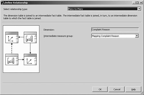 Using Perspectives to Group Related Dimensions and MeasuresThe police service cube that we have built includes four different measure groups and about 25 dimensions. This is helpful for building our scorecard, but will probably be somewhat overwhelming for users who connect to the cube using a BI client tool such as Excel 2003 or earlier. One way to help users to navigate complex cubes is to use Analysis Services perspectives to collect related measure groups and dimensions into simplified, topic-specific views of the cube. You can add perspectives to the cube using the Perspectives tab in the cube designer, which allows you to specify a name for the new perspective, as shown in Figure 9-9. For this particular solution, we will leave the default Police Service perspective, which shows everything in the cube, and add four new perspectives that cover the different business areas of Crime Reduction, Community Relationships, Internal Processes, and Professional Standards. Figure 9-9. Perspectives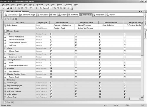 These different perspectives show up in client tools as different cubes when users connect to the database, but they are really just different views of the same cube. This is especially useful in client applications such as Excel 2003 and earlier that don't do a great job of displaying many attributes in a single cube. Note that perspectives cannot be used as a security mechanism to grant users access only to certain parts of the cube, because you can only permit or deny access to particular cubes, measures, and dimensionsnot to specific perspectives. Defining Key Performance IndicatorsThe term key performance indicator (KPI) can have different meanings depending on the context and the speaker, like so many concepts in BI. In the context of scorecards, it is usually used to refer to a measure that you are tracking, sometimes with an associated goal that you are trying to achieve. In Analysis Services, a KPI is an additional feature that you can add to the cube that can be used in queries. Each KPI has an associated measure expression that is used for the current value of the KPI as well as a target value or goal that you are trying to reach. In addition, you can define an expression that shows whether the trend over some time period is for the KPI to increase or decrease. We will be using KPIs to track the key measures of success in the police service's strategy. An example of a KPI is the average time taken to respond to emergency calls, because reducing that time will have a positive impact on both the crime reduction and public-perception fronts. Of course, to improve this indicator, the police service must do more than just measure it. They must take concrete steps such as improving the training levels of dispatchers (which will show up in the Professional Standards part of the scorecard).
How the KPIs display to the user depends entirely on the client tool. The MDX language includes KPI functions that the client tool can use to get the different numbers associated with the KPI, such as KPIValue, KPIGoal, and KPITrend. For our police service solution, we will be using a Reporting Services report that uses these functions to display performance indicators, as shown in the next section. Building the ReportsNow that we have built the Analysis Services database, we can create some Reporting Services reports based on the cube, instead of directly against the relational data warehouse as shown in Chapter 6, "Reporting." Reporting Services 2005 has really good integration with Analysis Services, so building reports on top of cubes is similar to relational reporting. The report designer in BI Development Studio includes a graphical query designer that you can use to create queries without an in-depth knowledge of the MDX language. Before we get started, we can add a new Report Server Project to the existing solution by selecting New, Project from the File menu. This makes it easier to work with the Analysis Services and Reporting Services projects in a single solution file. We will also add a shared data source to the report project that uses the Microsoft SQL Server Analysis Services provider and points to the Police Service OLAP database. The first report that we need for our scorecard is a summary of the complaints that were received during the current month. If you create a new report using the data source you previously defined, the default query editor that will be used is the graphical MDX editor. As shown in Figure 9-11, you can design a query by dragging the Complaint Count measure and Complaint Reasons hierarchy onto the design area. If you want to see the MDX that is used, click the Design Mode button on the right of the toolbar. Figure 9-11. MDX query designer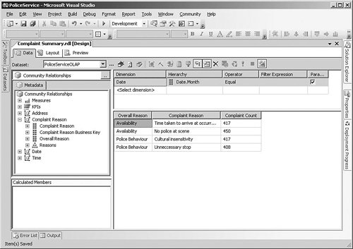 Setting Up Parameters for Analysis Services QueriesWe need to set up the report so that the user can select a particular month and show the number of complaints received in that month. This can be done in the same way as for relational reports, by defining a report parameter along with a database query that is used to populate the list of values that the user can choose from. It's a little tricky to write the correct MDX query to return this list, however, so the query designer includes a handy feature that helps you to create parameterized Analysis Services reports more easily. We can define a filter on Month by selecting the Date dimension and the Date. Month hierarchy in the filter area at the top of the designer, as shown in Figure 9-11. You can enter a specific value or set of values in the Filter Expression area, or just select the Parameters check box to parameterize the MDX query. When you select the check box, the designer automatically creates a new report parameter for you called DateMonth, and also creates a new dataset containing an MDX query that returns the list of all possible values for the Month hierarchy. You can see or modify this query and execute it to test the results by selecting DateMonth from the Dataset list at the top left of the designer. Tip: Add Attributes with the Full Name of the Quarter and Month to the Date Dimension As you will see when you run this parameterized report, the list that displays for the parameter contains the values of the Month attribute. If you have defined this attribute with just the month name, the user will have a hard time figuring out which year the month belongs to because the month will repeat if you have correctly defined a unique key. You can get around this either by defining cascading parameters for Year and Month in which the Month query picks up the selection for the Year parameter, or just make sure that the Month attribute includes the full name including the year, such as January 2006. By default, the parameter automatically created for you allows the user to select multiple values for the parameter using check boxes. In our case, that is not required because we want the report to be run for a specific month, so we can modify the properties for the parameter by selecting Report Parameters from the Report menu, and unchecking the Multi-value check box. Adding KPIs to a ReportWe will be using the Time To Arrival KPI that we have defined in the cube to build a report that graphically shows the performance for the current month, across a number of different Incident Types. Although it is possible to build reports that show KPIs, you need to do some manual work because there is no automatic KPI display in the current version of the BI Development Studio report designer.
The process described in the Quick Start for the Status column can also be applied to the Trend column using the arrow images in the KPIsBrowserPage folder. When you preview the report, you will see how the KPIs are displayed, as shown in Figure 9-13, although you will need to add a parameter to the report to select a specific month to be able to see some different results. Figure 9-13. KPI report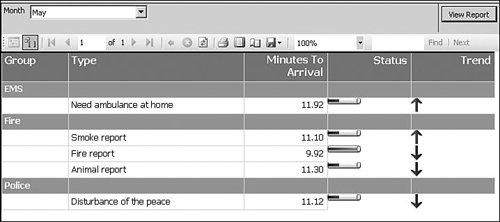 Using Charts in a ReportBecause a scorecard is meant to give people an overall impression of different business areas, you will often end up using lots of charts in the reports to make the information easier to understand. We will use the Chart component to build a complaints report that shows the number of complaints we are receiving every month, grouped by reason. The first step is to create a new report that contains a query that returns the Overall Reason attribute from the Complaint Type dimension, the Month, and the Complaint Count measure. You will also have to add a parameter for the Year attribute so that the user can select the year they are interested in. When you drag a new Chart onto the report, you will see three different areas at the top, bottom, and right of the chart, as shown in Figure 9-14. The Data area is used to define the numeric measures (Complaint Count) that the chart will display, and the Category area is for the information that will be shown on the rows (Month). You can also show different series in a chart, which we will use to show different lines for each complaint type. You can specify values for each of these areas by dragging the relevant column from the Datasets toolbox. Figure 9-14. Setting up the Chart component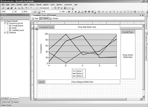 Building the Scorecard PortalThe business requirement is to provide employees with easy access to the information that they need to understand the current state of the police service, and asking them to run reports periodically or set up e-mail subscriptions is not really an effective way to promote change. As described in the section "High-Level Architecture," we will be using WSS to build a portal that will be every employee's home page and use this portal to publish our scorecard reports and any other information that they need. WSS is part of the Windows Server 2003 R2 installation, or for Windows Server 2003, you can download it from Microsoft's download site (search for WSS) and install it separately. Be careful to read the installation information before installing the technology on a Web server that has existing Web applications, because their behavior will be affected. We will be using WSS to create the main scorecard portal, as shown in Figure 9-15, which includes the high-level information that everyone needs to be aware of. WSS is a large topic, and we could have devoted a whole book to working with it, but this chapter introduces some of the main areas that you need to consider to create a portal. Figure 9-15. Scorecard Web portal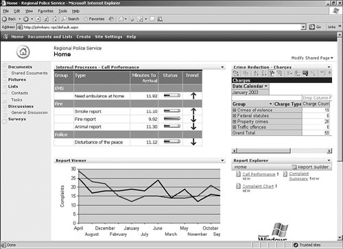 Creating a WSS Team SiteAfter you install WSS, any user who goes to the root Web (such as http://MyServer) will see the standard team site. This site includes a shared document library for publishing information, contact and task lists, and a discussion area. You can add additional types of lists or document libraries by clicking the Create button on the toolbar. WSS pages are built around the concept of web parts, which are components that you can arrange on the Web pages and configure to provide functionality such as displaying reports. We can also use WSS to create separate sites for different teams such as particular divisions that show specific scorecards that relate to their area. For example, the main portal page could show the number of occurrences in the whole police service, and the team site for 42 Division could use a parameterized report to show only the occurrences within that division. You can create separate team sites by clicking the Create button and choosing Sites and Workspaces. The site will then be available to users by navigating to the address you choose, such as http://MyServer/42division. Add Reports to the SiteReporting Services includes two web parts for displaying a list of reports to select from and displaying the contents of a single report on a Web site, but these are not installed by default. Before you can use these web parts, you must run a WSS utility called STSADM.EXE that registers the web parts with the Web server. The detailed steps are described in the Books Online topic "Viewing Reports with SharePoint Web Parts." The Report Viewer web part displays a report right in the Web page along with the other content, so it's a great way of integrating report content into the site. When you add the web part to a page, you can specify the URL of the report server and the path to the report. You can also decide whether to show the toolbar at the top of the web part to allow the user to select values for parameters or use actions such as printing. If you turn off the toolbar, the reports will look like a natural part of the page (see Figure 9-15), but you can't use this approach for reports with parameters because the web part needs to prompt the user. Tip: Use Linked Reports to Show Parameterized Reports in Web Parts If you want to turn off the toolbar on the Report Viewer web part for parameterized reports, you can create a linked report that has default values for all the parameters and then use the linked report as the source for the web part. This allows you to control exactly what the user sees but does mean that the user can't override the default, because the toolbar is disabled.
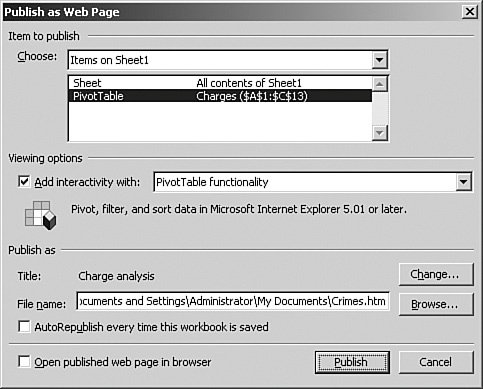
The Report Explorer web part can show a list of reports in a specified folder on the report server, as shown on the bottom right of the page shown in Figure 9-15. When a user clicks the hyperlink for a report, a separate browser window is opened to display the report. You can also add a Report Viewer web part to the page and then connect it to the explorer so that when the user clicks a link, the report displays within the Web page rather than a separate window. You can connect the two web parts by clicking the arrow at the top of the explorer web part and choosing Modify Shared Web Part, clicking the arrow again when the web part is in design mode and selecting Connections, Show report in, and then selecting the report viewer web part. Add PivotTable Views to the Web SiteThe reports that we have added so far are pretty flexible, and we could extend them to give the users even more capabilities by adding some of the features we described in Chapter 6 such as drilling through to detailed reports. However, users would get a lot of benefit from more than just report functionality for the crime occurrences web part because there are so many different ways to understand the information. Excel's PivotTables have a lot of functionality that allows users to slice and dice the information in a cube in a flexible and fairly intuitive way. Fortunately for this scorecard solution, we don't have to rely on users opening up Excel to analyze the information because Office 2003 includes a technology that allows us to include a PivotTable right on a Web page. Office Web Components (OWC) is a set of ActiveX controls that can be installed as part of Office. These are usually installed by default on all machines with Office applications, but with the appropriate license you can set up the controls so that they are downloaded on demand for machines in the internal network. Because this approach relies on having specific software installed on the client PC, it's usually not appropriate for Internet applications and is mostly used for intranet Web sites such as this scorecard portal. Setting Up the PivotTableThe approach we will use to add PivotTable views to the Web site is to first set up a PivotTable using Excel, and then save it as a Web page that includes the OWC control. From Excel, you can run the PivotTable and PivotChart Report Wizard from the Data menu, which will prompt you to connect to an external data source and use the OLAP cube as the source. Because we don't want to include all the dimensions and measures from the base cube, we can select the smaller cube based on the Crime Reduction perspective. After the wizard has completed, we can drag and drop the measures and dimensions to set up the pivot table view, including adding any filter dimensions such as Date to the page area. When the view is set up correctly, we can select Save As Web Page from the File menu, and then click the Publish button on the save dialog. This allows us to choose the PivotTable we created and specify a filename to save the HTML file. The important step is to check the Add interactivity with box and select PivotTable from the list (see Figure 9-17). If you open the resulting file in a text editor, the HTML is fairly straightforward and basically consists of one big <OBJECT> tag and some page definitions. Figure 9-17. Publishing a PivotTable using OWC Adding the OWC Control to the PortalWe can use a couple of different approaches to get the PivotTable definition we have just created into the portal Web page. The first is to publish the HTML page that was created on a Web server and then use the Page Viewer Web Part to include the page in a web part. This is a good approach when you are already managing a Web site and can just add your OWC pages; in our case, however, we will take advantage of WSS's ability to embed HTML fragments right in the WSS Web page. If you add a Content Editor web part to the page, you can open the tool pane and click the Source Editor button, which allows you to type HTML that will show up within the web part when the page displays. If you open the PivotTable HTML page that we saved from Excel, you can copy everything from <OBJECT ...> to </OBJECT> and paste the text into the WSS dialog box. When the changes have been applied, you will see the PivotTable control displayed in the Web page, as shown on the top right of Figure 9-15, and the users will now have the ability to flexibly analyze the crime occurrences right in the scorecard site. Tip: Add the Scorecard Web Site to Trusted Sites for OWC to Work If users go to a Web site that contains an OWC control and they are using a recent version of Internet Explorer, they may be prompted with the message "This Web site uses a data provider that may be unsafe." This gets very irritating after a while because this Web site is on their intranet and is known to the user, so the solution to avoid this prompt is for the user to open Internet Options and add the Web site to the Trusted Sites section of the Security tab. |
EAN: 2147483647
Pages: 132