The Animation Component Set
|
|
| Component | Included in the Chapter 6 folder on the companion CD is a collection of five highly optimized Eyeland Studio animation components. They were created specially for this chapter as tools for explaining the concepts and methods we will be discussing. Beyond that, they are useful instruments in any designer's toolbox. I encourage you to modify and use them in exciting new ways. |
You must install the animation component set before you can use them. Using the Macromedia Extension Manager (a link to which is provided on the companion CD), you can install, manage, and track all third-party expansions installed into any of Macromedia's suite of applications. This includes components and Flash MX.
Once you have installed Macromedia Extension Manager, open it. Choose File ➔ Install Extension. Browse to the Chapter 6 folder on the companion CD and select the file AnimationComponents.mxp. Click OK. If all is successful, you will see a dialog box displaying the terms of the installation. Agree to the terms by clicking the Accept button. The animation components are now installed as part of your Flash MX development environment.
The best way to introduce these components is to give a brief explanation of each, one by one. We will observe the appearance and behavior of the component using its default configuration, and then I'll provide a brief explanation of how the component can be used, describe the parameters in the component definition, and most importantly, provide some inspirational implementations of the component.
When you have successfully installed the animation components, begin a new FLA file (see Figure 6.1); you will use this as a blank canvas on which to experiment. You can access the components through the Components panel. To use them, drag instances of them from the panel onto the stage where you would like them to appear. Each animation component has a unique set of properties that determines its appearance and general behavior. Modifying these properties allows you to create wild and new computationally generated animations.
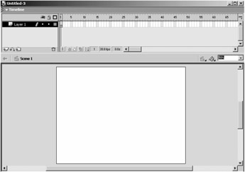
Figure 6.1: Begin a new FLA file to test this chapter's components.
General Parameters
The following parameters apply to more than one of the animation components:
Number Of <items> The total number of vertical bars, pebbles, or seeds to be displayed.
Color Points An array of hexadecimal color values from which shapes are assigned their colors.
Color Snap or Snap To Colors Setting this Boolean value to True causes each shape to be assigned one of the colors in the Color Points list. Setting it to False assigns shapes color values calculated from the gradients that form between colors in the Color Points list.
Alpha The amount of opacity for all the shapes, as a percentage. The lower this number is, the more transparent the shapes become. A value less than 5 is not recommended because the shapes will be practically invisible. A value of 100 keeps all shapes solid (no transparency).
The Parallel Bars Component
| Component | The Parallel Bars component fills a region of space with dynamic, animated vertical bars. The effect is commonly seen in both film and on the Web. What you cannot see in the pages of this book is the engaging visual effect created when these vertical bars are animated. Each bar slides and switches positions with the others in near continual, random fashion. With some tweaking of the component's settings, the Parallel Bars can even be a useful tool for displaying information. |
Drag an instance of the Parallel Bars component onto the main stage. Then publish the movie and observe the results. The default configuration of the Parallel Bars is animated and looks something like a funny, gray-shaded square, shown in Figure 6.2.

Figure 6.2: The default appearance of the published Parallel Bars component
Looks pretty simple, right? Well, it really is. By default, a 100×100 pixel region of space is filled with vertical bars. Each of the bars operates independently from the rest unless collision detection is enabled, in which case they bounce off of each other. The side-to-side movement is random but controllable through three separate parameters. The number, color, and thickness of the bars are also fully customizable. As we will see later in this chapter, combining multiple Parallel Bars components can produce some astonishingly complex results.
Component Basics
Within the Component Parameters panel, shown in Figure 6.3, you will find the controls that allow you to customize the Parallel Bars component. Each of the animation components is accessible through a similar interface. This makes the customization and tweaking of the components very easy. (Notice that this user interface scrolls vertically, unlike the tabbed UIs shown in earlier chapters.)
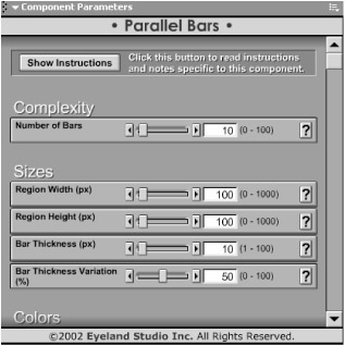
Figure 6.3: The component parameters for the Parallel Bars component
In addition to the general parameters listed in the preceding section, the following parameters control the appearance and behavior of the Parallel Bars component.
Region Width, Region Height The width and height of the area to be filled with bars, measured in pixels.
Bar Thickness, Bar Thickness Variation Bar Thickness is the maximum width of each bar, measured in pixels. Bar Thickness Variation is the percentage of variation in that thickness; a value of 0 forces all bars to be the same width. A Bar Thickness Variation value of 100 randomizes each bar's thickness within the maximum set by Bar Thickness.
Movement Frequency The frequency with which the bars change position, measured in milliseconds. The lower this number is, the faster and more chaotic the bars' movement seems.
Movement Chaos A percentage that introduces randomness in almost every aspect of the bars' movement. A higher number causes more unpredictable, chaotic movement, while a lower number causes smooth, more rhythmic movement.
Movement Velocity The speed with which the bars actually move on the screen. A value of 1000 causes the bars to move so fast that they seem to blink into their next position. Low values cause gentle, sweeping movements.
Movement Variation A percentage that controls the differences in speeds between the individual bars. A high number produces bars that move at all kinds of different speeds, while a low number generally keeps the bars moving at the same rate.
Enable Collision Detection Setting this Boolean value to True causes the bars to bounce off of each other while moving. Setting it to False allows the bars to move freely, often over and under other bars.
Inspirational Examples
With a little experimentation using only the component's parameters, all of the following animation effects are possible.
This first example (shown in Figure 6.4) fills a region of 800 pixels by 200 pixels with 100 bars. The thickness of the bars is set to 30 pixels, but because the Bar Thickness Variation is set to 100%, many of the bars are actually much thinner. The shades of gray are the result of hand-entered color values that range over a subtle palette of Earth tones. There are 12 unique colors, each with a differing contrast.
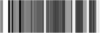
Figure 6.4: The Parallel Bars with custom settings
To re-create this example, first select the Parallel Bars instance you dragged onto the stage earlier. Launch the Component Parameters panel. Move the Number Of Bars slider to its maximum of 100—we want a lot of bars. Change the Region Width value to 800 pixels, to fill the horizontal stage of the same dimension, and change the Region Height value to 200 pixels, doubling the default value of 100. Next, change Bar Thickness to 30 pixels and move Bar Thickness Variation to 100%. This will give us a great range of thick and thin bars.
For the Color Points, I chose a favorite collection of 12 earthy tones using a scanned outdoor photograph and a paint program to pull hexadecimal values from it. For your own work, you will probably enter color values that best suit your project.
Entering color values is a two-step process. To enter colors into the list, first use the slider bars above the list to find the color you wish to enter. The hexadecimal value of the color will be shown and will look something like Hex#: FF0000. In this case, the color is bright red. Click the Add Color button in the Color Points list. In the dialog box that appears, type the hexadecimal number preceded by 0x. Click OK, and the new color should show up in the Color Points list. Adjust the order of the colors in the list by selecting them and using the Move Up and Move Down buttons.
The second example (see Figure 6.5) combines two Parallel Bars components, juxtaposed on top of each other. You will notice right away the predominance of darker colors in the lower Parallel Bars. This is a great example of how individual instances of the same component can hold unique parameters. The component on the bottom is using the same color palette as the first example, while the component on top is using an entirely new set of mainly lighter colors. It is interesting to note that all other component parameters for these two instances are the same. The variations in spacing and sizing are a result of the ongoing chaotic animation. The easiest way to re-create this example is to duplicate the original component and then edit the colors of the duplication. In this fashion, all other component parameters will remain the same.
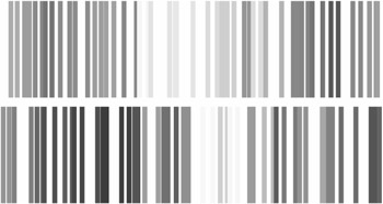
Figure 6.5: Two similar Parallel Bar components, each with different Color Points values
 |
While it may seem somewhat complex, all the animation components use a color system based on numbers to allow the highest degree of color precision possible. This means that you enter colors into the Color Points list by their hexadecimal number. The hexadecimal color system allows 16.7 million possible unique colors. Each color is indicated by the amounts of red, blue, and green to mix together. The higher the number, the brighter the color. A hexadecimal number in Flash looks like 0xFFFFFF (bright white). Some other colors are 0x000000 (absolute black), 0xFF0000 (bright red), 0x00FF00 (bright green), 0x0000FF (bright blue), and 0xFF00FF (purple). The leading 0x tells the computer that the number is in hexadecimal format. The remaining six characters are broken into three separate groups of two digits each. They represent the red, green, and blue components respectively. Each digit is a value from 0 to F where the system counts by 0 1 2 3 4 5 6 7 8 9 A B C D E F, with 0 being null value, and F being highest value. Even the best mathematicians have a hard time calculating the hexadecimal equivalent of a particular shade or hue. This is why a color picker has been included as part of the Color Point list control. Simply choose a color visually using the picker and copy the computed hexadecimal value into the Color Point list.
|
For the final example with the Parallel Bars (see Figure 6.6), we have done something a little bit tricky. Although it appears to be some kind of grid component, the images in the figure were actually generated by placing two instances of the Parallel Bars component one on top of the other and rotating the uppermost instance by 90 degrees. The upper instance also has exactly one Color Point value, 0xFFFFFF (bright white). Keeping this in mind, take another look at the images. Their method of construction might now be a bit more obvious, although the effect is still intriguing.
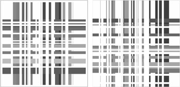
Figure 6.6: Abstract grid space illusions created using two Parallel Bars components
One great way to stack components on top of each other is to use separate layers. For each component to be stacked, create a new layer and place exactly one component within it. Keep in mind that the components on upper layers will block the components on lower layers. Use this to your advantage.
Using this technique of layering components will also speed the process of selecting and editing the components, since you can temporarily hide individual layers and select all objects on a layer by selecting the layer itself.
The Pond Ripples Component
| Component | The Pond Ripples component generates concentric, geometric structures of colored discs, shown in Figure 6.7. In many ways, this component is similar to the Parallel Bars component. One particularly interesting difference with this component, however, is the method in which the individual discs of the structure are animated. These discs breathe. The breathing cycle is a short animation loop that causes each disc's size to rise and fall, much like the chest of a breathing animal. When many discs are expanding and contracting in unison, the effect is sometimes, well, breathtaking. |

Component Basics
In addition to the Color and Alpha parameters listed in the first section of this chapter, the following parameters control the appearance and behavior of the Pond Ripples component.
Outer Radius This value determines the overall size of the component. To determine the actual size of the component in pixels, simply multiply the radius by 2.
Ring Thickness, Ring Thickness Variation The first of these determines the maximum thickness of each colored ring in the Pond Ripples in pixels. Experiment with this setting; if only a few colors are defined, several skinny rings of the same color will be created, giving the illusion of one fat ring, so you may want to add colors to see thin rings. Ring Thickness Variation allows ring thickness to be sized randomly; the higher the value, the more randomly sized the rings.
Centerpoint Offset, Centerpoint Offset Variation The Centerpoint Offset pixel number repositions individual rings some random amount from the center of the ripple. Higher numbers provide more room in which the rings might move around. The default value of 0 keeps all rings perfectly centered. The Variation value is a percentage that allows each ring's offset value to be randomized further. Higher values cause a more chaotic distribution of rings, while lower values generally keep rings within the same range.
Color Mixing Chaos This percentage determines to what extent the colors in the Color Points array will be mixed when applied to the rings. See the first example of this component for an illustration and further explanation on Color Mixing Chaos.
Breathing Intensity This number controls the depth of breath each ring takes. Larger values produce more exaggerated breaths. A value of 0 produces rings that do not breathe at all.
Breathing Variation This percentage is used to mix up the times that rings take their breaths. A value of 0 creates rings that breathe simultaneously (so the entire structure grows and contracts together), while higher values create with rings that breathe further and further out of sync.
Lifetime This setting imposes a specified time for the component to live. After the number of seconds entered has been reached, the Pond Ripples component begins to die. This is especially useful if many Pond Ripples are being created and some need to be destroyed to keep CPU resources plentiful. The Lifetime value is unique to the Pond Ripples component. A Lifetime value of 0 gives the Pond Ripples indefinite life.
Fade Out This Boolean value is used in conjunction with the Lifetime value. If set to True, the entire Pond Ripples effect fades away at the end of its lifetime.
Show Build Process This Boolean value controls the method in which the Pond Ripples effect is assembled. A setting of True shows the construction process of each ring being attached from the center outward. A value of False instantly displays the entire Pond Ripples. This component parameter is common to most of the other animation components.
Inspirational Examples
This first example of the Pond Ripples component (see Figure 6.8) is a demonstration of the power of the Color Mixing Chaos value. The instance on the left has a Color Mixing Chaos value of 0, and the instance on the right has a Color Mixing Chaos value of 100. All other component parameters are the same in the two instances. Clearly, setting a large value for the Color Mixing Chaos creates a Pond Ripples effect with severely mixed up colors. Try experimenting with this setting by creating a third instance with a Color Mixing Chaos value of 50. What will it look like?
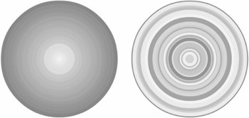
Figure 6.8: Two duplicates of the Pond Ripples component. The ripple on the right has Color Mixing Chaos set at 100%.
The next example (see Figure 6.9) shows how changing just a couple of different settings can produce some beautiful results. The most striking feature of the images below is probably the strange alignment of rings. Setting a small number for the Centerpoint Offset value creates this effect. Also, the entire Pond Ripples component has some transparency because the Alpha value is set to 30.
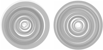
Figure 6.9: The Pond Ripples component can take on many different appearances. These ripples have a small value set for Centerpoint Offset and a bit of transparency.
The Concentric Path Component
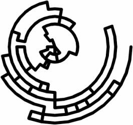
| Component | The Concentric Path component shown in Figure 6.10 draws a random walking, concentric path. Starting from the outside, a single line works its way inward by following prescribed paths of a given radius. At random intervals, it drops one ring towards the center and, based on settings within the component, either chooses to continue going in the same direction or switches and heads back the other way. Once the line finally drops into the center, a new one begins. Each path takes a different route to the center. The result is a geometric construction similar to a maze or the artistic work of the ancient Mimbres people of North America. |
Component Basics
The following parameters control the appearance and behavior of the Concentric Path component.
Number Of Rings Controls the number of unique ring levels the path will follow on its journey towards the center.
Erase Old Paths After Controls the frequency with which old paths will be erased. Each time the drawn line of the Concentric Path reaches the center, it begins again at the outside radius. Paths eventually begin to overlap each other and also require more and more CPU resources, so the Erase Old Paths After value can be used to wipe the old paths away after so many have been drawn.
Draw Only Once Setting this Boolean value to True forces the component to draw only one path.
Outer Radius, Inner Radius These values control the outside and inside radii of the Concentric Path. Double the outer number to figure the total size in pixels. The Inner Radius should not be greater than the Outer Radius.
Resolution The Concentric Path is drawn using a large number of straight lines. The Resolution is a value that controls how closely together the straight lines are placed. The smaller the values, the higher the resolution of the path. Extremely large values begin to show the straight lines at higher radii. This can also be used as an interesting effect.
Line Thickness, Line Color The first parameter controls the width in pixels of the drawn line; a value of 0 creates a hairline path. The second describes the color and opacity of the line; all paths of the Concentric Path use the same color.
Chance Of Drop A percentage that determines how often the path drops to the next ring. High values create paths that quickly reach the center. Low values create paths that tend to circle the origin before dropping in.
Chance Of Switch You use this percentage to be used in combination with the Chance Of Drop value. This value determines how likely it is that the path will switch directions (clockwise or counterclockwise) after it drops. High values create paths that switch back and forth quite a bit. Low values create paths that tend to spiral towards the center.
Random Wandering This value adds a nice little arbitrary walk to the path as it is drawn. A value of 0 creates a perfectly round path, while higher values tend to create a path that looks hand drawn.
XYZ Rotation Using this setting, in degrees, the Concentric Path can be instructed to rotate about any of its axes. If the component seems to rotate too fast, try using decimal values (0.01). Positive values will rotate the path clockwise, while negative values will rotate the path counterclockwise.
Inspirational Examples
This first illustration (Figure 6.11) shows a typical rendering process of the Concentric Path component as it draws itself from nothing to several dozen paths. Note how each path takes a unique course to the center. For purposes of detail, the instance used in this example was given a large Outer Radius (250 pixels) and a higher Number Of Rings (50). All other values were kept at default.

Figure 6.11: The intricate construction process of the Concentric Path can be seen in these timed screen captures.
This next example (Figure 6.12) shows how you might combine several Concentric Path components to create a larger, more colorful path. This image was created using six instances, all centered at the same point. The purpose of using several unique instances of the Concentric Path component is to allow them to overlap in ways that are simply not possible with only one instance. In this example, all paths shared the same radii and number of rings. The result is a mesmerizing display of swirling paths.

Figure 6.12: By overlaying two or more Concentric Path components, you can create complex color patterns.
The final example using the concentric components in their unmodified form (Figure 6.13) takes advantage of the XYZ Rotation settings. Since it's not quite possible to display a moving image within the confines of this printed page, several consecutive screen shots were combined and blurred to demonstrate the wildly oscillating nature of the rotating Concentric Path.
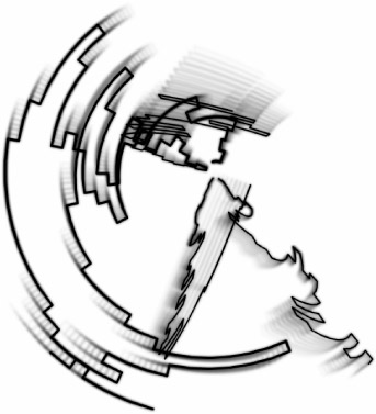
Figure 6.13: Setting small values for XYZ Rotation creates a concentric path that appears to spin about its center.
The Pebbles Component
| Component | The Pebbles component creates a computationally arranged field of simple graphic objects, as shown in Figure 6.14. The Pebbles component is perhaps the simplest of all these animation components. In that sense, though, its general-purpose nature makes it a powerful tool for creating many diverse effects with minimal effort. |
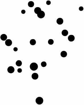
We have all had visions of vast fields; whether they be fields of flowers or of stars, large collections of self-similar objects are a common occurrence in nature. The Pebbles component was created with this in mind. By dragging a single instance of this component onto the stage, you can instantly generate an entire universe of self-similar movie clips.
Component Basics
In addition to the general parameters listed in the first section of this chapter, the following parameters control the appearance and behavior of the Pebbles component.
Region Width, Region Height The width and height of the area in which to place pebbles, measured in pixels.
Pebble Size, Pebble Size Variation The average size of each pebble created, measured in pixels. The variation between pebbles is measured as a percent of the Pebble Size. For example, a Pebble Size of 10 with a Pebble Size Variation of 50 would produce pebbles ranging from 5 to 15 pixels.
Rotation Speed This value adjusts the speed with which the pebbles rotate. Each pebble has a built-in rotational property that allows it to orbit a single point. Higher values will produce faster rotation. Negative values will produce rotation in the opposite direction, generally counterclockwise.
Rotation Variation This percentage sets the rotational variability between individual pebbles. The larger the number is, the more extreme the differences in rotation speed between pebbles.
Show Build Process The placement of individual pebbles within the field can be animated. Setting this Boolean value to True shows each pebble as it is created. Setting it to False instantaneously shows the entire pebble field.
Inspirational Examples
For this example, we used a single Pebbles component to fill a finite space with very small pebbles of varying color intensity. To create the example, we dragged a single instance of the component to the top-left corner of the stage of the movie. A Region Width of 800 and a Region Height of 600 (the same dimensions as the movie document) was specified so that the entire screen would be filled with stars. Pebble Size was set very low at 5 pixels. Pebble Size Variation was set very high at 80%, to create a sky of diversely sized stars. The variation in color was achieved by loading the Color Points array with exactly two colors, white and black (0xFFFFFF, 0x000000). Snap To Colors was set at False so that stars could be any of the grays in between.
The result (Figure 6.15) is one of my favorite examples. It reminds me of a starry sky in New Mexico on an especially clear night. The best thing about this component is that each time it is run, a totally unique sky of stars will be produced. This means that every user who visits your site will see an entirely unique field of stars.
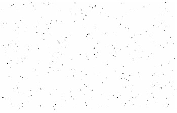
Figure 6.15: The Pebbles Component can generate a simple star field.
The Seeds Component
| Component | The Seeds component generates a seed pattern in a natural, radiating configuration, as shown in Figure 6.16. |
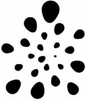
In nature, the relative rotation of 137.5 degrees occurs frequently. You can see the production of this strange alignment in pinecones, sunflowers, strawberries, the pineapple, and thousands of other botanical specimens. Are you getting hungry?
The Seeds component uses this naturally occurring phenomenon to generate a computational structure of intriguing geometric form. To extend the power of the component, we've added a breathing animation behavior, demonstrated in Figure 6.17, to the individual seeds.
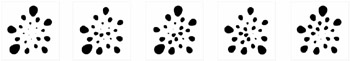
Figure 6.17: This illustration shows a sequence of the Seed breathing cycle. Note the subtle, asynchronous variations in individual seed size between frames.
Component Basics
In addition to the number and color parameters listed in the first section of this chapter, the following parameters control the appearance and behavior of the Seeds component.
Outer Radius, Inner Radius The outside and inside radii of the seed arrangement. All seeds will be placed between the outer and inner radii.
Outside Seed Scale, Inside Seed Scale These set the scale of the seeds at the outside and inside of the arrangement. Individual seeds are exponentially scaled within a range of sizes defined at both the outside and inside of the arrangement.
Color Mixing Chaos This percentage determines to what extent the colors in the Color Points array will be mixed when applied to the seeds.
Breathing Intensity This value controls the depth of breaths each seed takes. Larger values produce more exaggerated breaths. A value of 0 produces seeds that do not breathe at all.
Breathing Variation This percentage is used to mix up the times that seeds take their breaths. A value of 0 creates a seed arrangement with seeds that breathe simultaneously, while higher values create a seed arrangement with seeds that breathe further and further out of sync.
Show Build Process This Boolean value determines if the construction of the seed arrangement is shown as it happens or after it has completed. If this value is set to True, the seeds are placed one at a time, starting from the outside edge. If it is set to False, the seed arrangement is instantaneously constructed and shown all at once.
Inspirational Examples
A great example of the seed arrangement is shown in Figure 6.18. Here, the radius has been increased to 250 pixels, producing a seed arrangement approximately 500 pixels wide and tall. The Number Of Seeds was also increased to fill the larger size. Three colors of unique brightness were added to the Color Point array. Color Mixing Chaos has been set at zero, and Snap To Colors was left at false. The net result of these last two component parameters is a seed arrangement with a smooth transition of brightness from the inside out.

Figure 6.18: The Seeds Component with some color and a large number of seeds
Figure 6.19 uses the clever trick of setting the inner and outer radii very close to each other. The result is a ring of seeds.
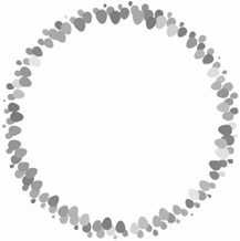
Figure 6.19: The seeds in this example have been compacted around the edge of the component by setting the values of the Inner Radius and Outer Radius very close to each other.
One slight deviation using the Seeds component takes advantage of foreground / background dynamics. Instead of using the seeds as objects to be observed, we can use the seeds to block out an object behind them. In Figure 6.20, our seeds are white, the same color as the background. A single black disc has been drawn on a layer below the seeds. The resulting animation is a spongelike form, whose porous perimeter pulsates with the breathing cycle of the seeds. In development, watching this particular form hypnotized me for what seemed like hours.
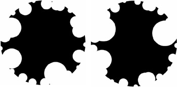
Figure 6.20: An unusual shape has been created by the Seeds component using seeds the same color as the background, placed over a black disc. The seeds in this example are perfect spheres.
|
|
EAN: 2147483647
Pages: 111