Using Basic ActionScript with Components
|
|
Open the take2.fla file in the Chapter 5 folder on the CD (see Figure 5.1). Save the file to your local computer so that you can save your edits as you follow along.
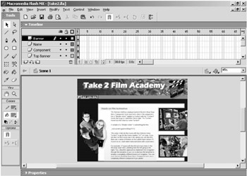
Figure 5.1: The take2.fla file
 |
All photos in the take2.fla interface are from Art Today's www.clipart.com. To date, clipart.com offers over 2.5 million images including vector images, photos, sounds, fonts, and more. Their search engine is particularly useful because you can easily run a search to see if they have the art you need.
|
| Component | The take2.fla file is a sample Flash template from Eyeland Studio's Flash Foundry. This template features a component that generates a drop-down menu. Test the movie and notice that a drop-down menu is generated when the movie is published. Roll over the menus and click some of the options (see Figure 5.2). |
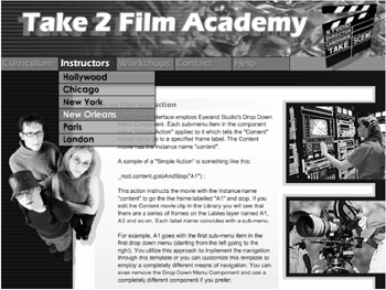
Notice that clicking an item within any of the drop-down menus navigates you to a different section of the overall template. In other words, when you click an item, you see text related to that section (only the Headline changes). As you can see, the drop-down menu is controlling the navigation within the template. You will soon see that the component allows you to specify several forms of navigation within its parameters. Close the test movie and return to the take2.fla file.
It might be a little difficult to see the component on the stage. Zoom in on the small gray bar labeled Drop Down Menu toward the top left of the stage. It is below the word Take in the heading Take 2 Film Academy, as shown in Figure 5.3. This component is similar to the components you worked with in Chapter 3. The gray bar is a place holder or temporary representation of the component on the stage. It helps you see the component while you are working with it in Flash, but the gray bar disappears and is replaced by the drop-down menu when you publish the movie.
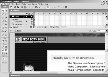
Figure 5.3: The Drop Down Menu component is located toward the upper left of the stage.
Select the gray bar labeled Drop Down Menu and open the Component Parameters panel. The first screen in this custom UI, shown in Figure 5.4, contains a scrollable text field and a button to navigate to the next page.
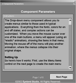
Figure 5.4: The first screen of the component parameters for the Drop Down Menu component
The text field explains that the Drop Down Menu component helps you create menus similar to those used in typical applications. You can customize everything from the fonts, colors for on and off states, to complex actions via the component parameters. When you move the mouse cursor over one of the main buttons, the drop-down menu you've created will appear (using an "elastic" animation), showing the items in that menu. Moving the mouse off the menu will play another animation, collapsing the menus into their original shape. The text field also explains how to set up the component and how to adjust the fonts. We will be looking at setup and working with the fonts later in this chapter.
Click the Next Page button to view the first page of parameters for the Drop Down Menu component, shown in Figure 5.5. Notice that this is merely page 2 out of 6 pages. Below is a description of the parameters of the Drop Down Menu component.
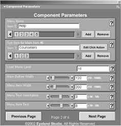
Figure 5.5: The parameters for the Drop Down Menu component begin on page 2 of the custom UI.
Menu Items The Menu Items parameter specifies how many main menu items there will be and what the text will be on each. Each item you add to the Menu Items parameter has a label. This label will be the text that appears on the main menu. Each main menu item has an associated sub item or sub items. When you select an item in the Menu Items parameter, the associated sub items will be displayed.
Sub Item For Main Item #n This Sub Item For Main Item parameter is associated with the Menu Items parameter. The name of this parameter changes slightly depending on the Menu Items parameter you have selected. For example, if you have selected the second item in the Menu Items parameter, this parameter will be labeled "Sub Item For Main Item #2".
Each item you add to the Menu Items parameter has a label. This label will be the text that appears on the main menu. Each item in this parameter can also have a click action associated with it. For example, you can set each item so that a different URL loads when the viewer clicks on the sub item in the published movie.
Load Movie Level The Load Movie parameter specifies the level into which the movie will load. Level 0 is the level where the host movie is located. Therefore, if you specify 0 the movie being loaded will overwrite the host movie. Thus you usually want to specify a value other than 0. It is common to specify a level such as 10 or 100 to decrease the likelihood that another movie might inadvertently be loaded into the same level.
Main Button Width Specifies the width of the main items (specified in the Menu Items parameter). All of the main menu buttons will be set to the width specified in this parameter.
Menu Item Width Specifies the width of the sub items (specified in the Sub Item For Main Item parameter). All of the sub items will be set to the width specified in this parameter.
Menu Text Indentation Sets the distance, in pixels, that the text on the main menu buttons will be indented (to the right).
Menu Item Text Sets the distance, in pixels, that the text on the submenu buttons will be indented (to the right).
Main Button Border Color Sets the color for the 1-pixel border around each main menu button. You can set the Alpha for this parameter to 0 if you do not want a border for the main menu buttons.
Menu Item Border Color Sets the color for the 1-pixel border around each submenu button. You can set the Alpha for this parameter to 0 if you do not want a border for the submenu buttons.
Spring Stiffness Adjusts the stiffness (also known as the spring constant k) of the menu opening animation. The higher the value of the Spring Stiffness parameter, the more quickly the menu will open to its full size. If you set this to 0, the menu won't open at all. Note that the menu items will not appear until the menu stops moving.
Spring Inertia Adjusts the inertia of the menu opening animation, or its tendency to keep moving back and forth. In general, as you increase inertia, the menu's motion becomes more bouncy. Note that the menu items will not appear until the menu stops moving. A value of 1 will result in no bouncing effect which, in turn, means that menu items will not appear.
Menu Closing Speed Adjusts the speed that the menu will close when the mouse is moved off a button. Set this to the maximum value (20) to have the menus close instantly.
Main Button Color (Default) and Main Button Color (Over) Adjusts the color used for main menu buttons in their default state (when the mouse is not hovering over the button) and in their "over" state (when the mouse is hovering over the button).
Menu Item Color (Default) and Menu Item Color (Over) Adjusts the color used for the submenu buttons in their default state (when the mouse is not hovering over the button) and in their "over" state (when the mouse is hovering over the button).
Main Text Color (Default) and Main Text Color (Over) Specifies the text color for main buttons in their default state (when the mouse is not hovering over the button) and in their "over" state (when the mouse is hovering over the button).
Menu Item Text (Default) and Menu Item Text (Over) Specifies the text color for submenu buttons in their default state (when the mouse is not hovering over the button) and in their "over" state (when the mouse is hovering over the button).
Text Shadow Color Specifies the color for the text shadow on each button in the menu (both sublevel menu items and main buttons). Set the opacity to 0 if you don't want to display a shadow.
Text Shadow Offset X and Text Shadow Offset Y Adjusts the text shadow's position with relation to the text. For example, a Text Shadow Offset X setting of -2 will place the shadow 2 pixels left of the text; a Text Shadow Offset Y setting of 1 will place the shadow 1 pixel below the text.
Menu Shadow Color Specifies the color of the shadow for the menu. When the menu is open, a shadow will appear beneath it. Use this control to adjust the color and opacity of the shadow.
Menu Shadow Offset X and Menu Shadow Offset Y Adjusts the menu shadow's position with relation to the menu. For example, a Menu Shadow Offset X setting of -2 will place the shadow 2 pixels left of the menu; a Menu Shadow Offset Y setting of 10 will place the shadow 10 pixels below the menu.
|
|
EAN: 2147483647
Pages: 111